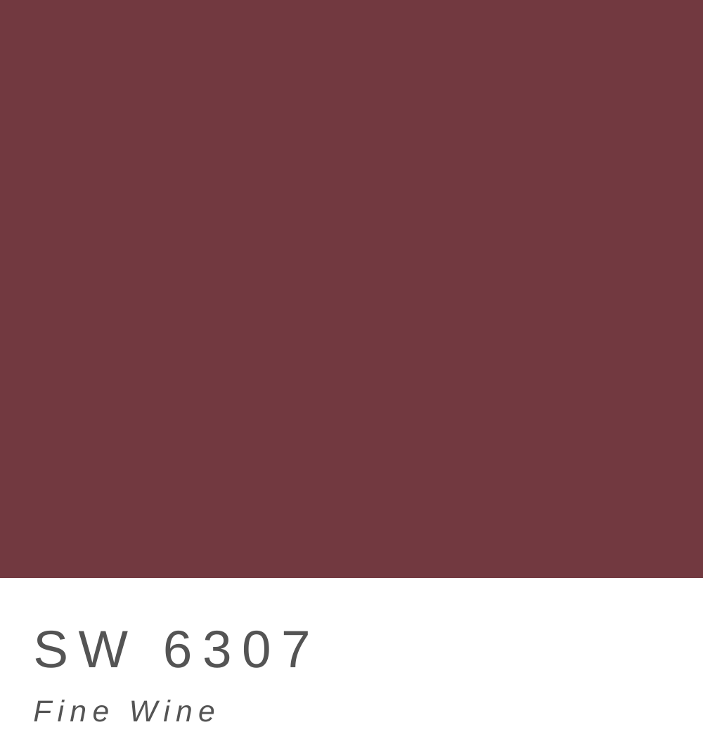
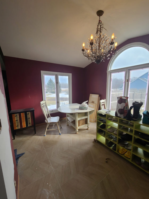
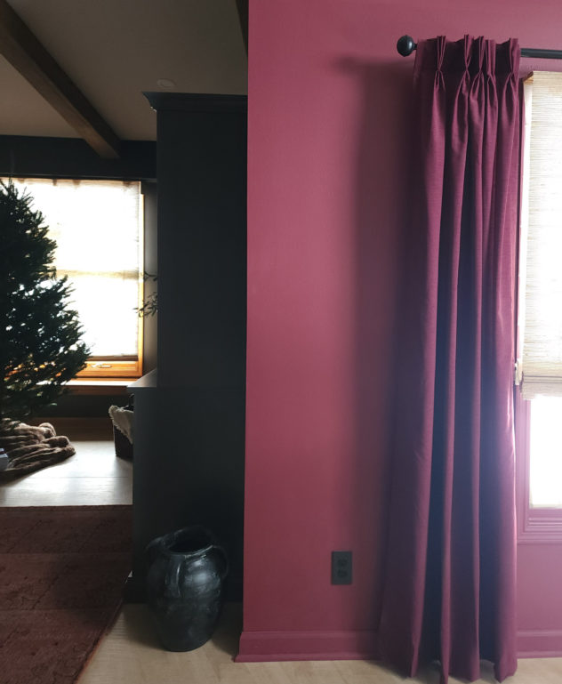
When I first approached this dining room project, as always, I reflected on the things I liked about it. It was open with lots of natural light. It would be visible from both the kitchen and the living room so the colors could play on each other in a fun way. I also liked that it was red! I wasn’t a huge fan of the Southwest-y brick color but I was definitely inspired by where it was headed. It was honestly one of my first decisions that this space would be deep red from top to bottom, trim and all.
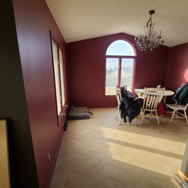
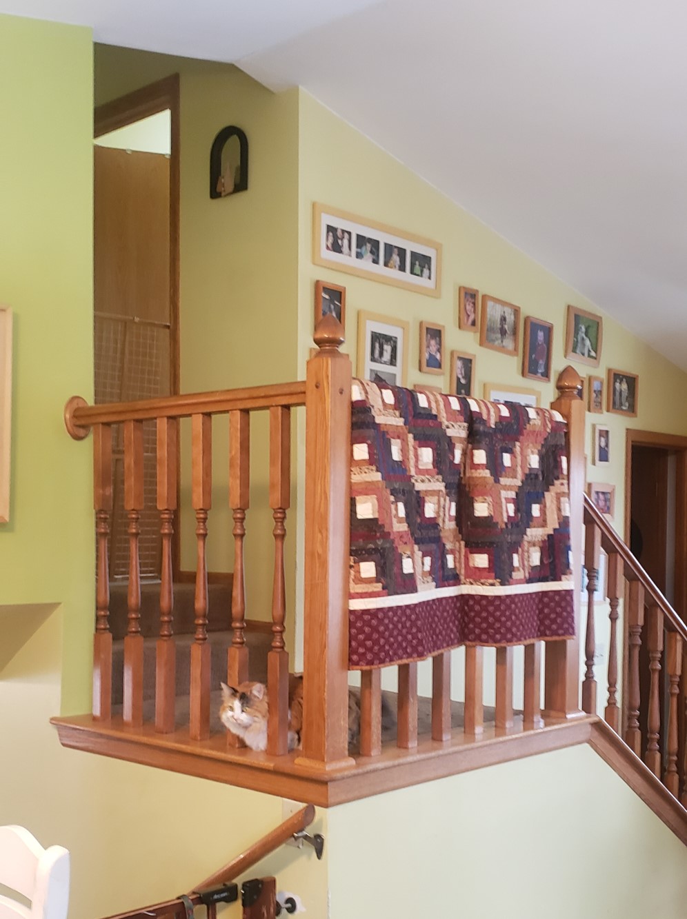
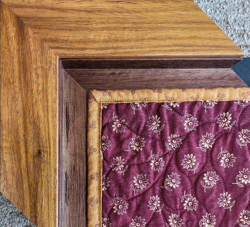
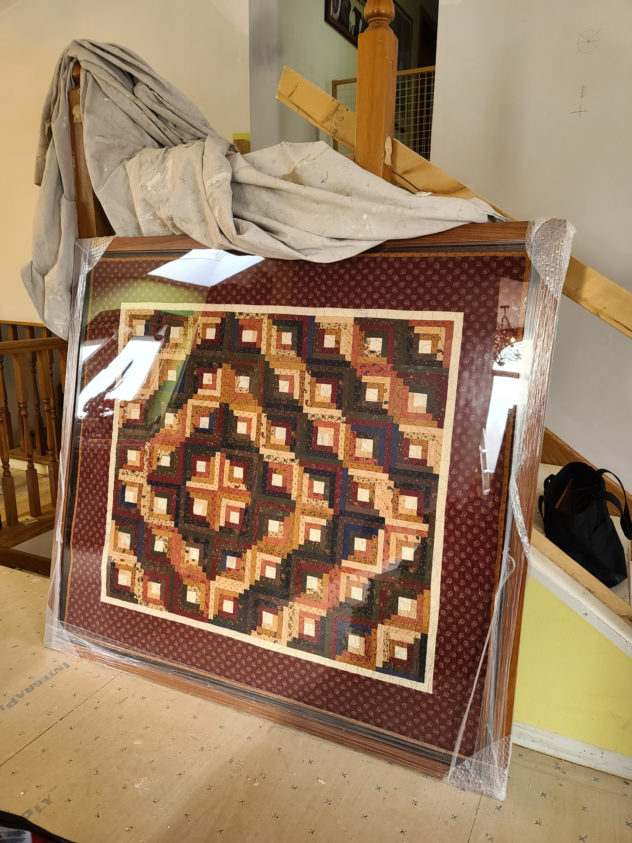
The other jumping-off point was a handmade quilt I saw hanging on the handrail in the living room. I thought it would be lovely framed on the wall and the client agreed so the sweet couple at Photographic Designs here in Racine pulled off some magic. The existing chandelier was also fun and provided the little touch of sparkle that became a pattern throughout this project. It was one of the few items that survived the renovation.
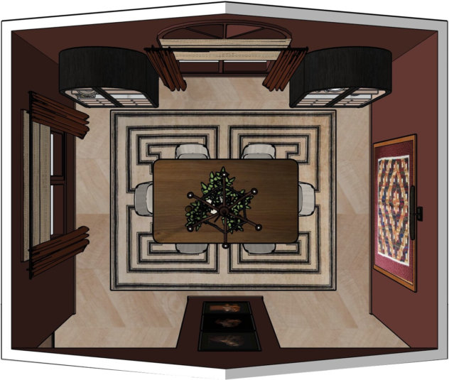
The overall goal for the vibe was sophisticated and bold, but relaxed.
Now let’s walk through the approach.
The Problems
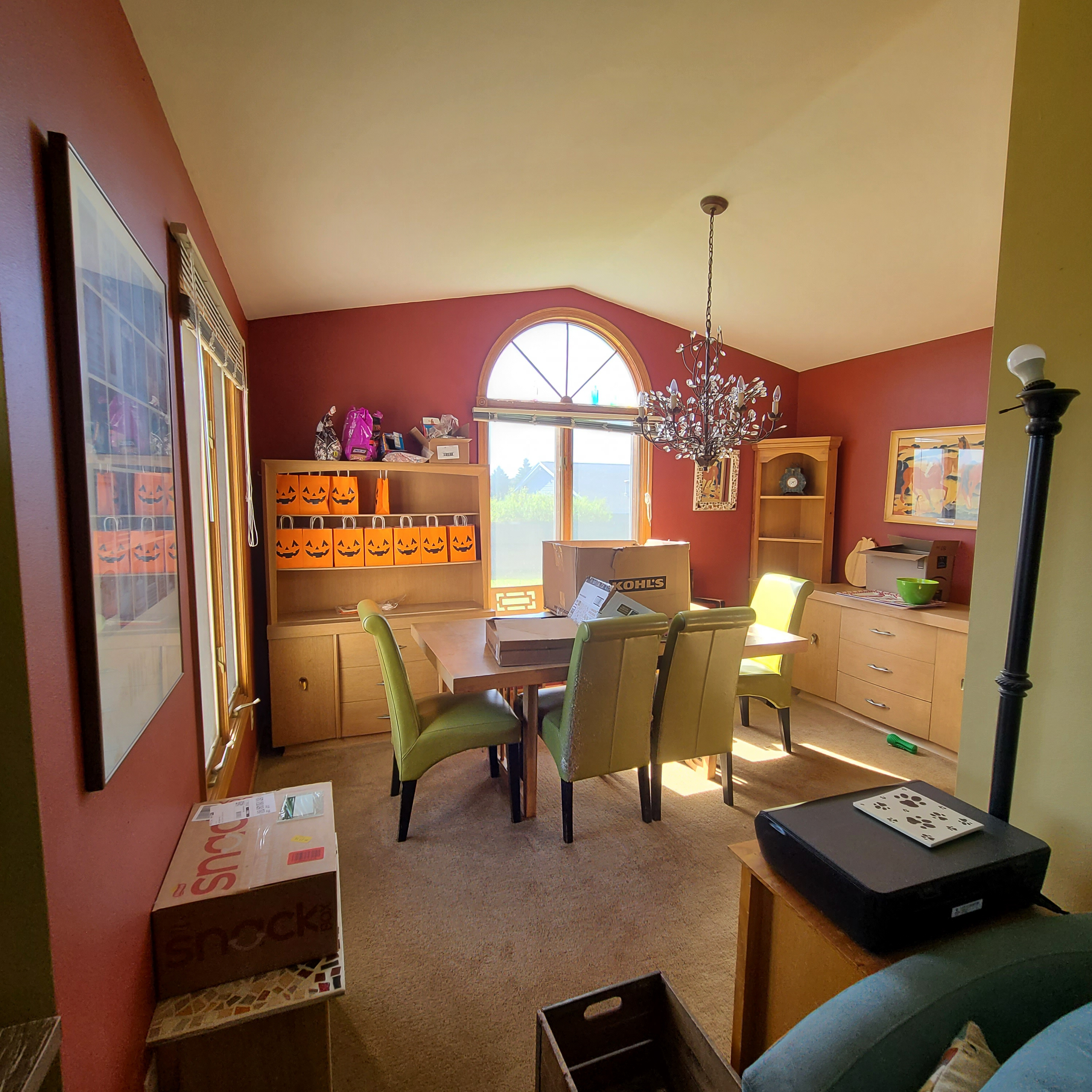
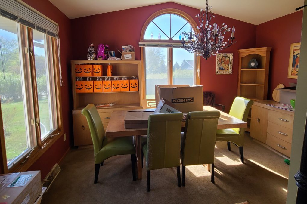
The existing furniture pieces felt out of context and sort of randomly placed.
The style/ color of the dining set wasn’t working and the different wood tones did not coordinate meaningfully.
The focal points of the room were unclear.
The windows felt both overly prominent and naked, somehow.
The carpet had seen better days and, as mentioned in previous posts, is not ideal for pet houses like this one.
The Plan
The Solutions:
I sourced furniture that is more tied together without “matching”.
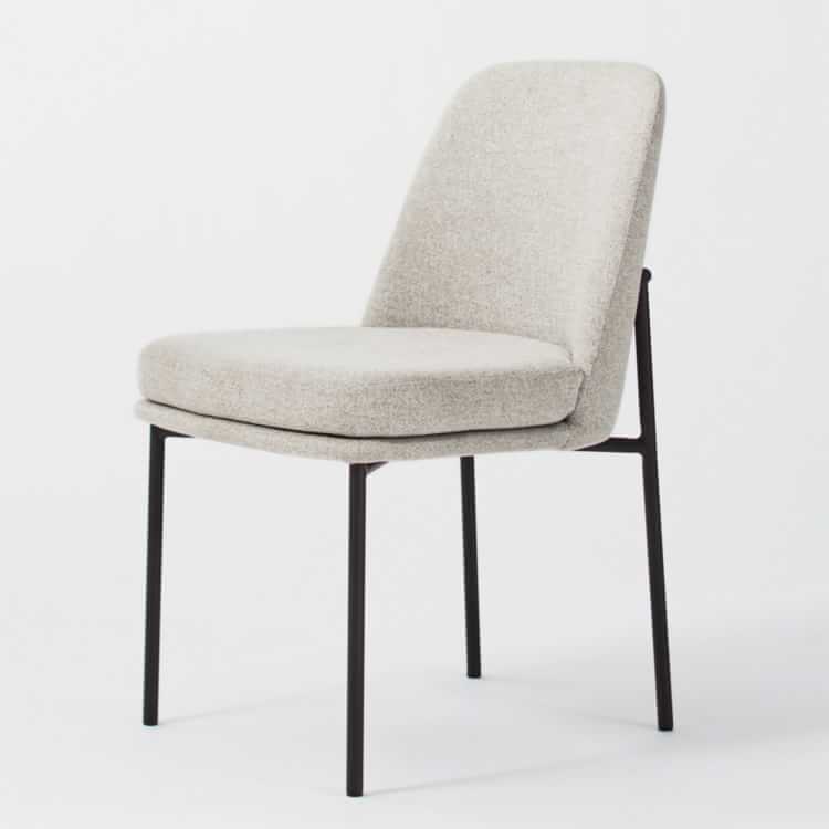
I sourced sturdy and neutral chairs with less chewable 🙂 metal legs.
I focused on varying materials and wood tones a bit more.
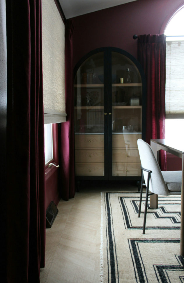
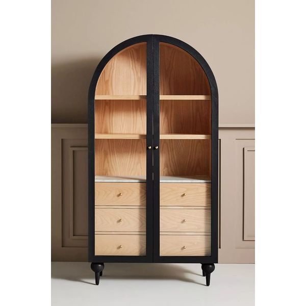
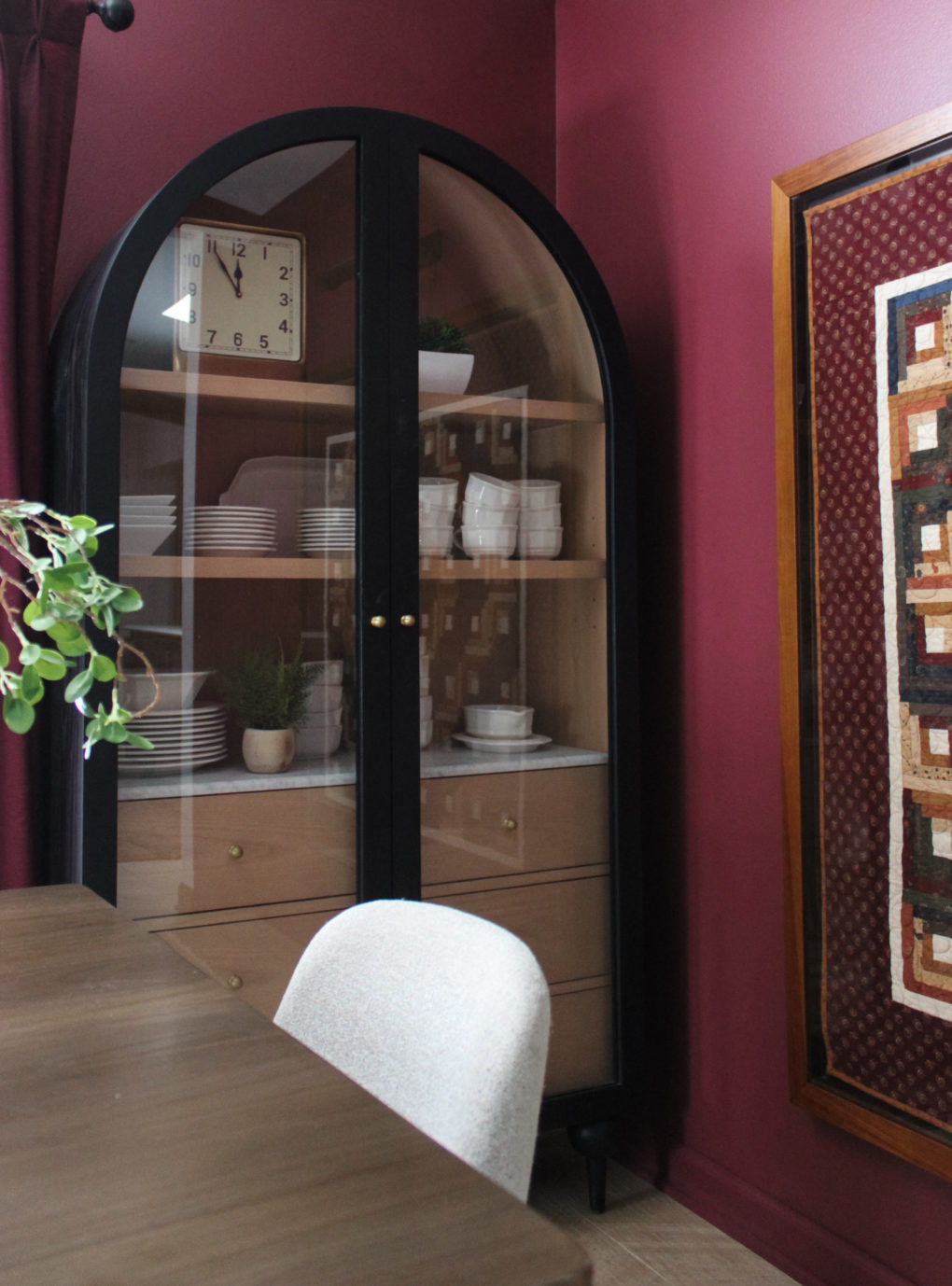
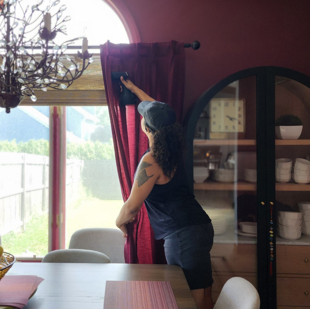
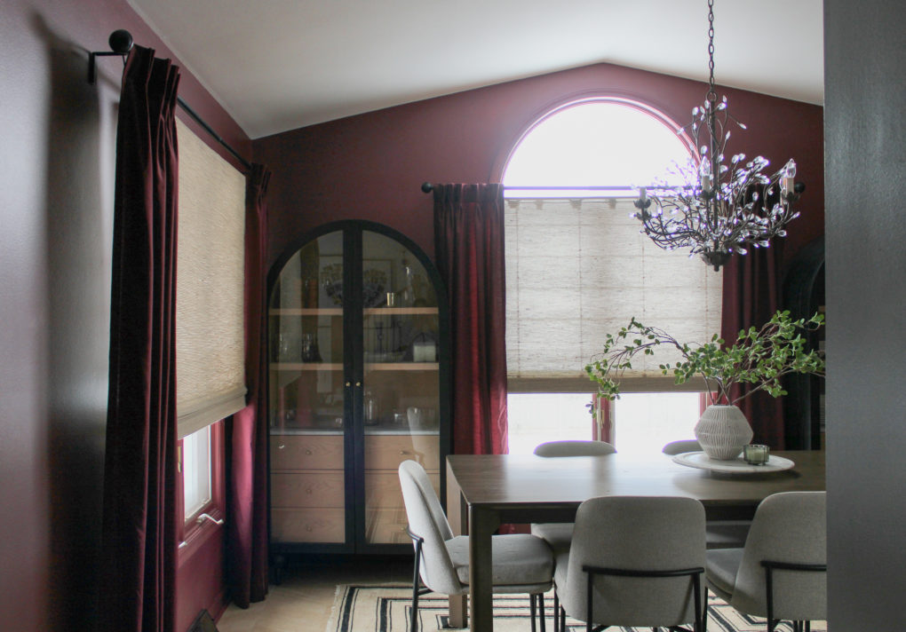
I sourced two arched cabinets to flank the arched window. This created symmetry and balance while contextualizing the only curved line in the room, which was the window. You’ll note the curved shape that repeats throughout the house, noticeably in the scalloped kitchen hood, the circular iron balusters, and the entryway mirror. Varying lines can go a long way in adding interest. Too many right angles will feel rigid even if you don’t know why.
We painted the window trim and base in the wall color for a more updated and elegant look. It was the one room in which I decided not to let the oak trim ride because it feels just a little bit more formal to me.
I added woven shades to maintain a natural element but then paired them with a few pleated curtain panels to finish the look. These specific shades are cordless and have a liner that is controlled separately.
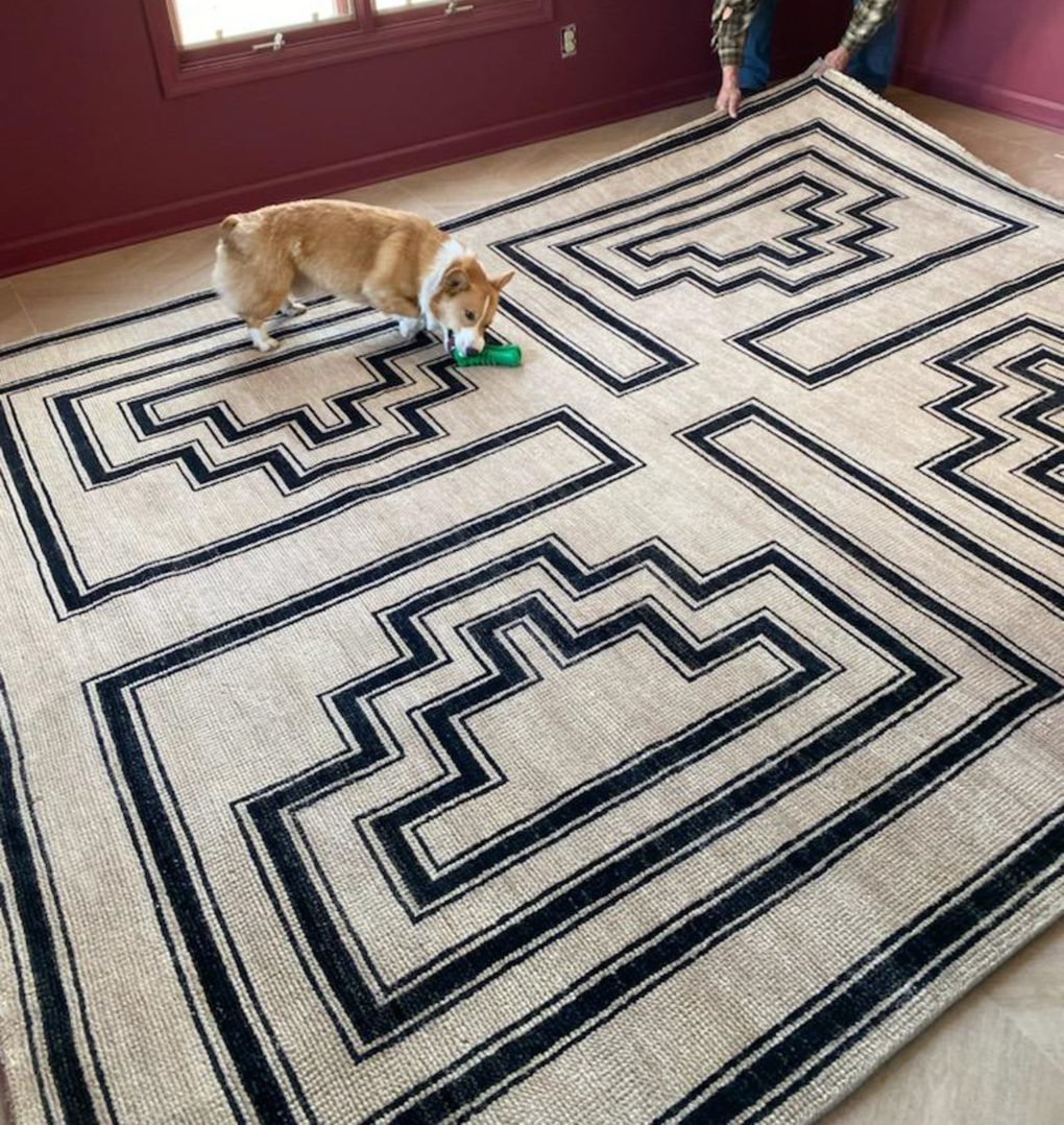
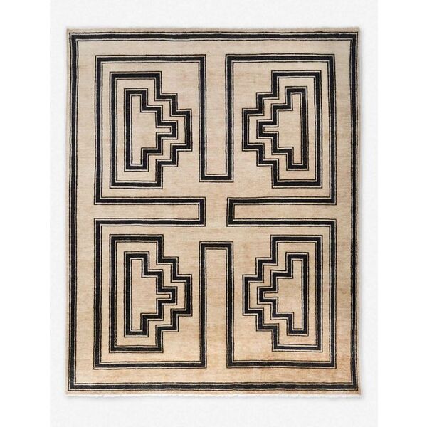
The maple-look porcelain flooring used throughout the project was extended here and I sourced a neutral but high-contrast patterned area rug that helps emphasize the room’s personality.
A Few Faves:
The Results:
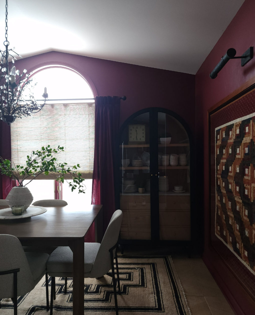
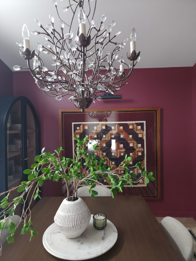
The space now feels cohesive and dramatic and stands out from several vantage points in the house, naturally drawing visitors into what should be a comfortable and pleasant hub for eating and entertaining.
Shout out to John and the team at J Edwards Renovations, Brad and Carol at Photographic Design and Framing, and of course the Jensen family for your trust.