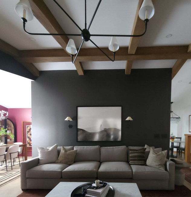
I had a vision right away for this Living Room. I saw great potential in what was there. Not just in what could be changed, but in what could be revealed. So much about transformation is about revelation. The ceilings were high. The open flow between adjoining rooms was an opportunity for interplay. And it was the room you spilled right into coming from the front door or garage, which meant it would set the tone and feeling for the house. I knew I wanted it to be a little serious and more grown-up than it was, but still comfortable and unstuffy. My bright idea to set the tone I was going for was to go dark! I knew it would be striking and that the room got enough light and was big enough to carry it off. But I also knew that the lighter floor and furniture would offset the visual weight. The other project in the space was the staircase leading to the second floor. It was sturdy and in good shape but it was dated and a little underwhelming. I knew I wanted it to be more striking and slightly more modern and I wanted to pare down the photo gallery, which was reading as messy with all the little frames.
So let’s talk about how it went down.
THE PROBLEMS
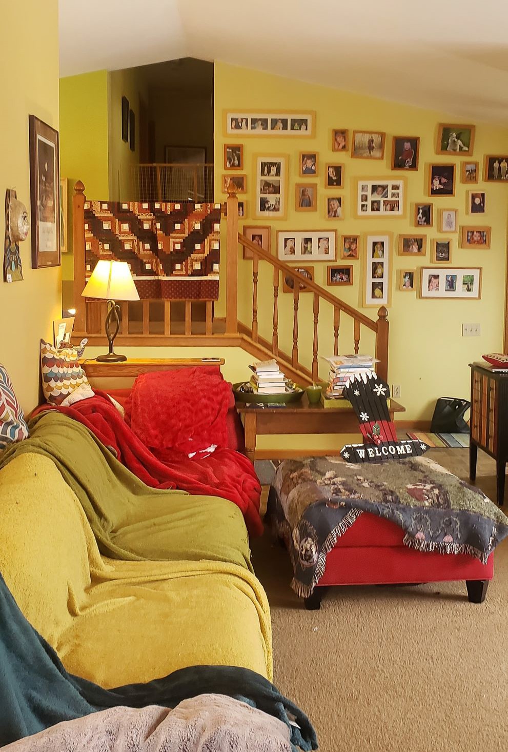
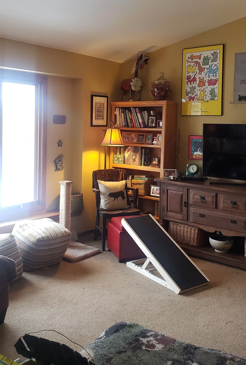
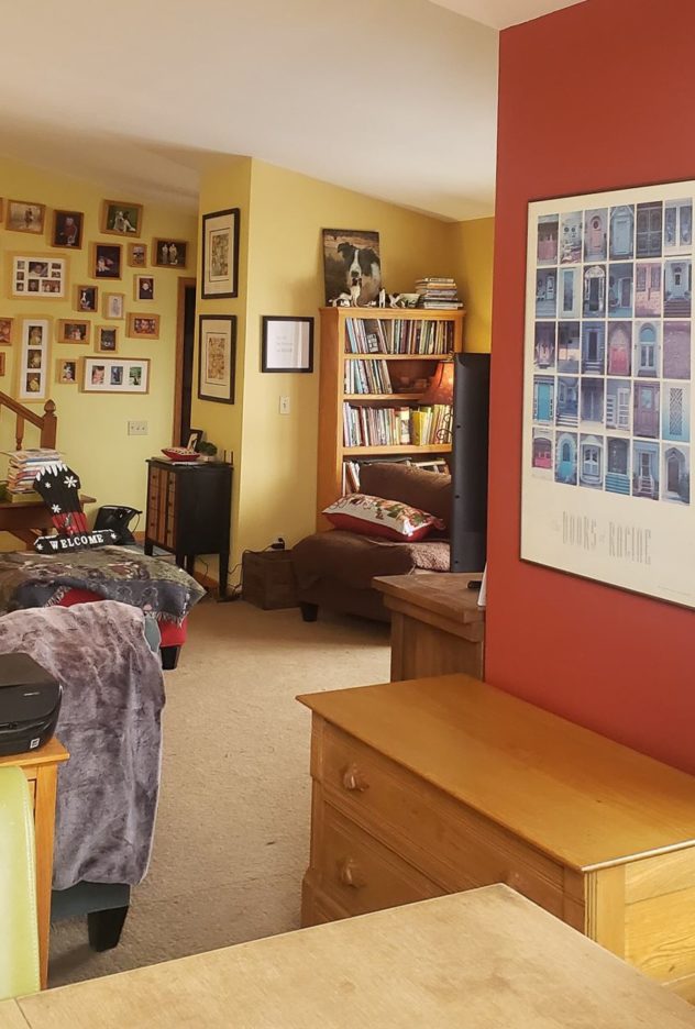
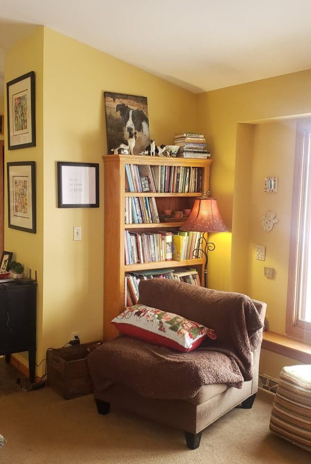
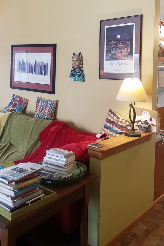
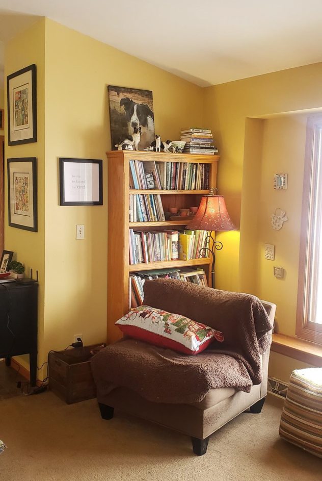
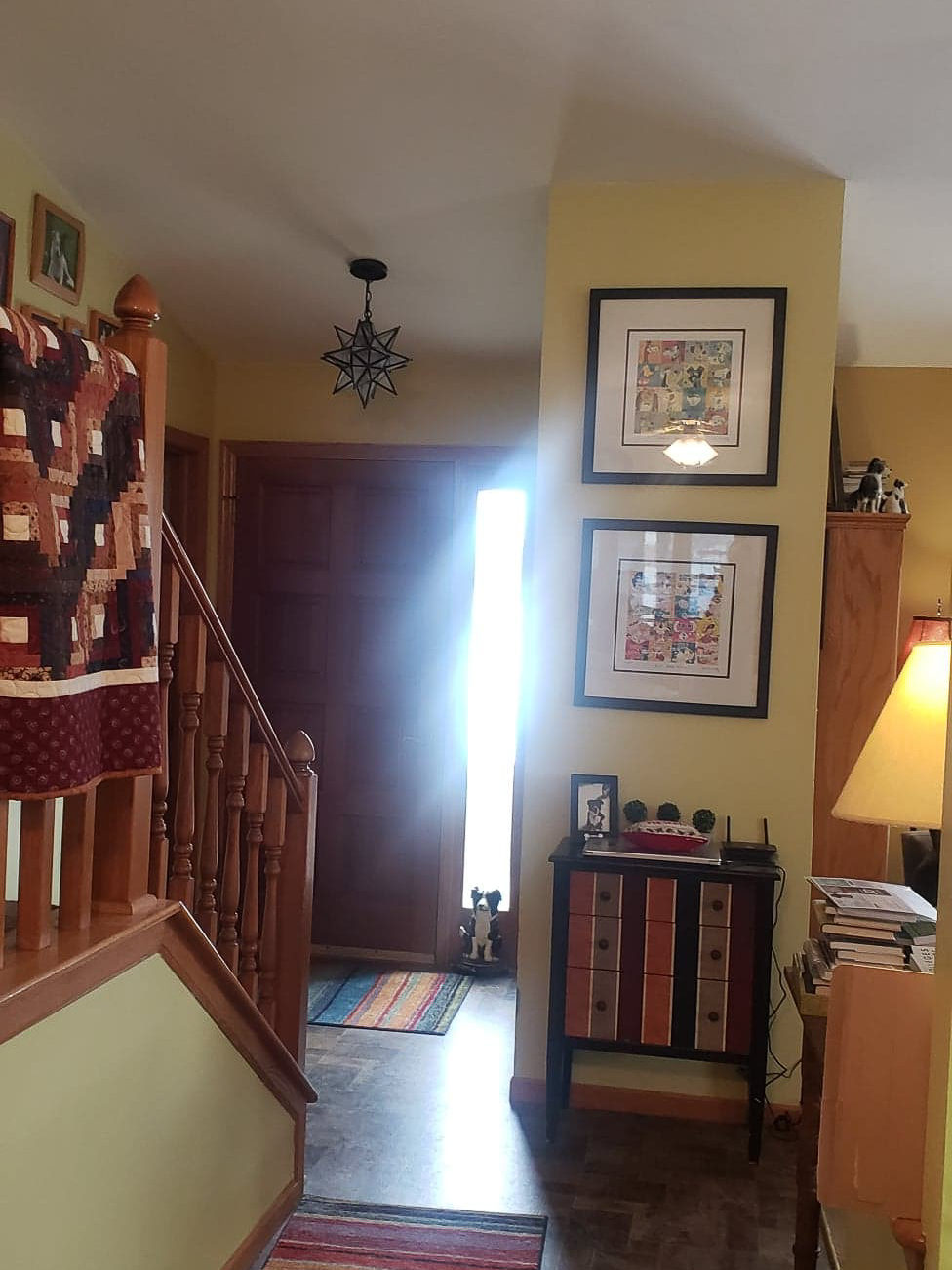
Insufficient lighting (lamps in every corner) added to the clutter
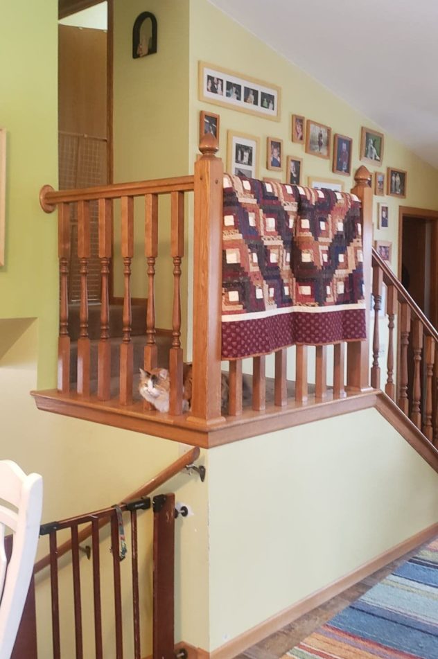
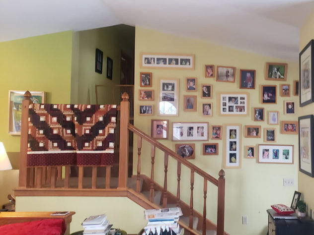
Clutter: lack of closed storage, too many individual photo frames, too many small art prints (remember that negative space on walls is important too!)
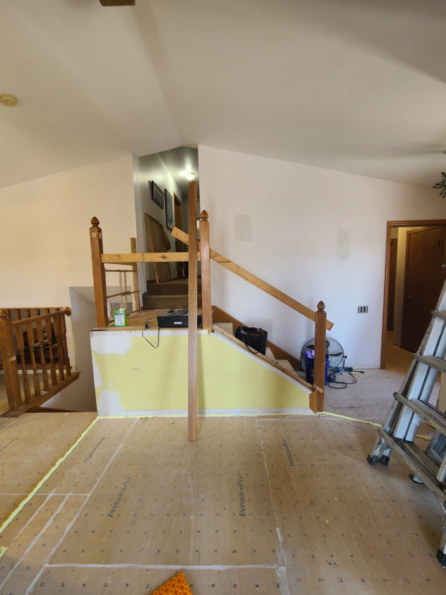
The furniture layout felt obtrusive between rooms and there was an unnecessary pony wall.
The yellow paint shade on the walls was not terrible but did not complement the oak trim or existing flooring. It’s all about context.
Lack of contrast. Everything was just sort of warm and medium-toned.
Lack of focus. There weren’t enough visual cues to draw the eye to any particular areas.
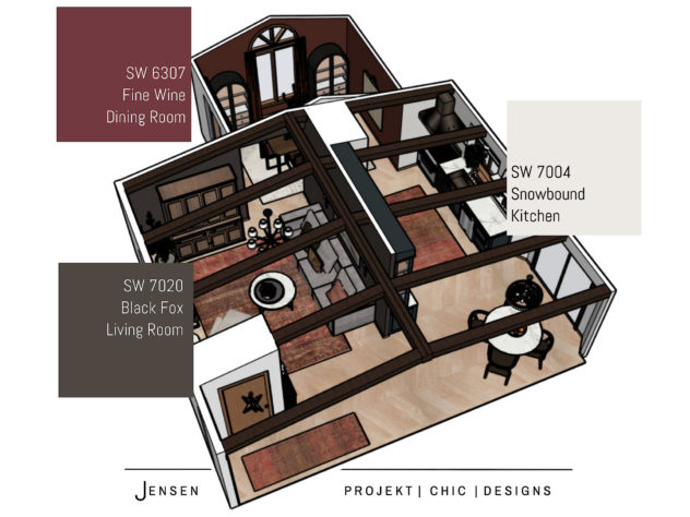
THE PLAN
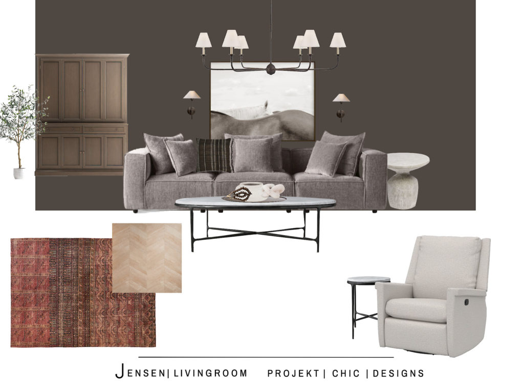
THE SOLUTIONS
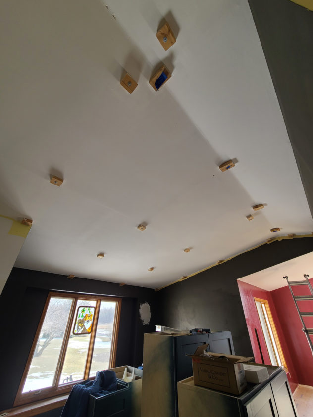
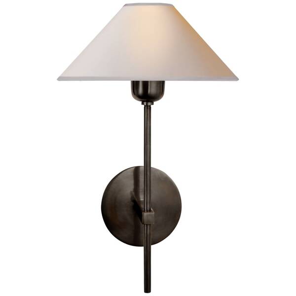
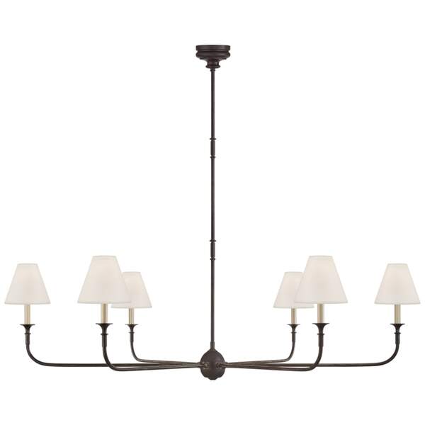
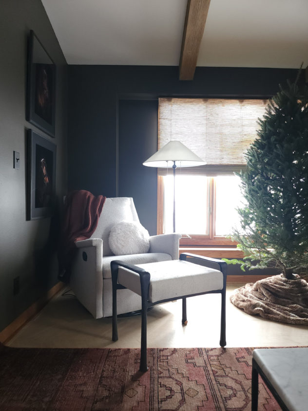
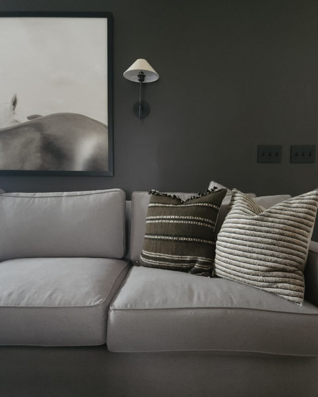
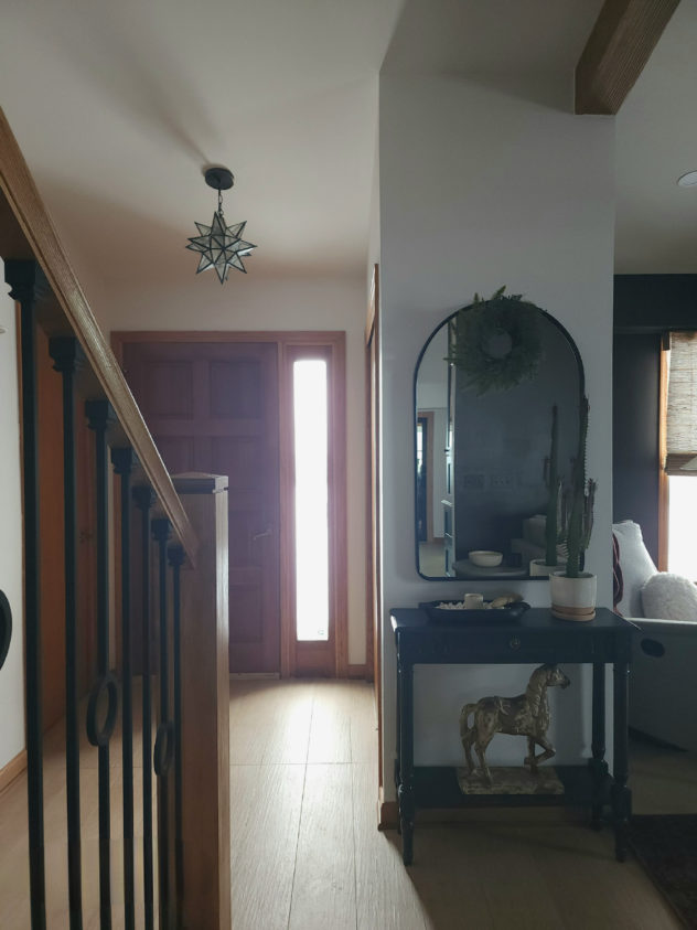
Added LED recessed downlighting, wall sconces, and a dimmable chandelier. You want versatility when possible. The client thought it might be overkill but now she loves the options!
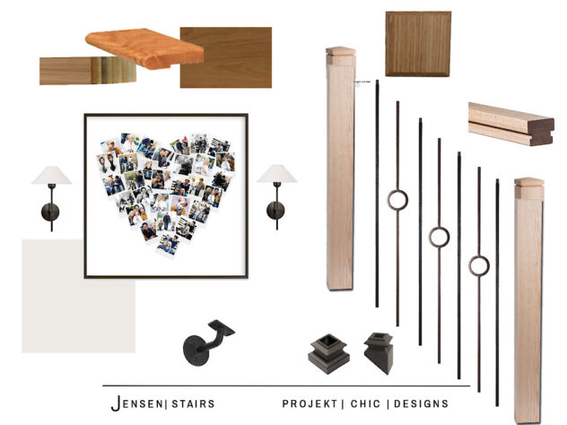
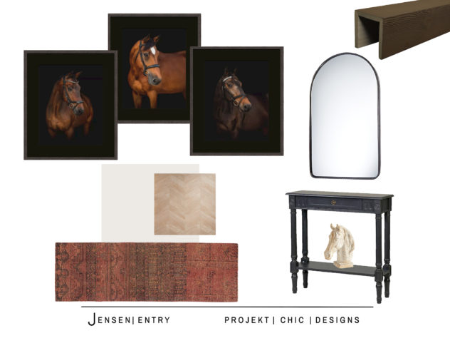
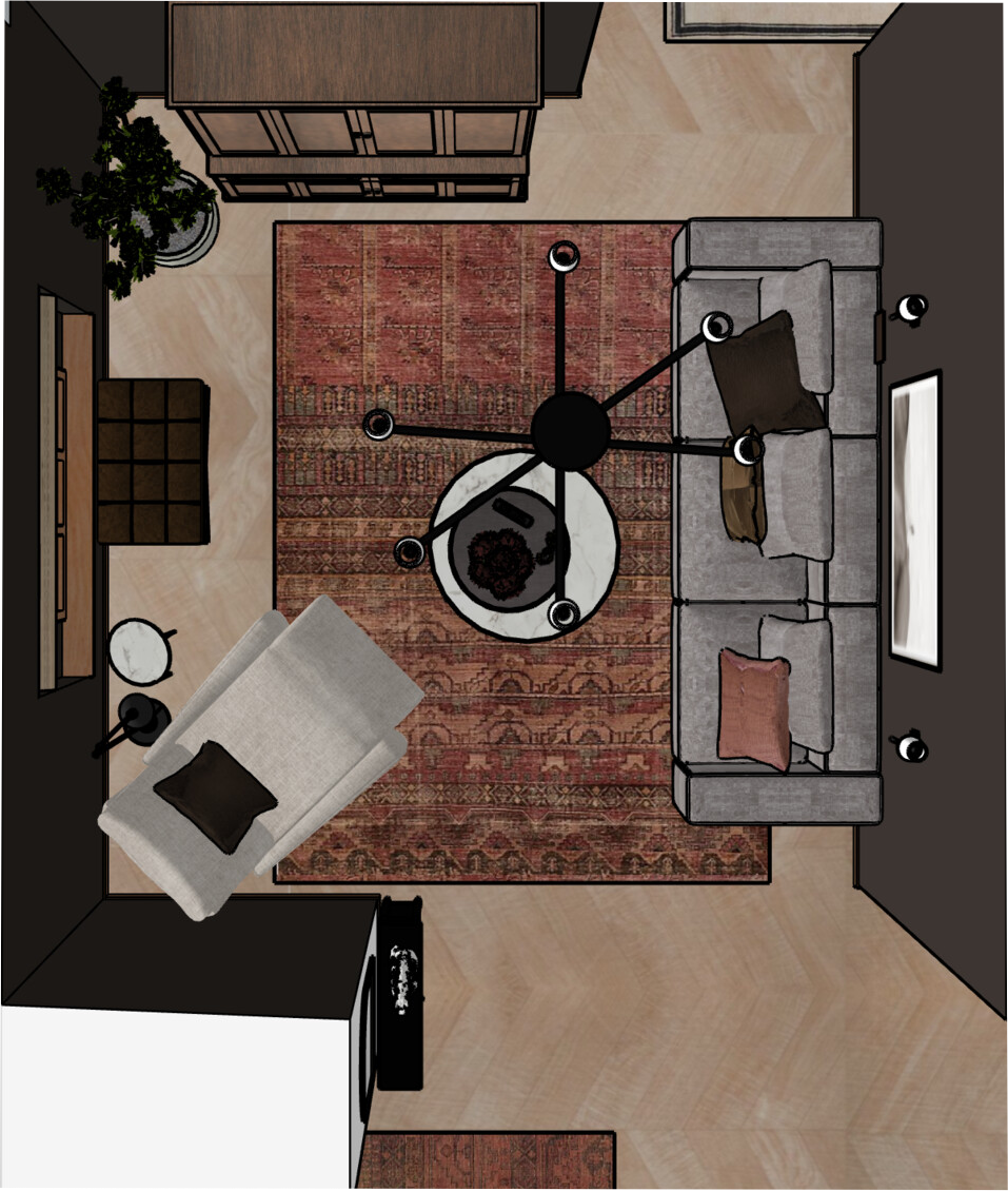
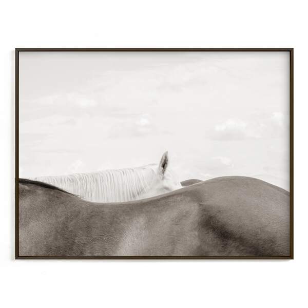
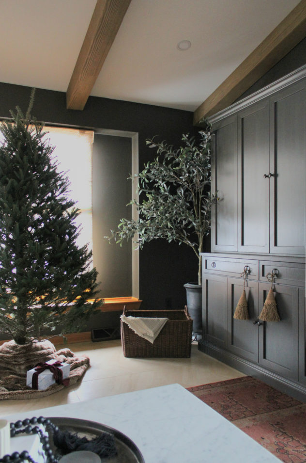
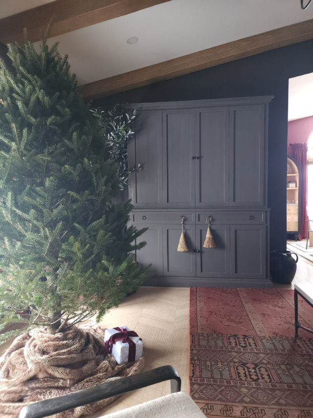
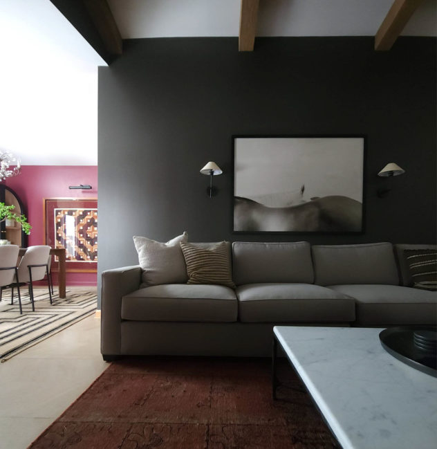
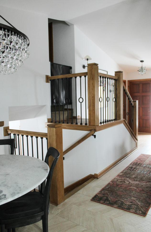
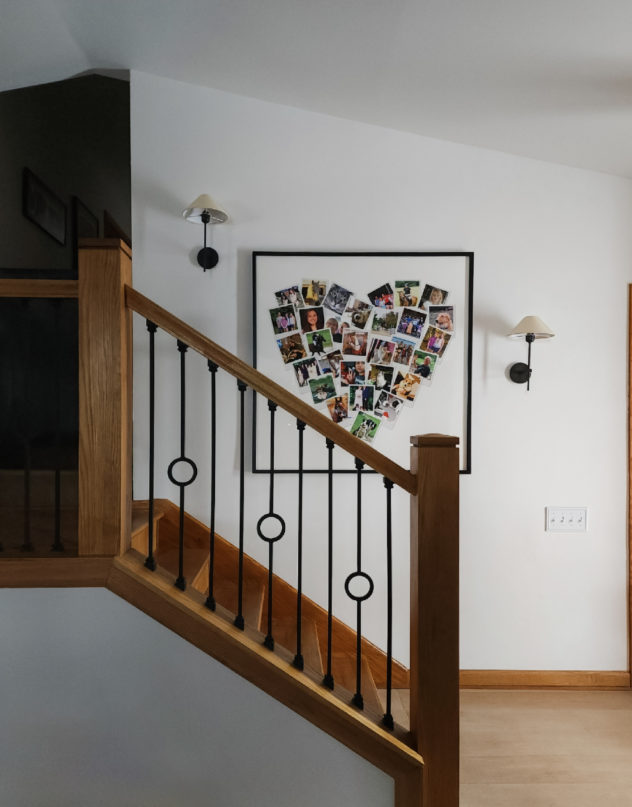
We used a cabinet to hide the tv and store books and other items in a streamlined way. We got rid of all the little framed wall art and went really big with a print over the sofa and a photo collage on the staircase wall. It’s important to consider the scale of the room when selecting furniture and art. A print or sofa that would look ridiculous and overwhelming in one context will be reasonable in another. In this case the tall ceilings and open concept lend to larger scale selections.
We ditched the pony wall, simplified the seating and added one large coffee table to bridge the two sides of the room. It’s big enough to be at home in the space but still allows for easy flow through the room.
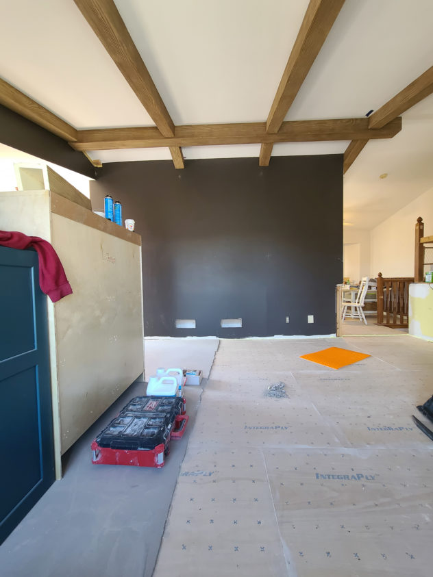
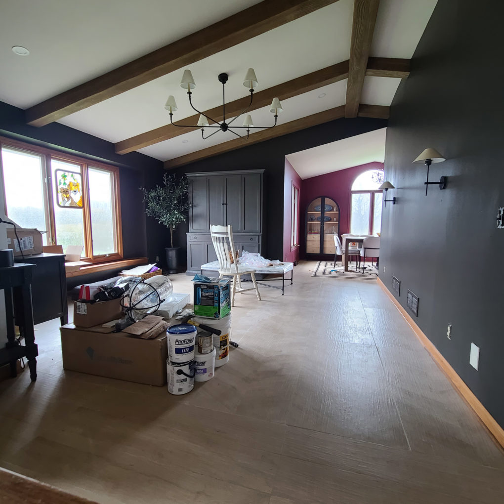
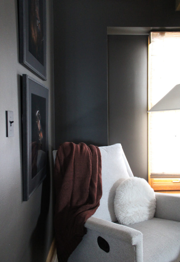
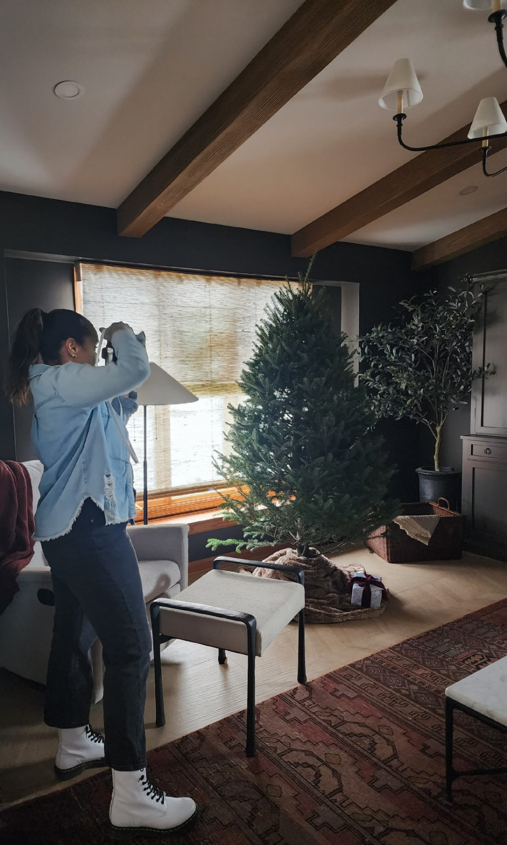
The wall color is called Black Fox (SW 7020) and is a perfect dark luxurious amalgamation of black, brown and gray. It appears to be all three colors throughout the day.
It gave me the contrast I was looking for between the bright ceiling, the lighter maple colored flooring and the oak trim.
I also added faux wood beams to break up the ceiling a little bit and add visual interest and warmth to an otherwise flat and uninteresting view.
The black iron balusters on the stairway also added some shape and contrast and makes that side of the space more balanced and more of a feature.
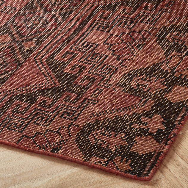
The rug was important because it added some color and it also clearly drew the eye, creating one of a few main focal points, the large shaded chandelier being another.
A FEW FAVES


THE RESULTS

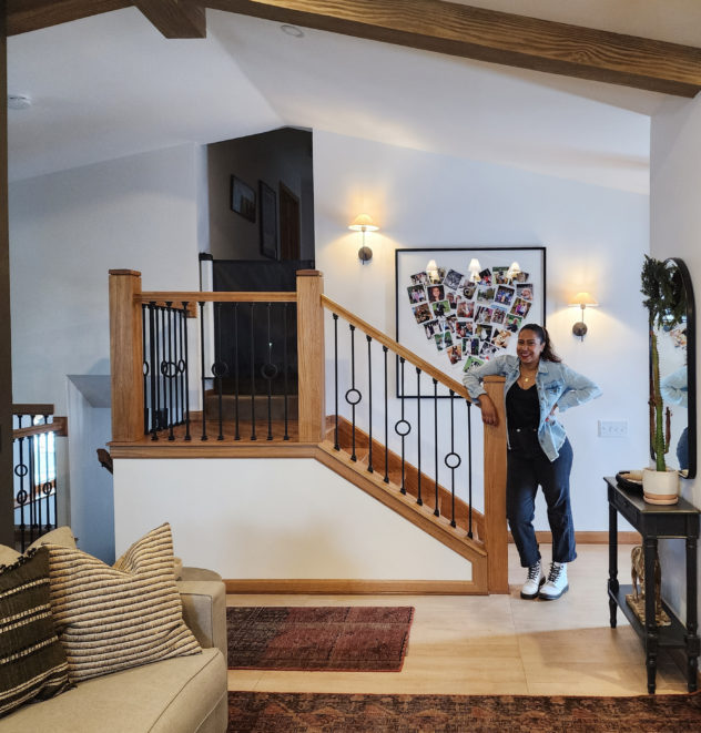
Overall I think the space was made more sophisticated and more intentional. I’m thrilled with how it charts a path for the rest of the projekt.
…And in the spirit of revealing the great things about our own spaces, tell me in the comments one thing about your house that you would never change even if you could renovate top to bottom! Mine is my uneven plaster walls, cracks and all. They insulate so well and I actually like that they are not perfect. It takes the pressure off keeping them that way and the hint at the age of the home like fine lines and wrinkles.
As always, my deepest gratitude for following along and thanks again to J Edwards Renovations.
This is a striking transformation, Angela. Brava!