
It can be tempting to walk into a space and see what’s yelling the loudest at you. But let me tell you what made it to my notes on day one of this kitchen projekt.
Color.
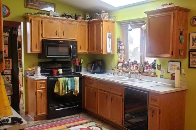
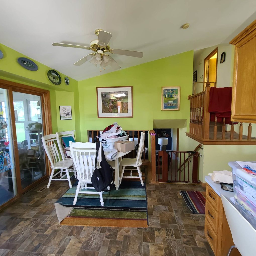
Even though I don’t think the shade of bright green was working, it was a really good sign that the client was extremely open to color and that is rarer than you’d think. The second I walked in, I sighed in relief that I would not be designing an all-white kitchen. Halleluiah!
The other thing I noticed was the oak trim everywhere. We had on our hands a classic Midwestern-to-oak or not-to-oak dilemma. We all know it has become popular to paint it all white in the last few decades. I’m not against that in some homes but allow me to rant for a minute to about how everything ain’t for every home.
Some good questions to ask oneself when trying to determine if a certain trend or application or update is a good fit would be:
Does it fit with the era of the home?
Will it be the best choice in the overall context given the other choices you’ve made/ will make?
Is it practical from a maintenance/ cleaning standpoint for your life (I’m looking at you, open shelving instead of wall cabinets)?
Of course, there are no actual rules. As always, do you. But I do think sometimes people struggle with why certain things don’t seem to be working in their spaces as they did in that inspo pic. You can put that barn door on the bathroom of your MCM ranch. Nobody is going to stop you. But there is a fine line between eclectic and chaotic and I do believe we all feel it. And in the case of that barn door…hear it 😉
In this projekt, however, the choice was pretty clear. Between the early 2000s construction, the extent of the oak throughout, the warm easygoing outdoorsy vibe I was picking up from the family’s lifestyle, and then… you know, the Jumanji of it all (See my previous posts on this projeket for a recap on the creatures of The Caledonia House) we were sticking with the oak and we were just going to focus on freshening it up a bit within the context of the overall design. One last thing I noted was that there were a lot of items displayed wherever they could find a spot. Christmas villages and knickknacks and figures. I noted these things as well as the client’s storage/ counter space concerns so that the new kitchen would function for the family as they actually lived.

It’s funny. In my personal life, people always make self-conscious comments when I’m at their houses because of what I do. They think I’m going to judge their spaces. But honestly, judgment is completely useless in this work. The questions that arise before a transformation are never “how could they?” or “why would they?” The way people live in their spaces is what works best for their lives and sometimes their spaces aren’t set up optimally. Often, their life isn’t wrong, their space just isn’t adaptive enough. If there is laundry on the kitchen table, maybe they need a designated area to fold. If the carpet is worn and dirty, maybe a flooring that doesn’t require professional cleaning is more suitable. If a space is cluttered, there probably isn’t enough storage. It’s all just problem-solving. And there are real-life reasonable limitations to folks’ access to solving those problems, especially in the long list of priorities we all have. So everybody just breathe and let the judgment go. We don’t need it.
I want my projekts to serve as templates for how to problem solve, not just add to the many ways we find to compare ourselves and our lives to others.
In the Jensen kitchen, the problems were minor and mostly cosmetic, and the potential was exciting! Sloped ceilings, good sunlight, spacious, and a client that was adventurous and open to color and suggestions?!
Here’s how it all went down:
The Problems
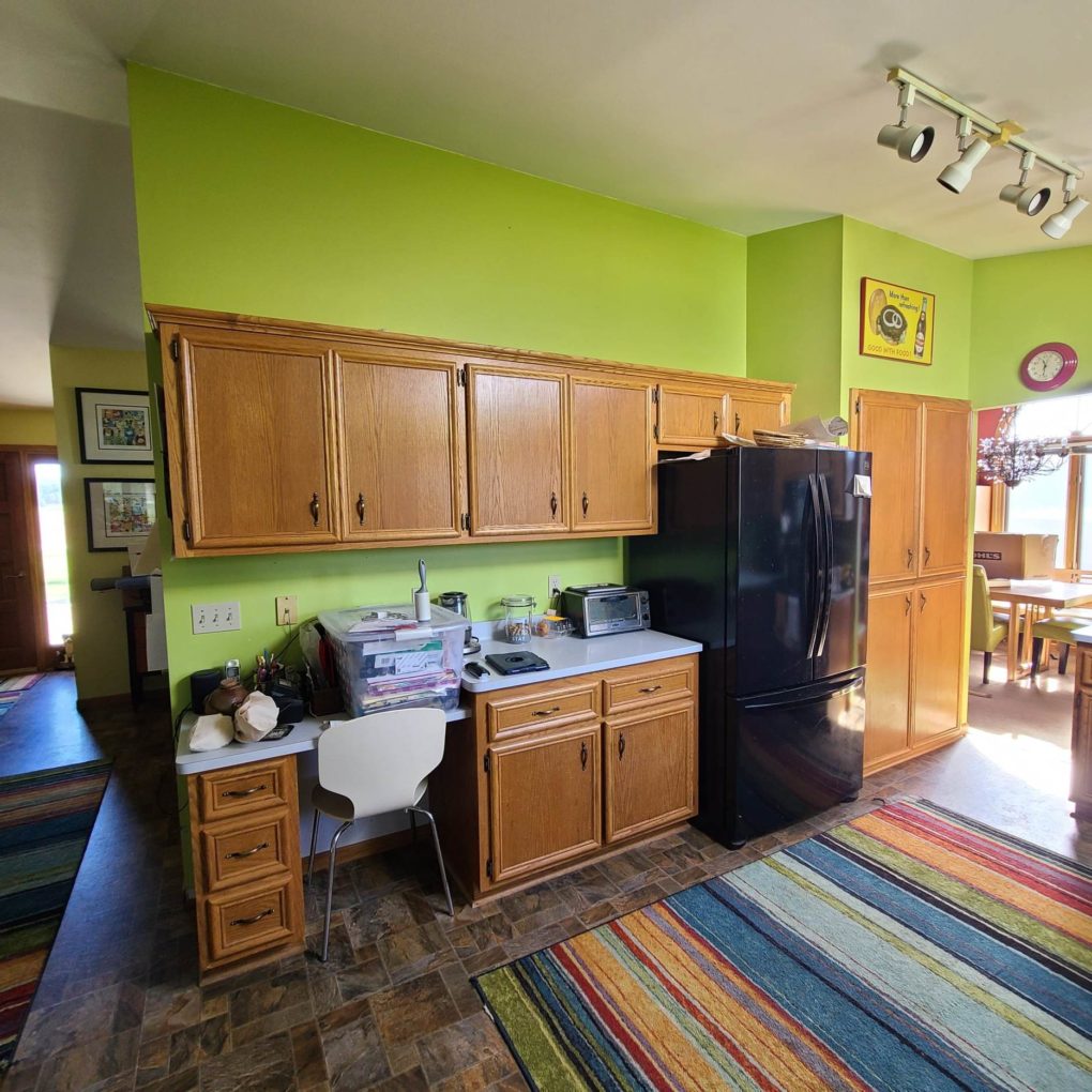
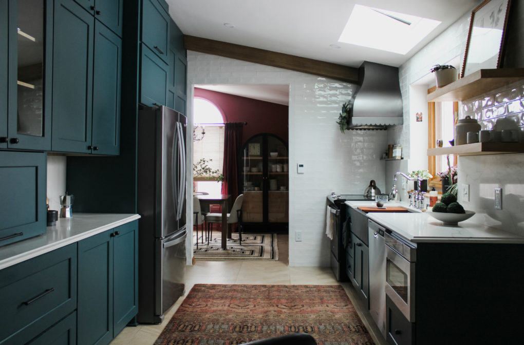
The color was bold but not balanced. It didn’t complement the oak trim and it cut off the walls, minimizing the effect of the sloped ceiling.
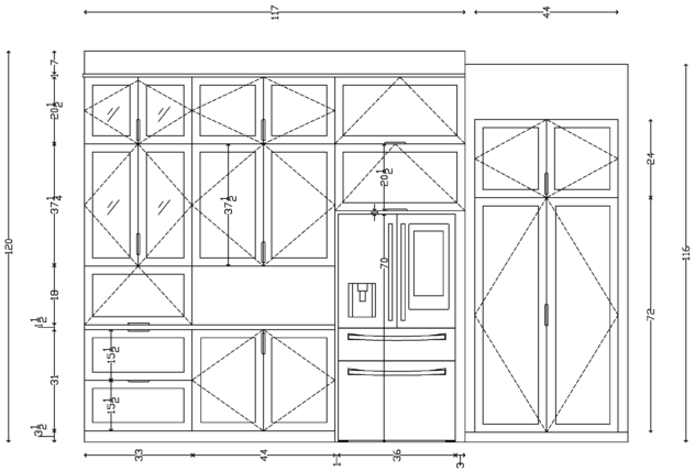
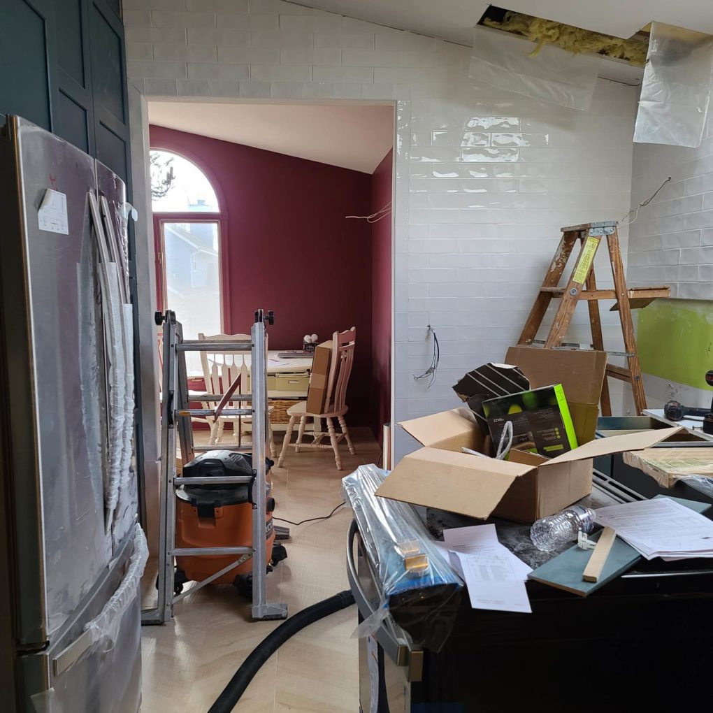
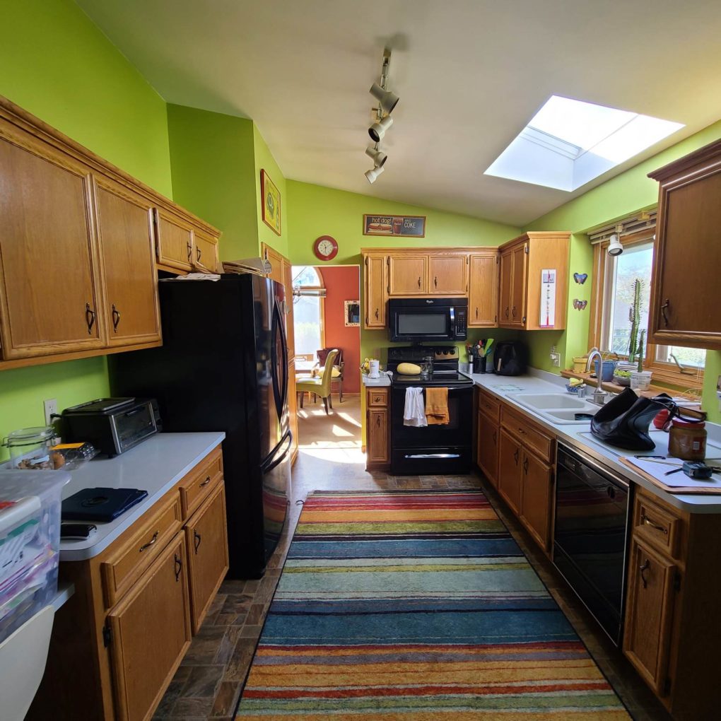
The oak cabinets were dated and there was wasted storage space above them. And one of those kitchen desks that hardly anybody actually uses.
The stove position was not the most comfortable with your back to the room and only a microwave to look at.
The black appliances stood out too much, something you generally only want if they are especially beautiful.
Limited counter space
How to incorporate some warmth from wood that is often so lacking in modern kitchens, but in a more balanced way
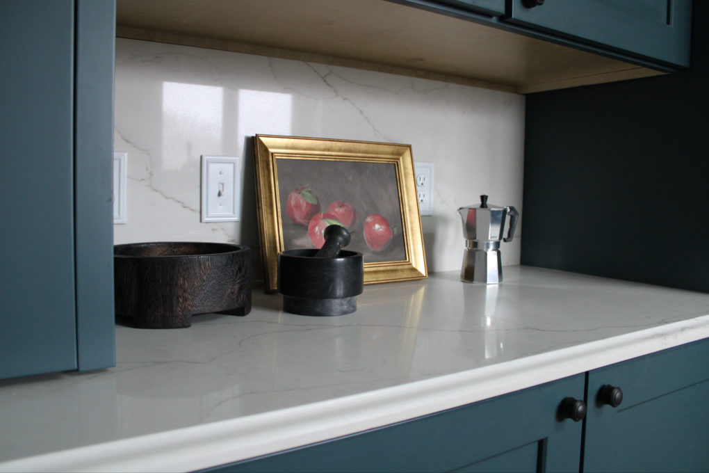
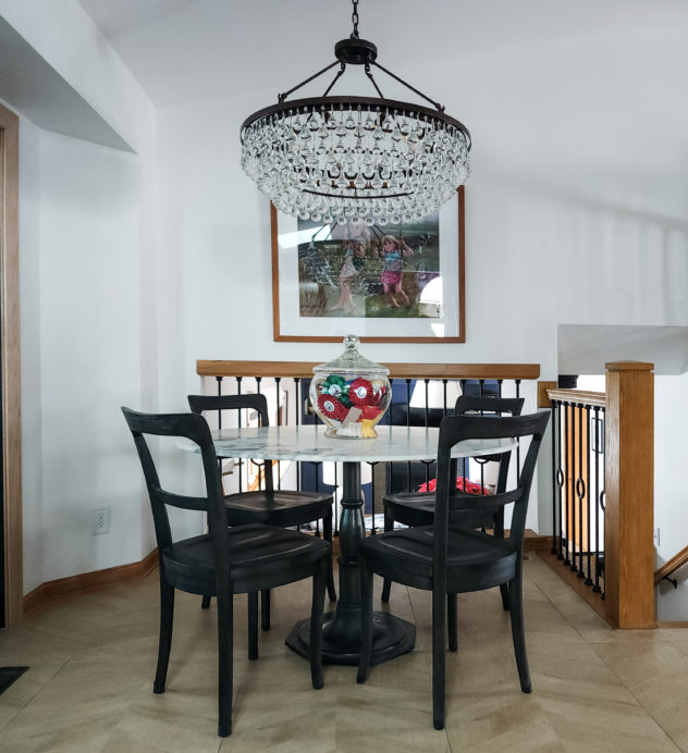
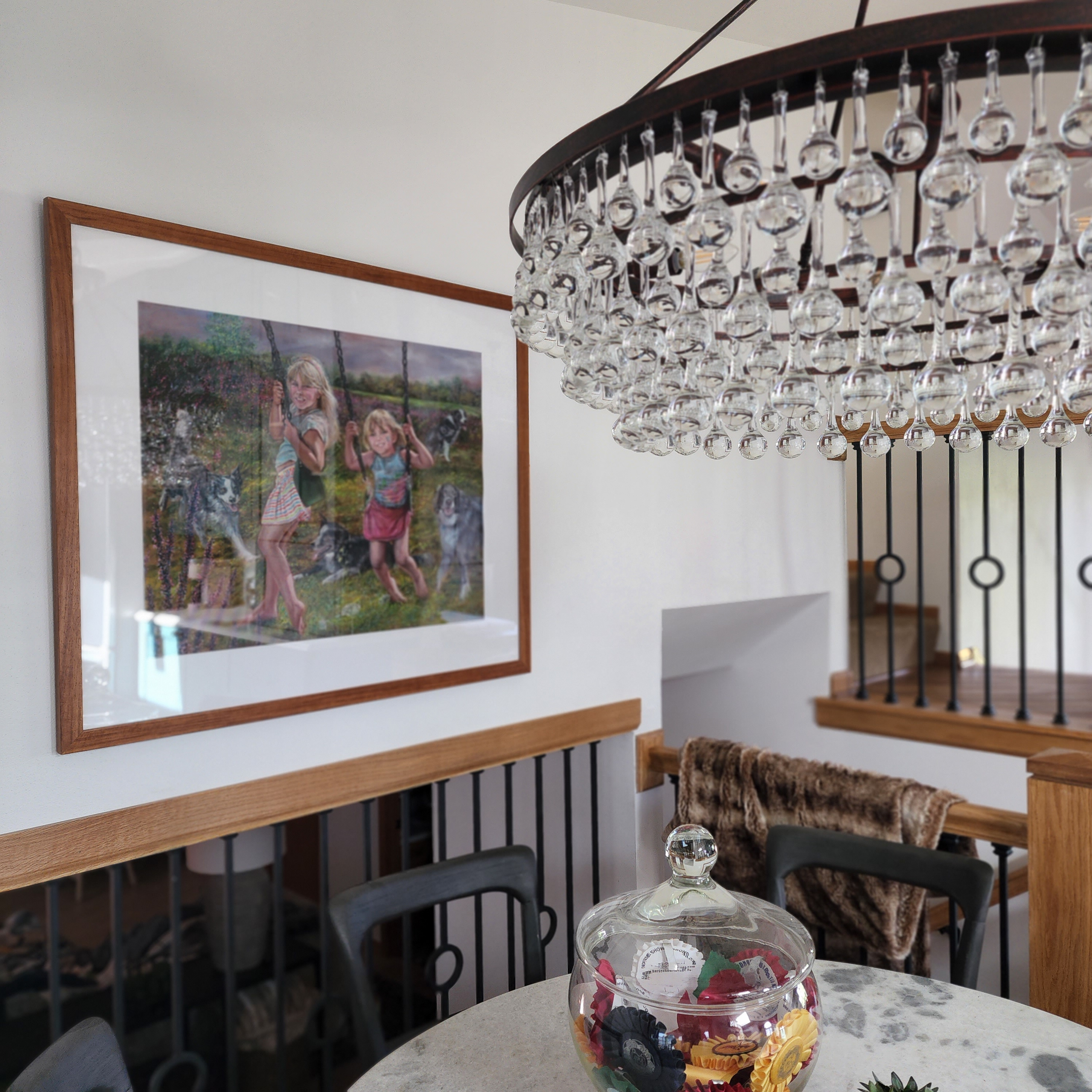
How to create opportunities for display more intentionally
The Plan


The Solutions:
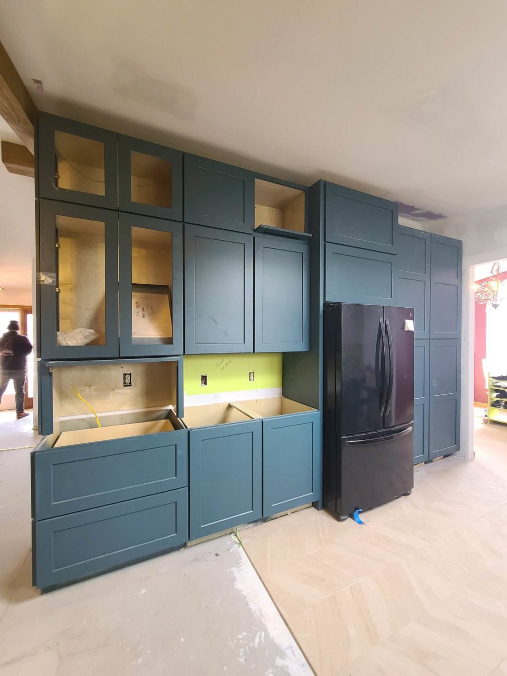
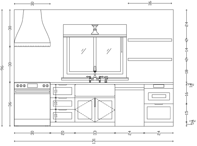
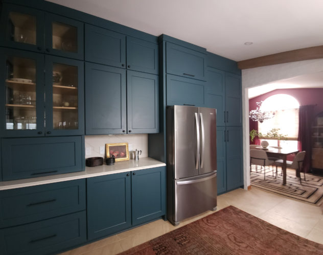
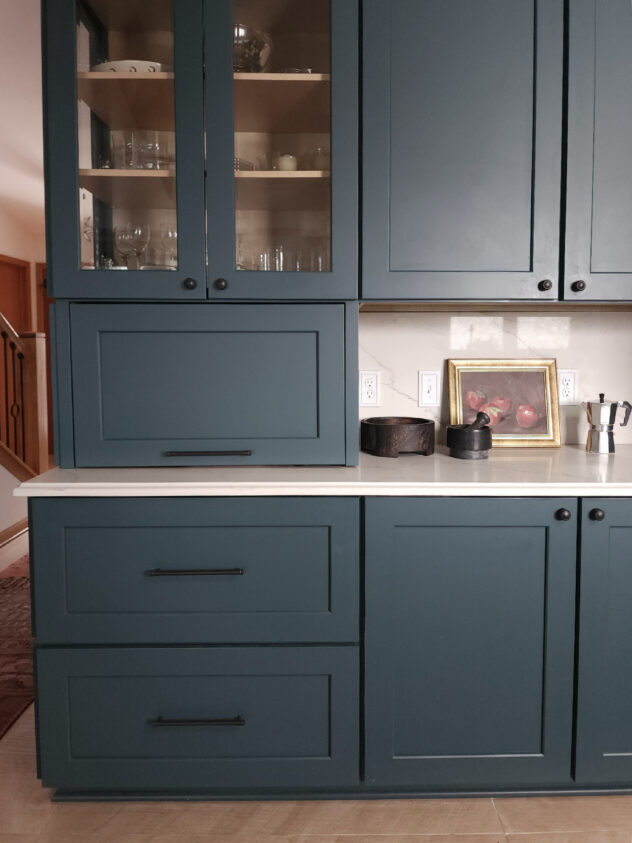
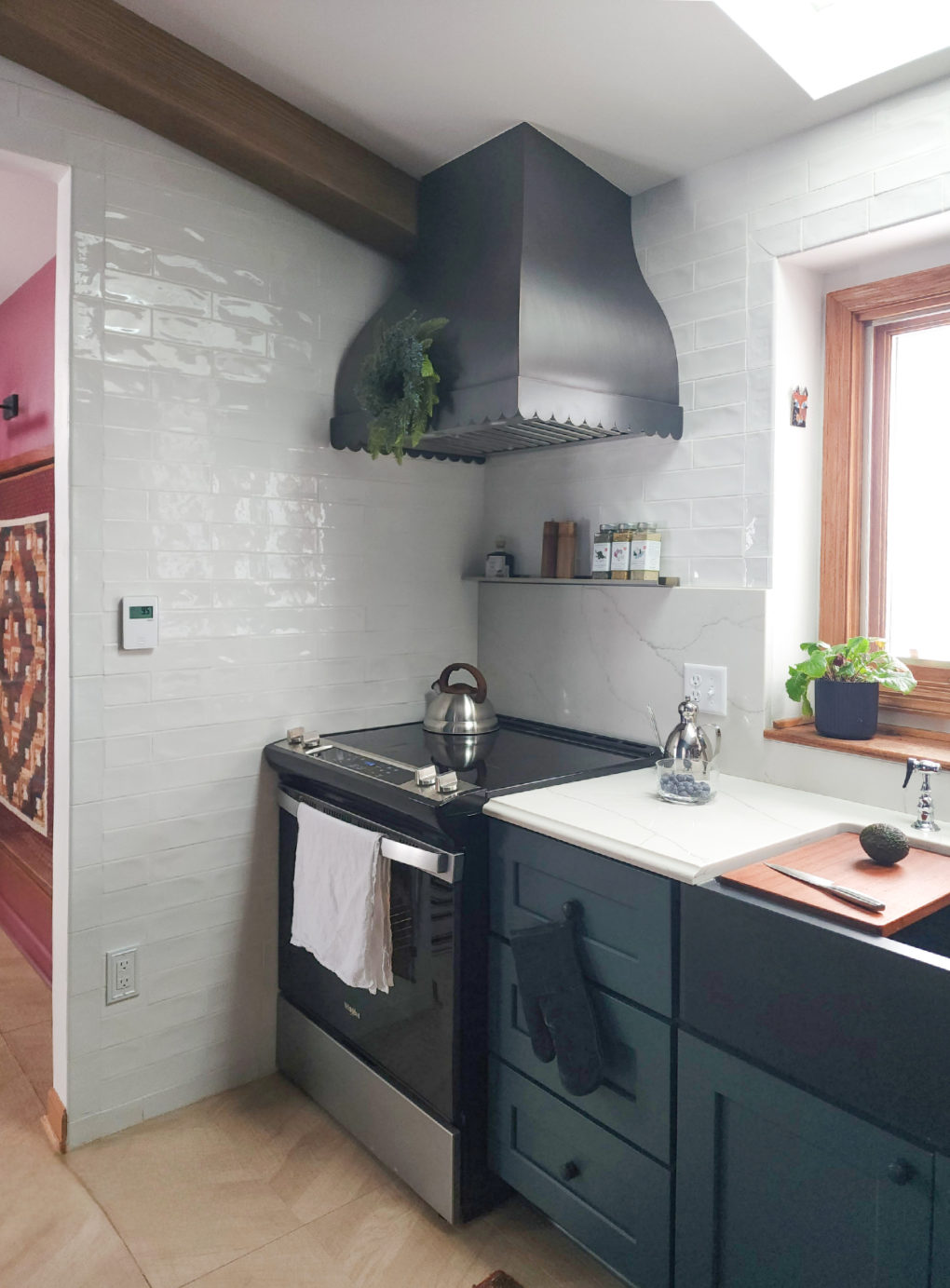
I chose a vibrant deeper toned green color that wouldn’t compete against the oak and I took the cabinets to the ceiling, gaining a row of storage, including in the pantry. The pantry was updated with pull out shelves.
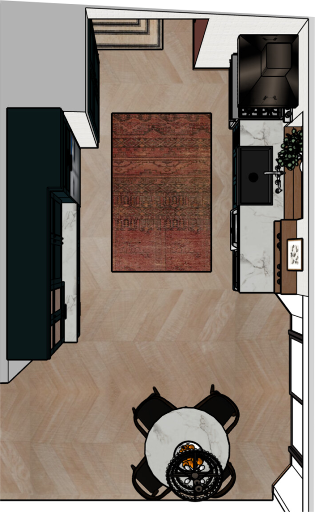
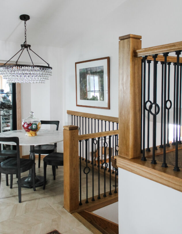
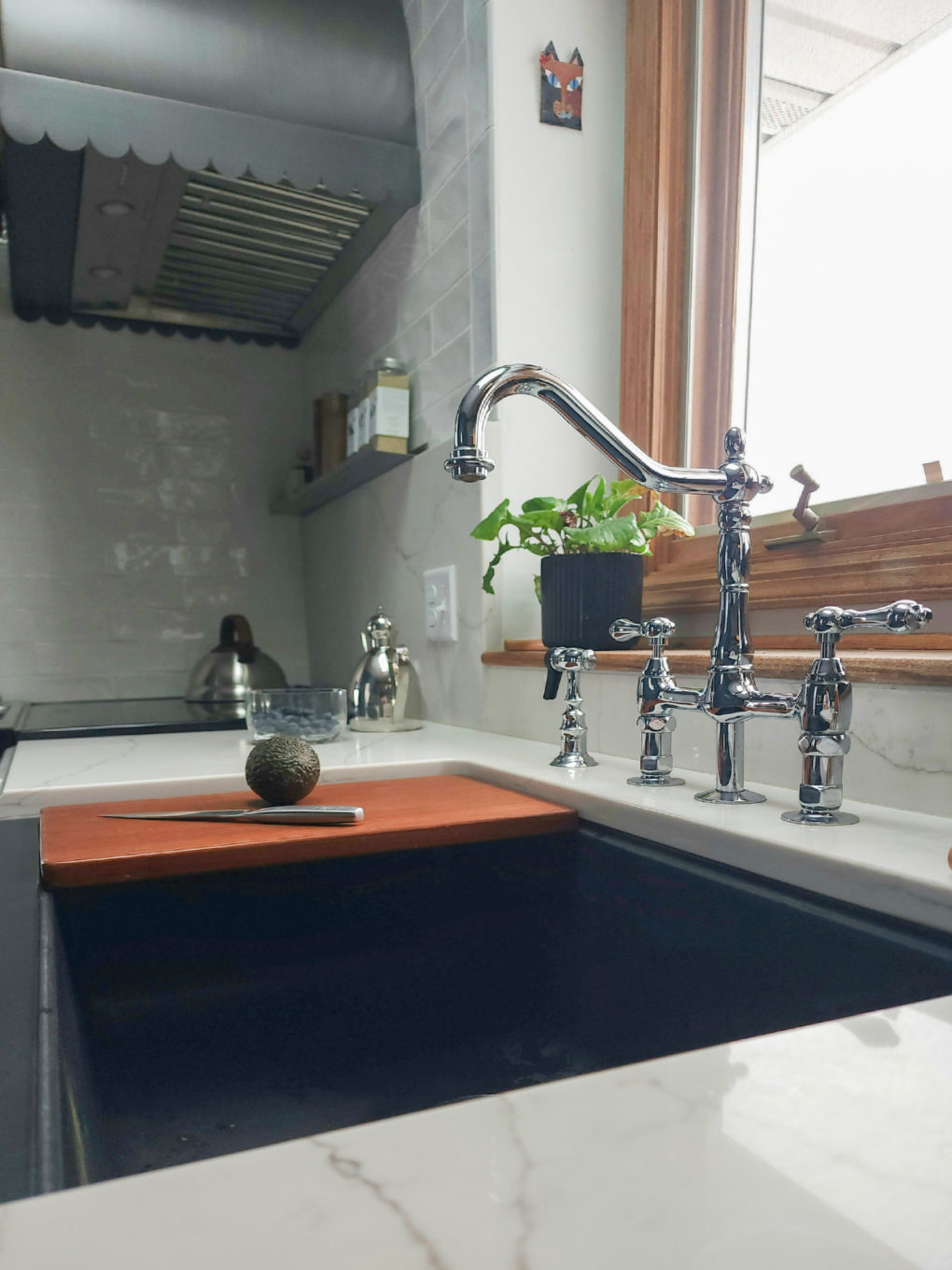
We changed the layout to a galley style so that the stove work area would have a view out of the window and we widened the doorway to the Dining Room to open things up a bit. We did lose a few wall cabinets in that corner, although the box above the range housed the microwave vent so those were not functional and between the open shelving, extending the base cabinets further towards the patio door a few inches, and the new upper row on the adjacent wall we more than made up for those few that we lost.
New stainless appliances, switched to counter depth for the fridge, and client opted for a microwave drawer which is a bit more discreet than an under cabinet or countertop unit.
Added a flip-up garage for small appliances.
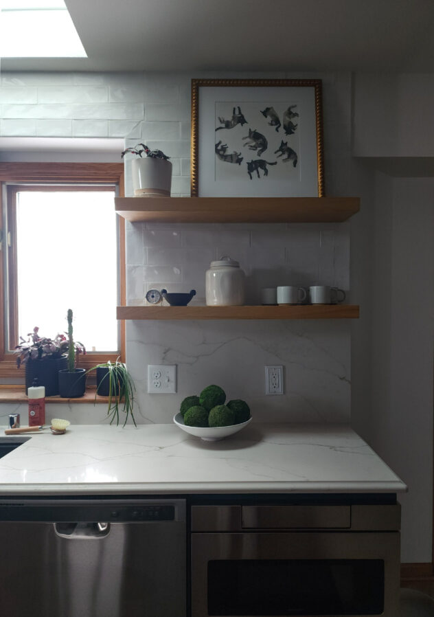
We also gained some usable counters by ditching the desk area and got a bit more storage underneath, which we had wired for charging in the drawer As I mentioned in my Family Room post, the maple-look chevron patterned porcelain is extremely durable and helps with warmth but slightly tones down the oak trim.
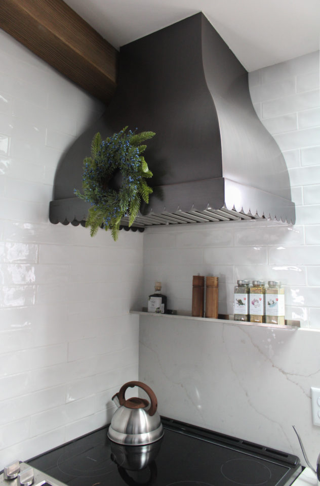
Added open shelving and a glass wall unit with LED lights for display
A Few Faves:


The Results:
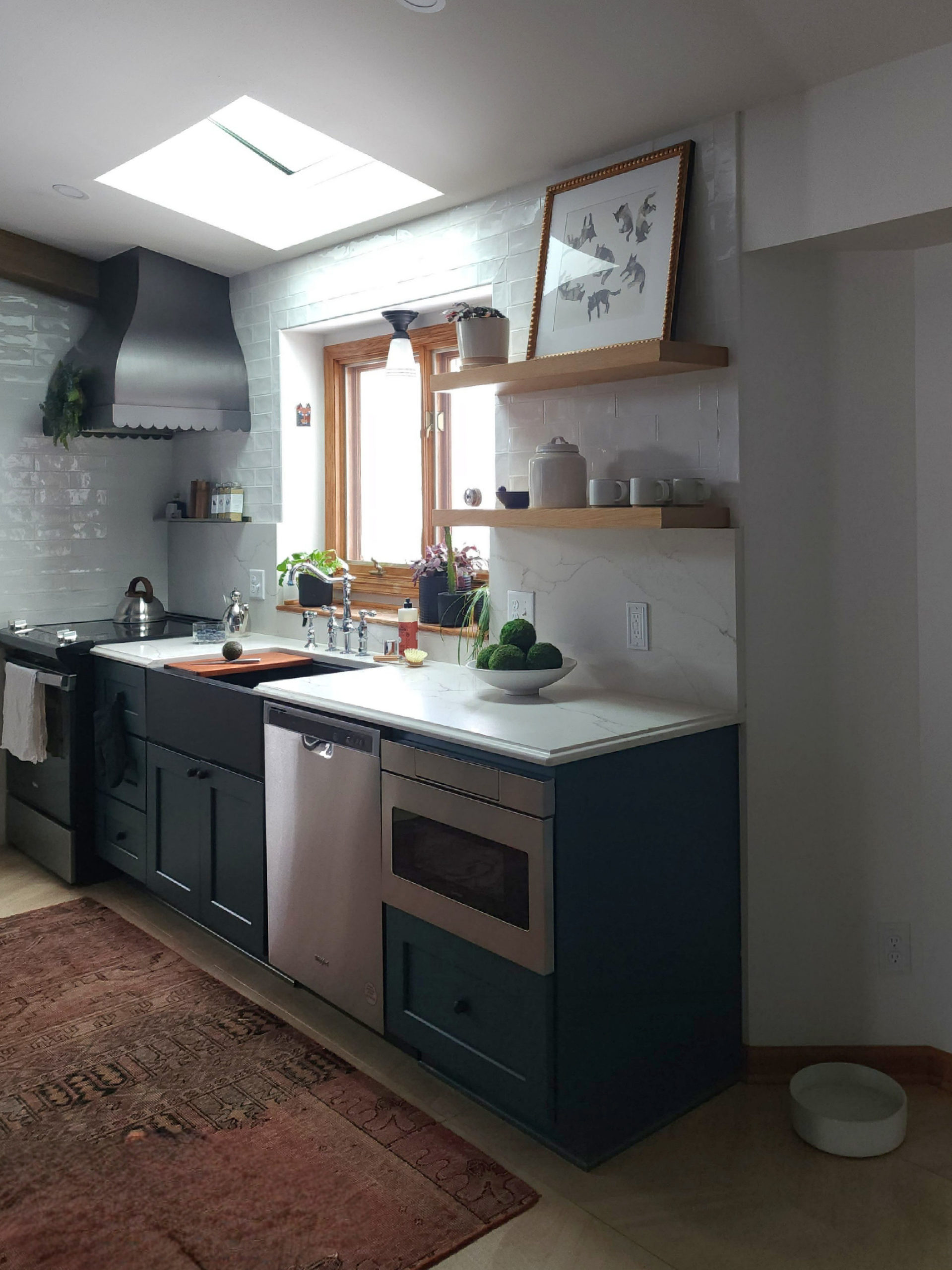
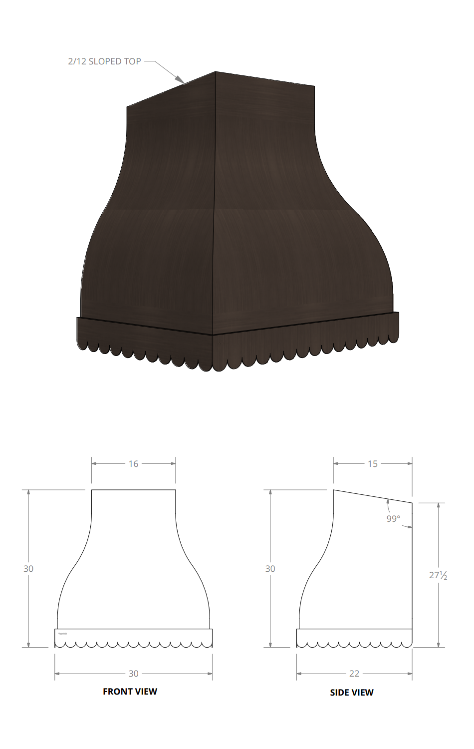
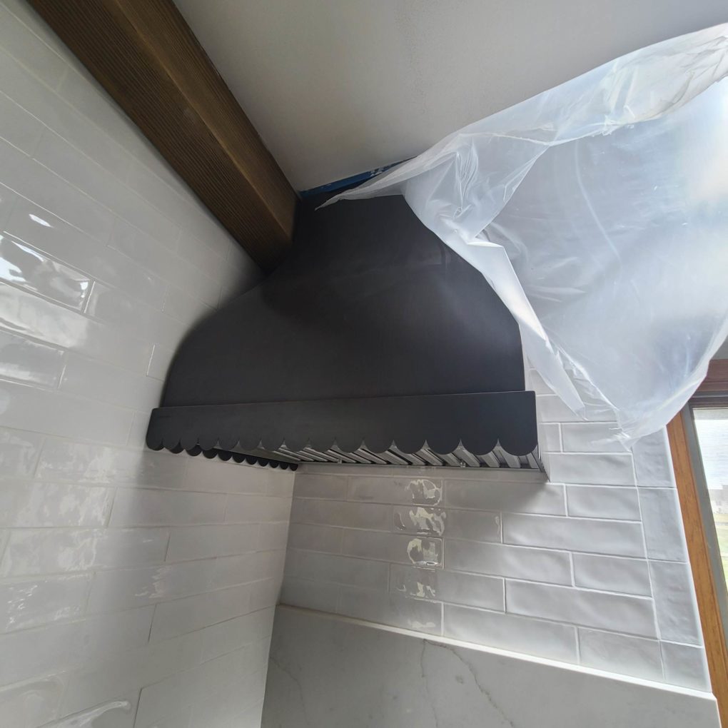
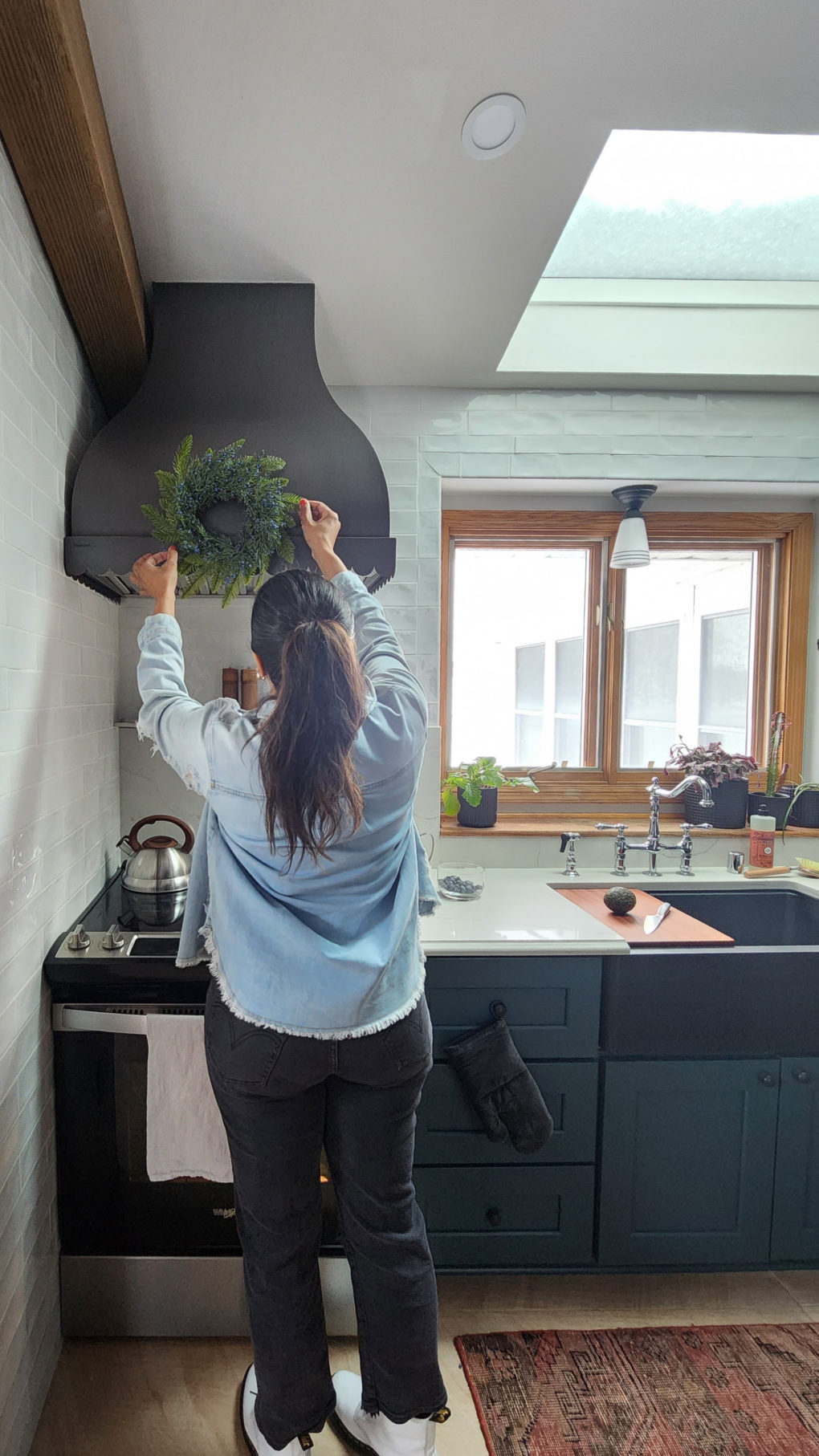
By far the most exciting piece of this kitchen was the sexy- ass custom dark copper scalloped edge vent hood from Coppersmith over the range. The absolute star of the show. That company was really great to work with, as well. It took several months to come (in the height of supply chain madness) but I just about passed out once the contractors got it out of its packaging. Stun. Ning. I don’t have anything smart to say about it. It’s probably overkill for the family’s cooking habits if we’re honest with ourselves but sometimes stuff is just pretty. I’m not above it.
And that’s that on that. We solved some problems. We didn’t skimp on the color. We oaked to the best of our abilities. I hope this post can serve as a guide on how to assess how your spaces are working even if a full renovation isn’t your fix.
And feel free to reach out from anywhere if you’d like help with a projekt!