By now you might already know the process. I like to start with some positives. It’s a tried and true way to approach a transformation. The client and I try to figure out what they want to honor and bring out about their space. Even when there’s extensive demolition required, I like to think of it like weeding a garden to better highlight the best features.
The Considerations
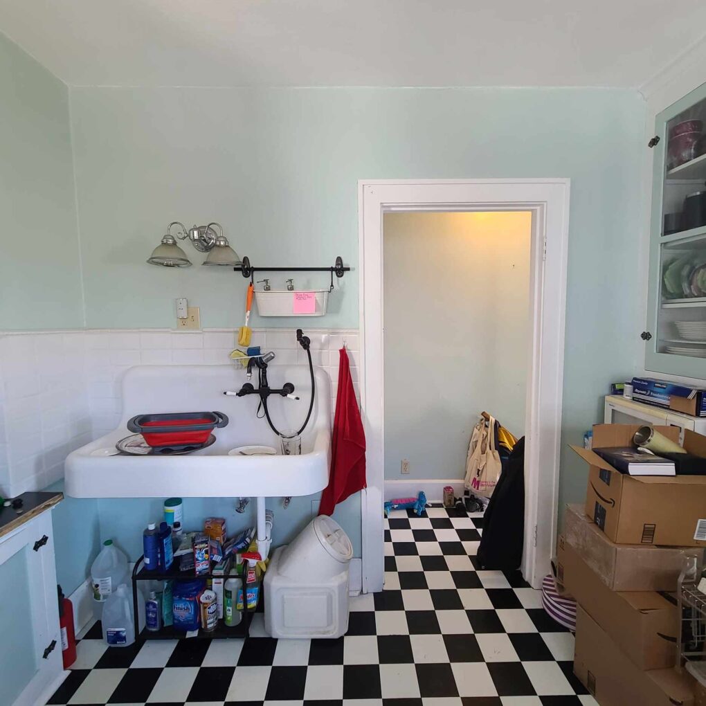
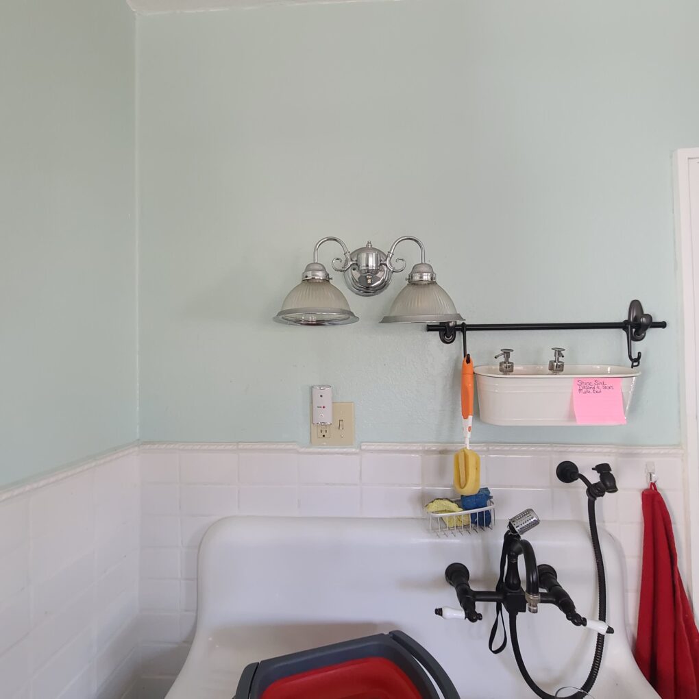
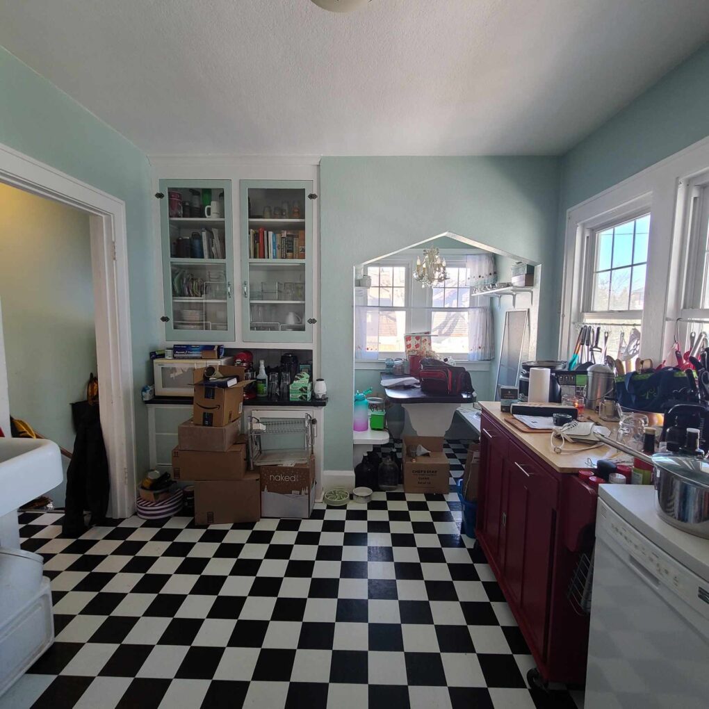
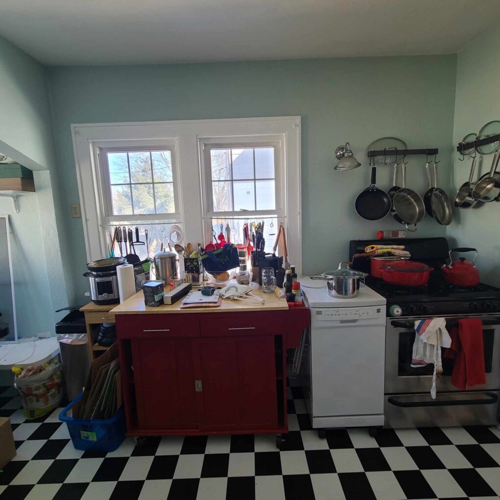
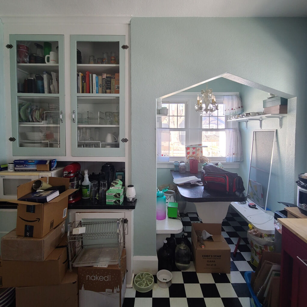
In the case of this kitchen, even with some obvious room for improvement, the vibes were there. The space did feel good and that goes a long way!
-The natural light was pretty
-The minty pastel color felt fresh and bright
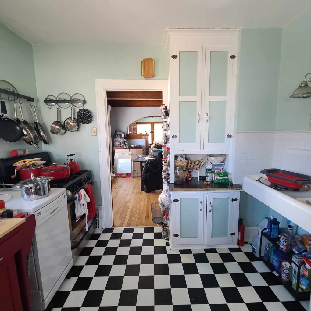
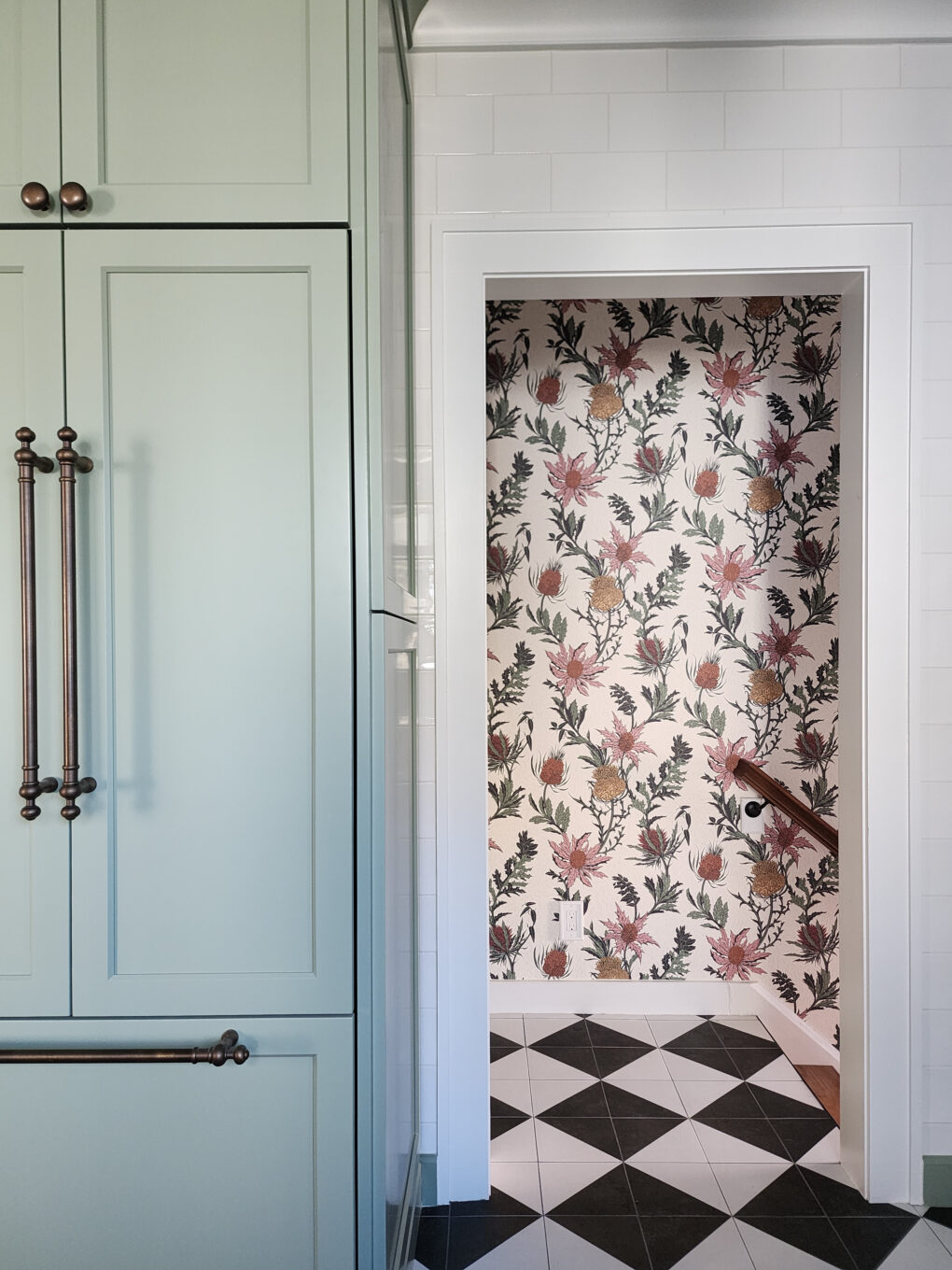
-The vintage feel of the checkerboard floor pattern and subway tile felt like a good jumping off point
-The room itself was actually pretty spacious
The client also had a pretty essential list of problems they wanted to solve:
-A layout that wasn’t functional
-An awkward work triangle (Sink-Stove-Refrigerator) The fridge was tucked around the corner in a nook
-Lack of adequate storage
-Almost no counter space or work surface
-Insufficient lighting
The only real style guidance from the client was, nothing too fussy, fru fru, or hard to clean, and she was dreaming of light blue or green for the cabinetry. I love a client who’s not afraid of some color! Since she is an OG client and friend, I had the added benefit of being somewhat familiar with her personal style.
And since the Caledonia project pretty much solidified my title as the official designer to the pets of Racine, I also made sure to account for the ever-discerning Hunter in the final designs. (More on that later.)

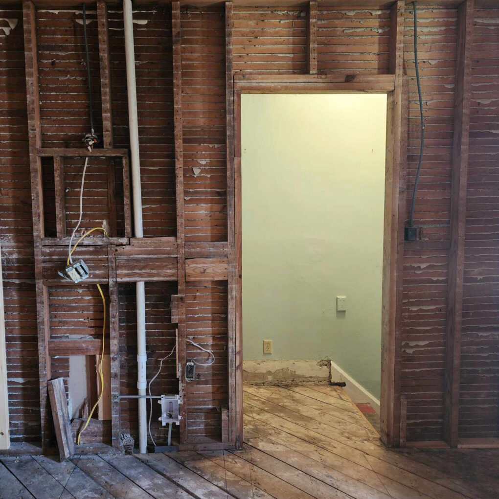
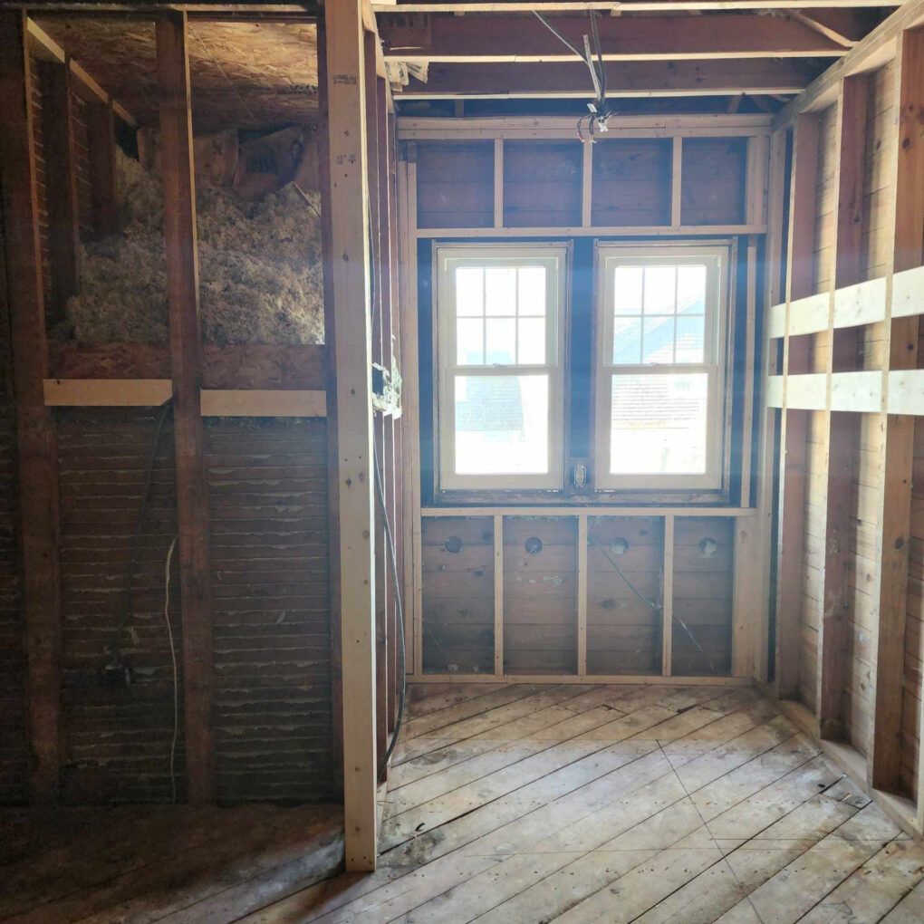
So, with a lot to consider and a lot to work with, the contractors got to business pulling those weeds to reveal some fabulous blooms!
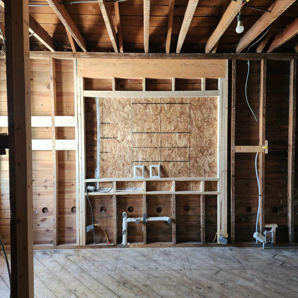
The Plan & The Process
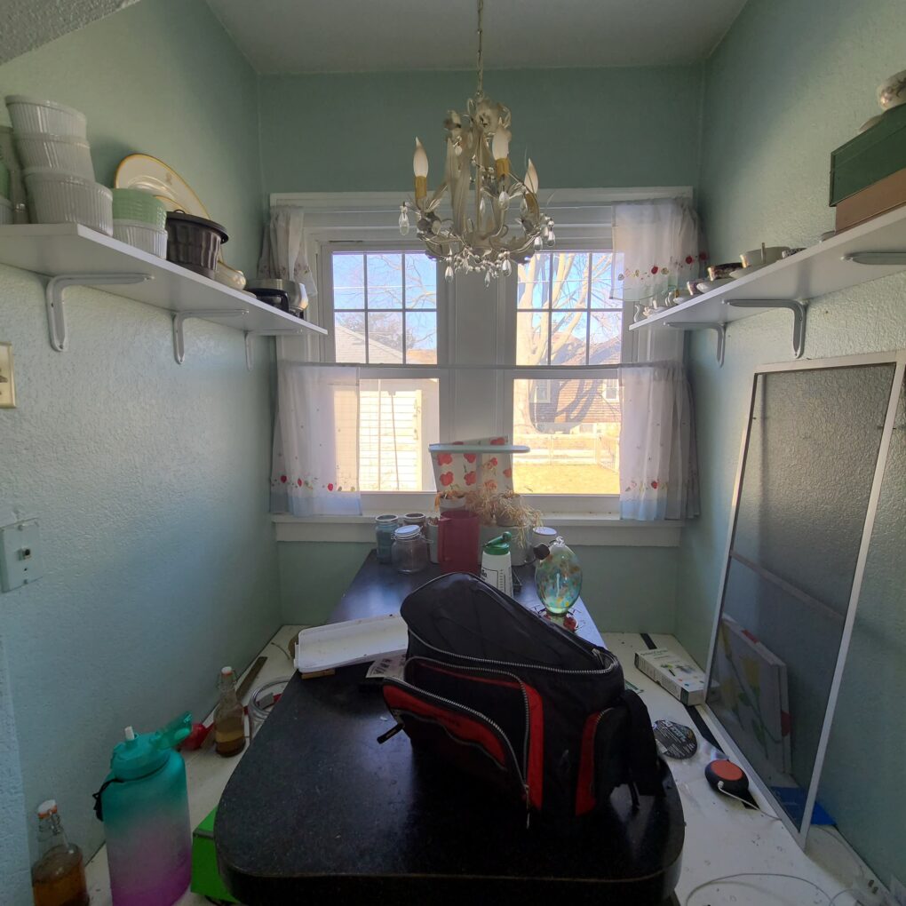
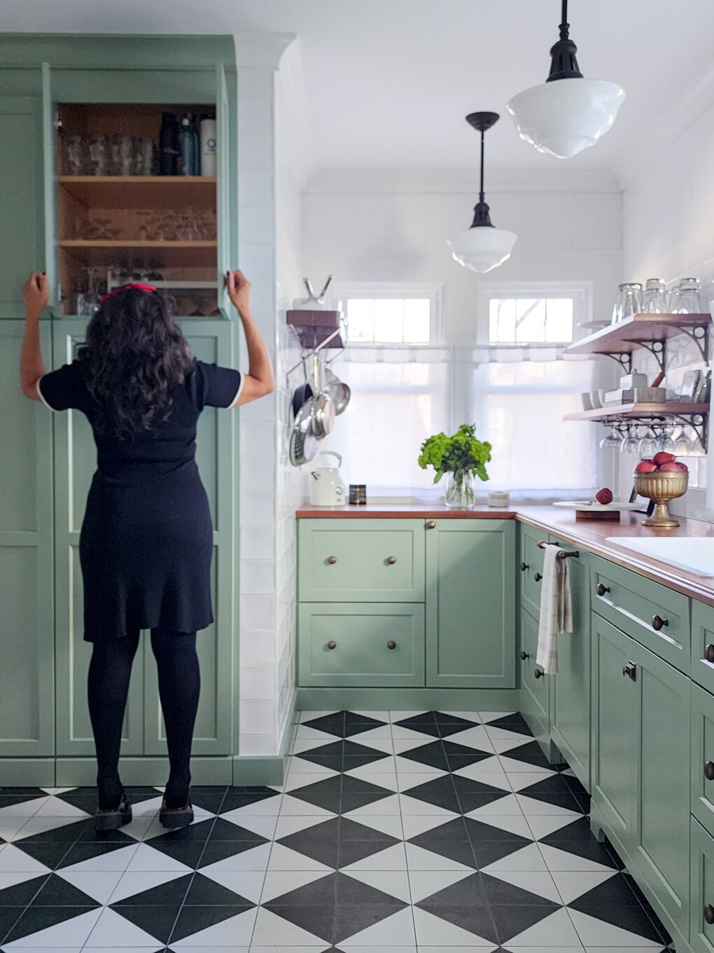
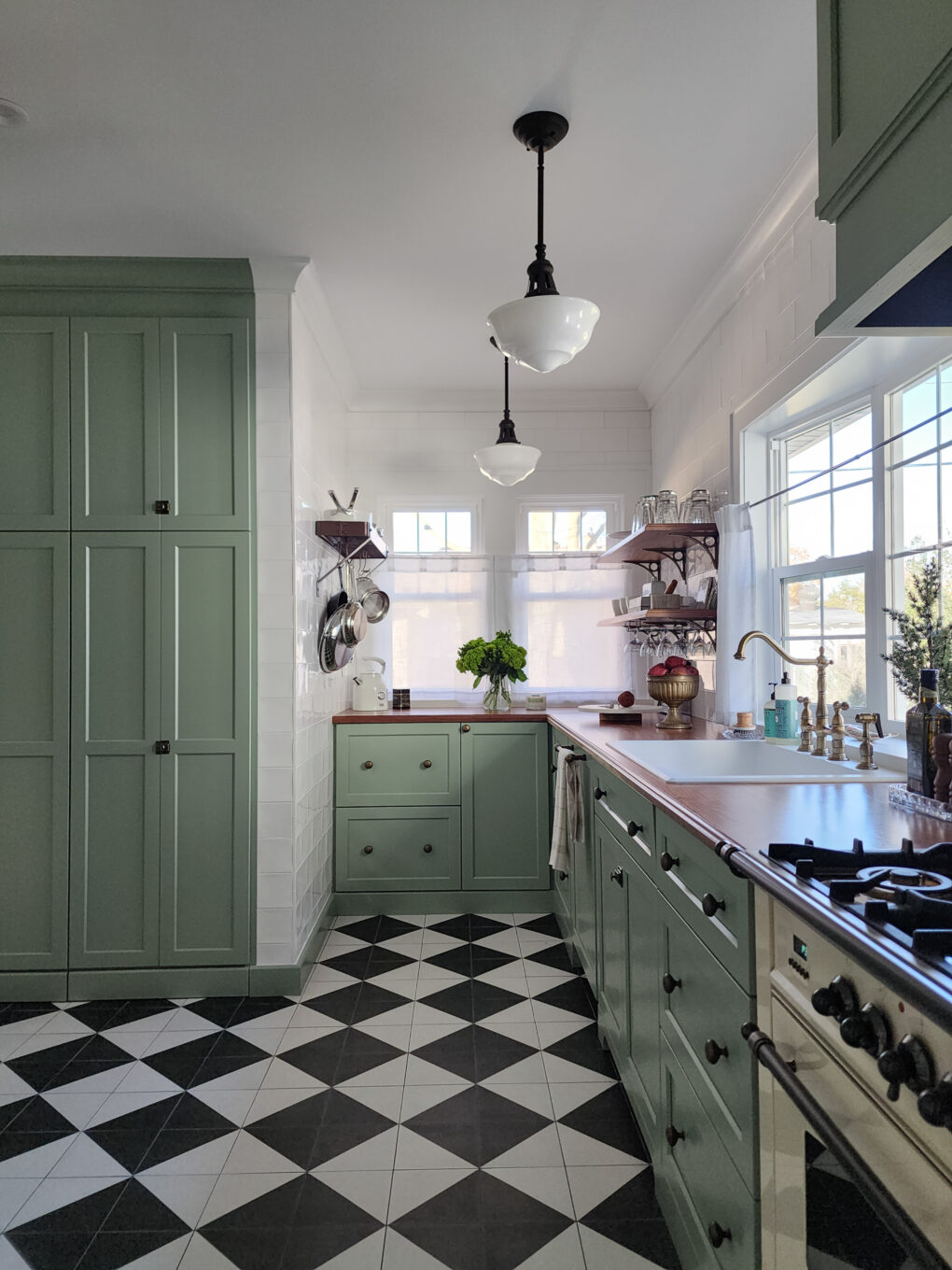
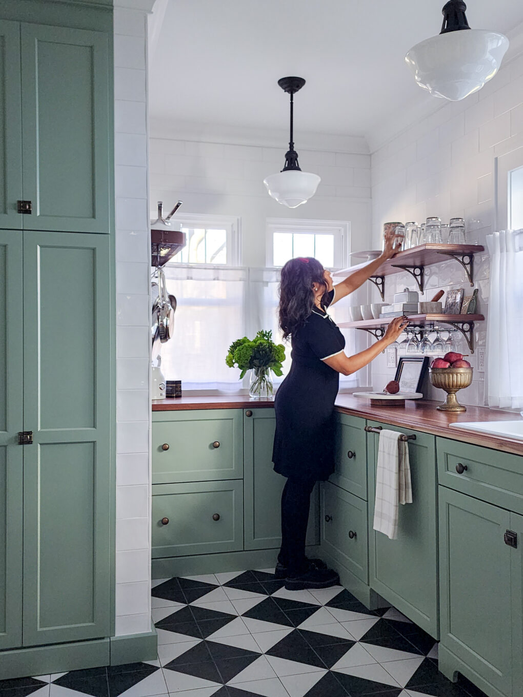
For the layout, we focused on creating a better workflow, increasing counter space, and considering specific storage needs. Given that the house has an adjacent sit-down dining room and the breakfast nook wasn’t being utilized, we decided that ditching the nook was the easiest way to gain real estate and counter space. The main zones would be:
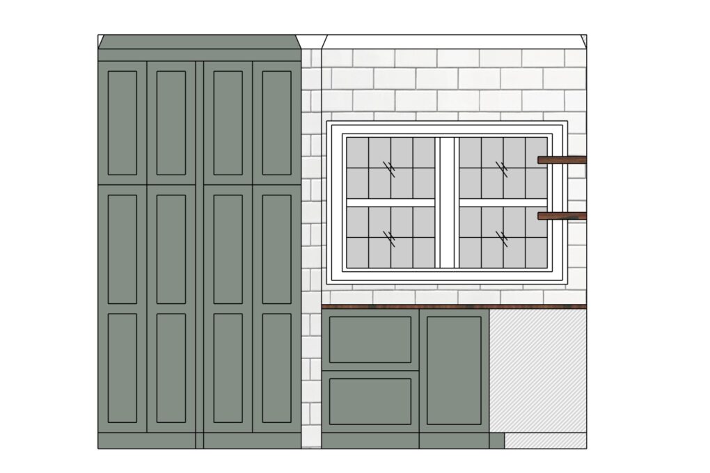
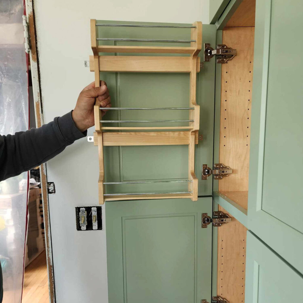
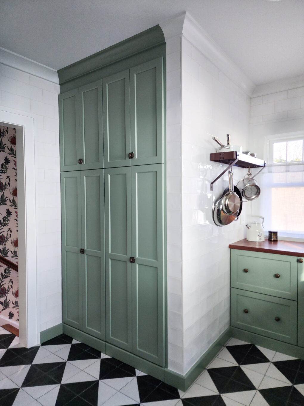
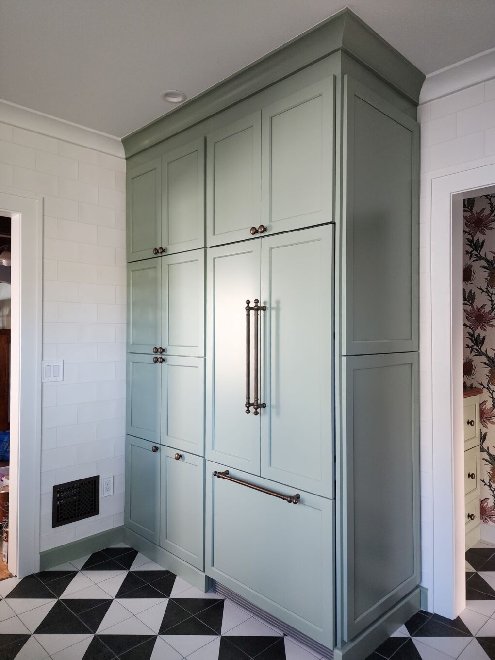
-The refrigerator zone with a pantry and spice storage beside it
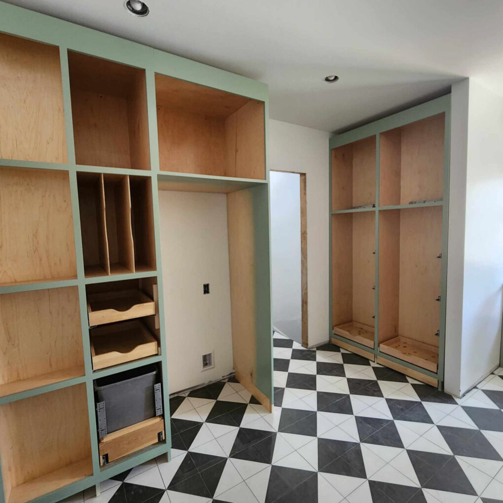
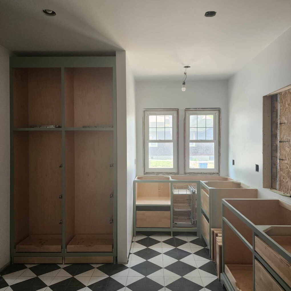
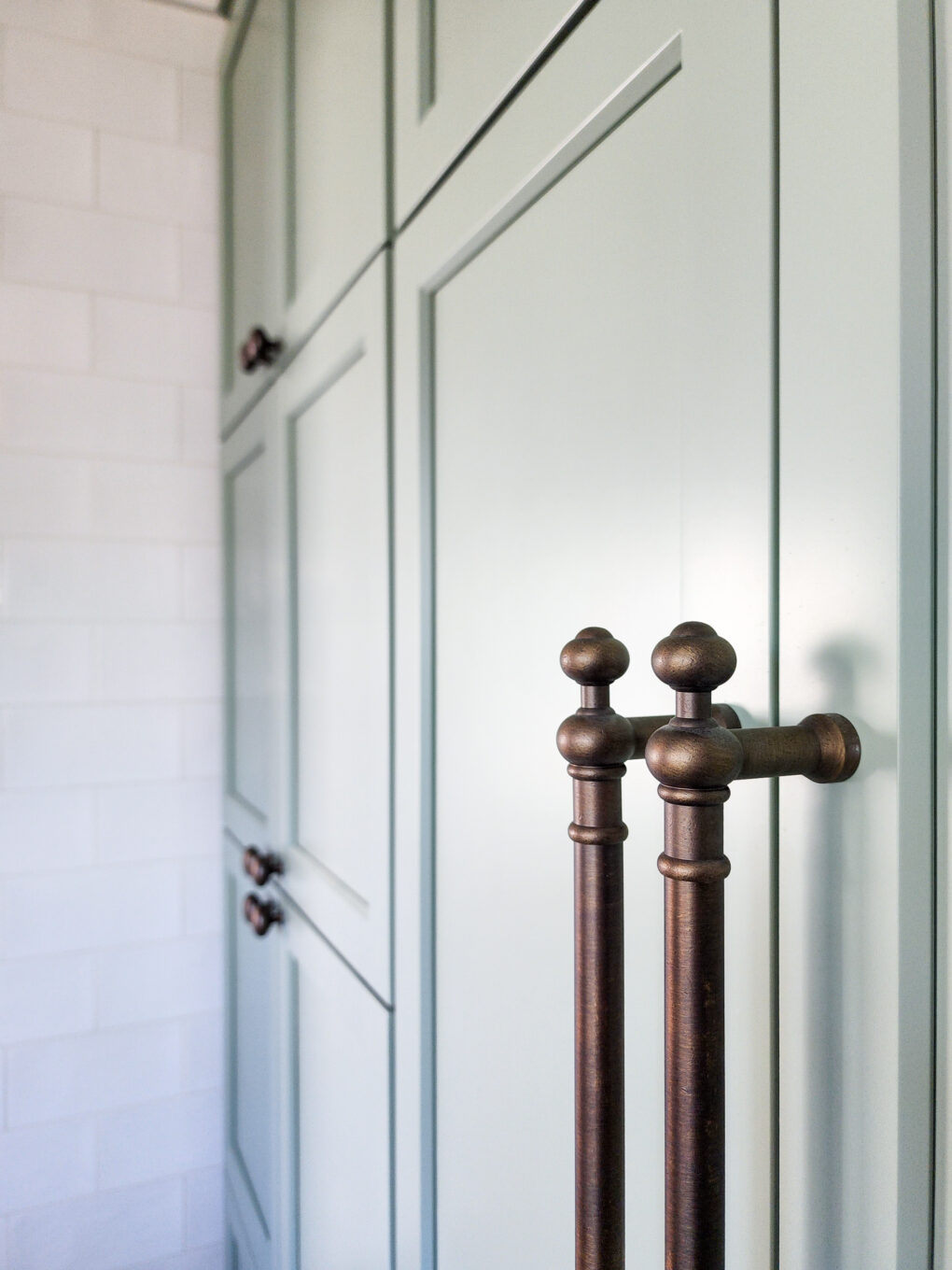
-The floor-to-ceiling built-ins with toe-kick drawers
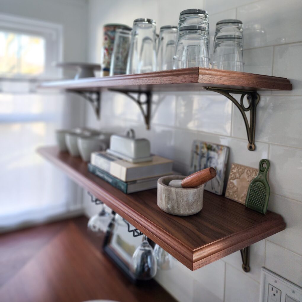
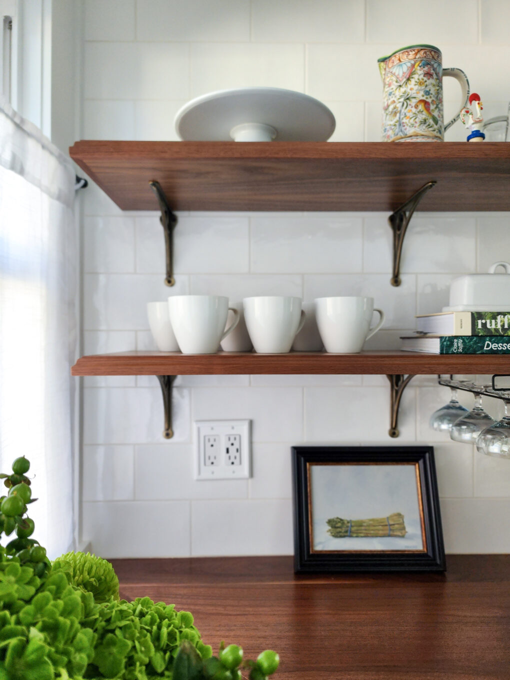
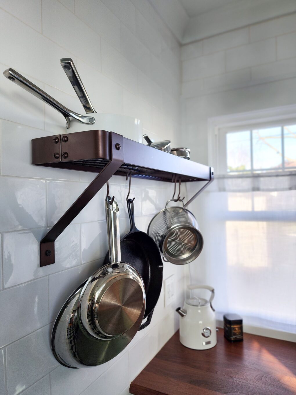
-The corner prep area with a hidden microwave, magic corner, and open shelving for display
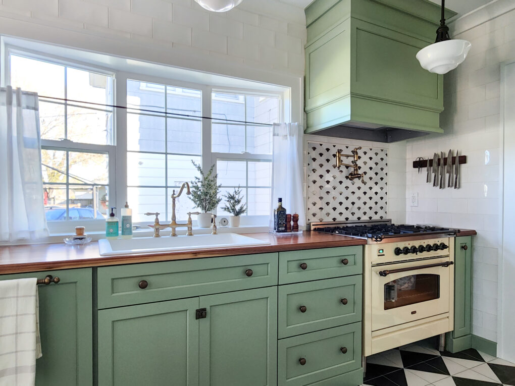
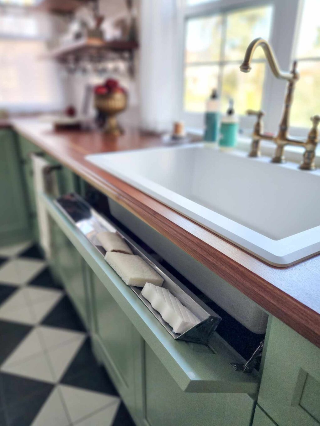
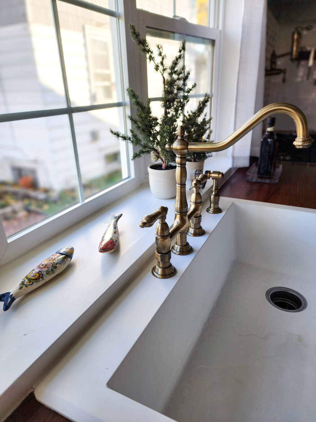
-The range (same as existing location), sink (relocated to opposite wall), and dishwasher with ample counter space and pull-out utensil storage
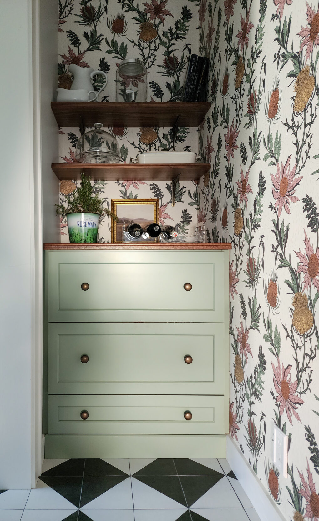
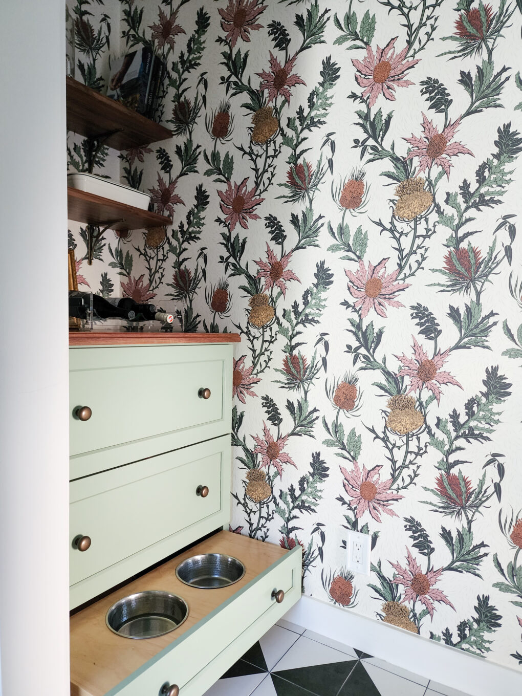
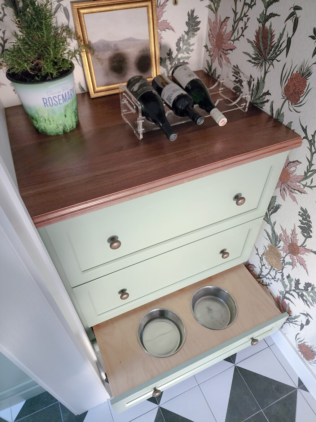
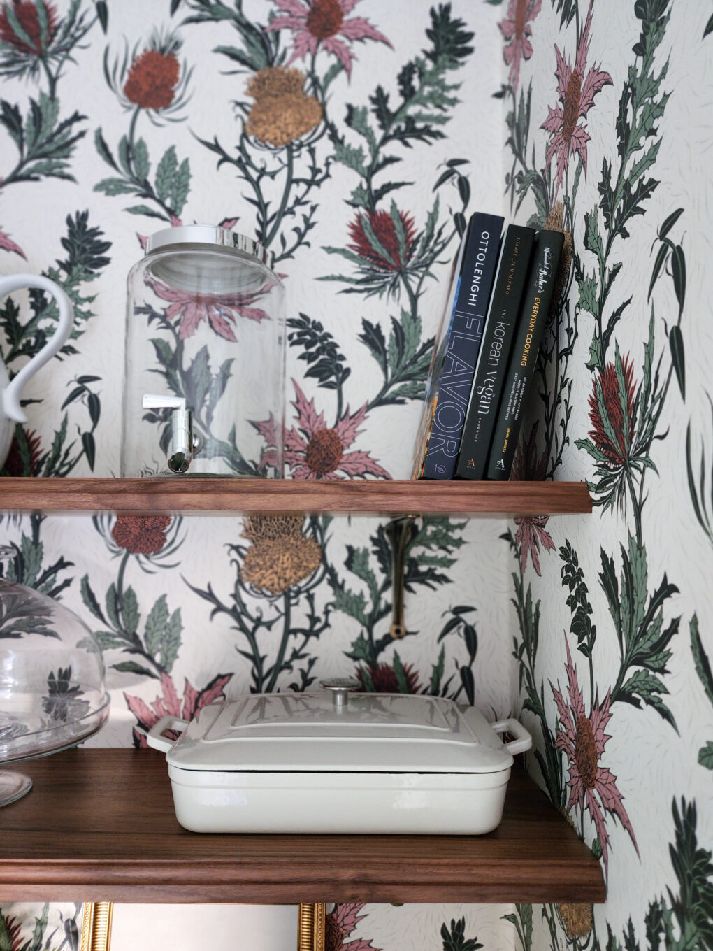
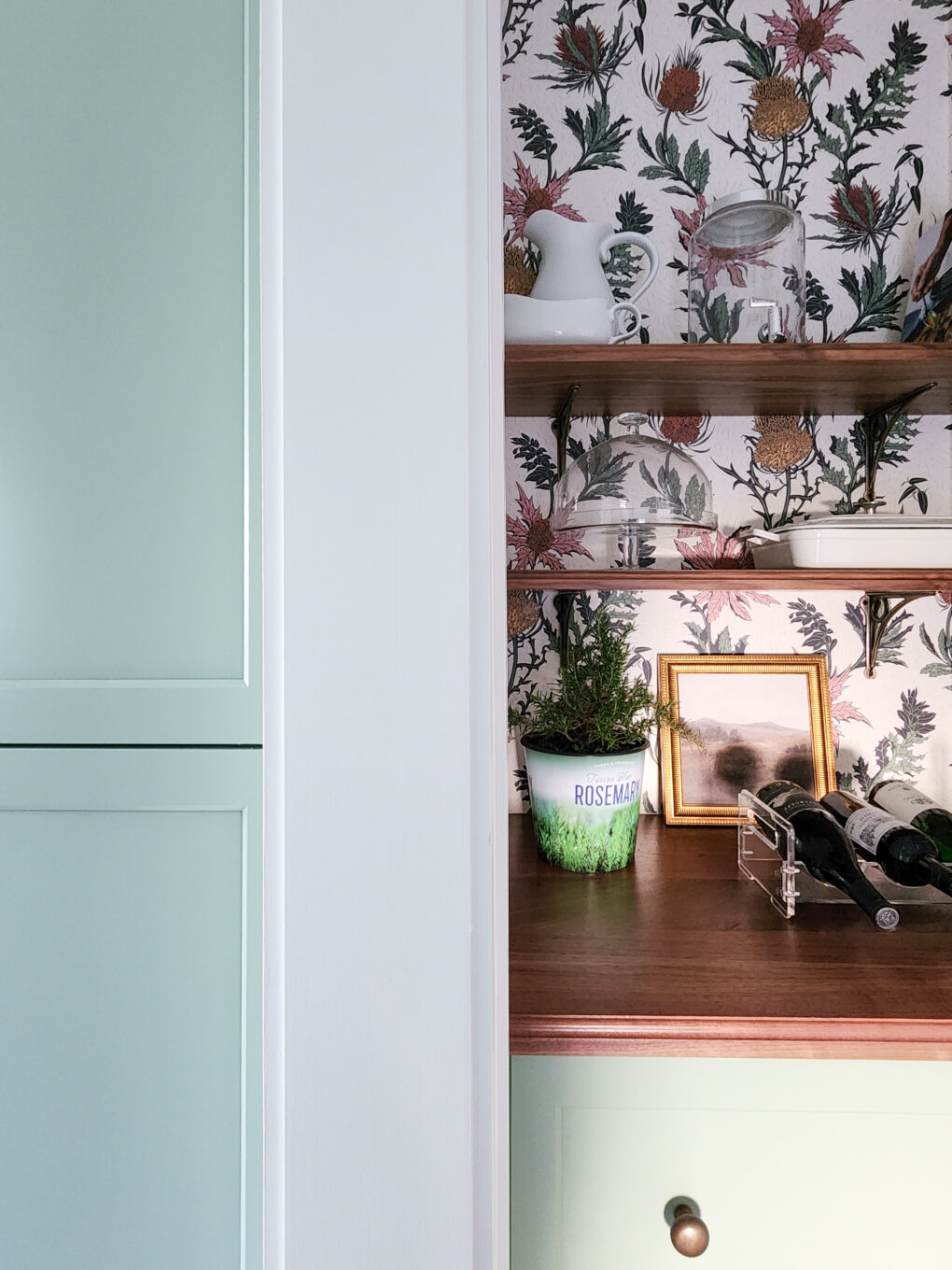
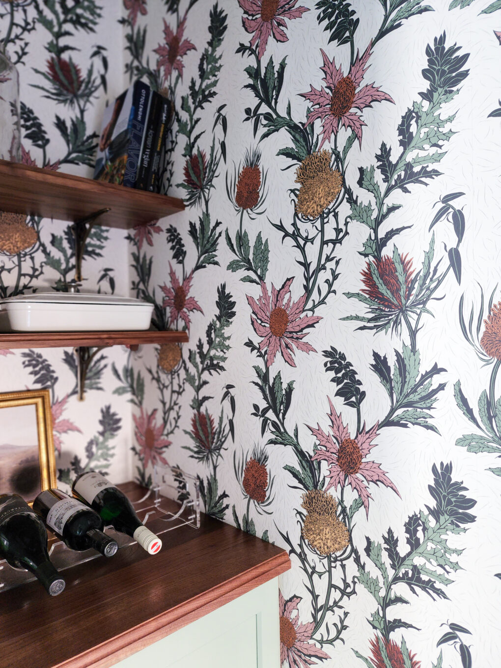
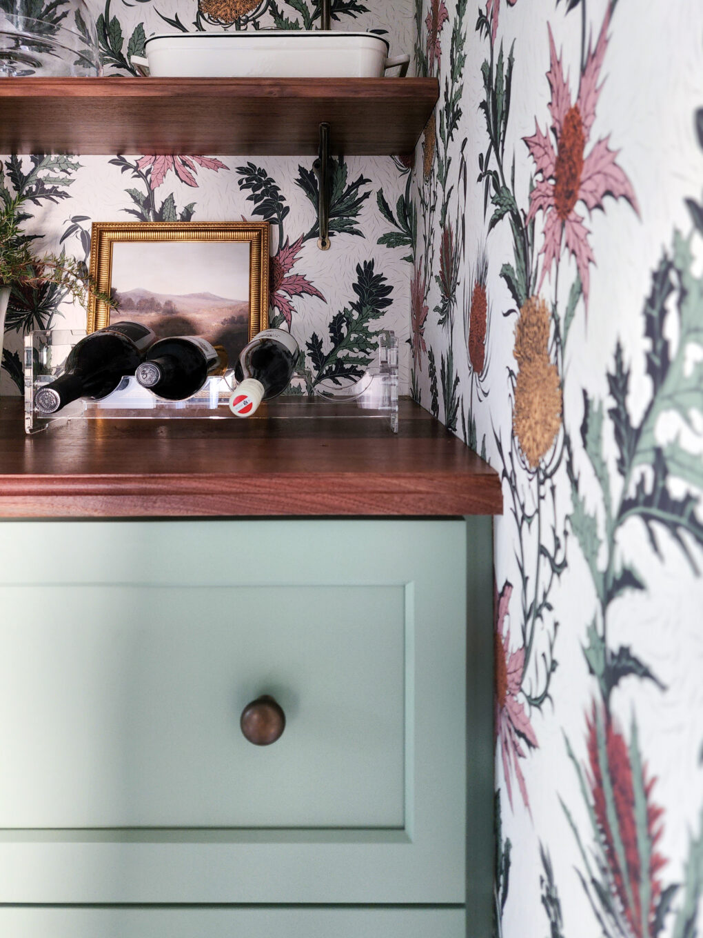
-The back hall pet zone with accent wallpaper and more open shelving
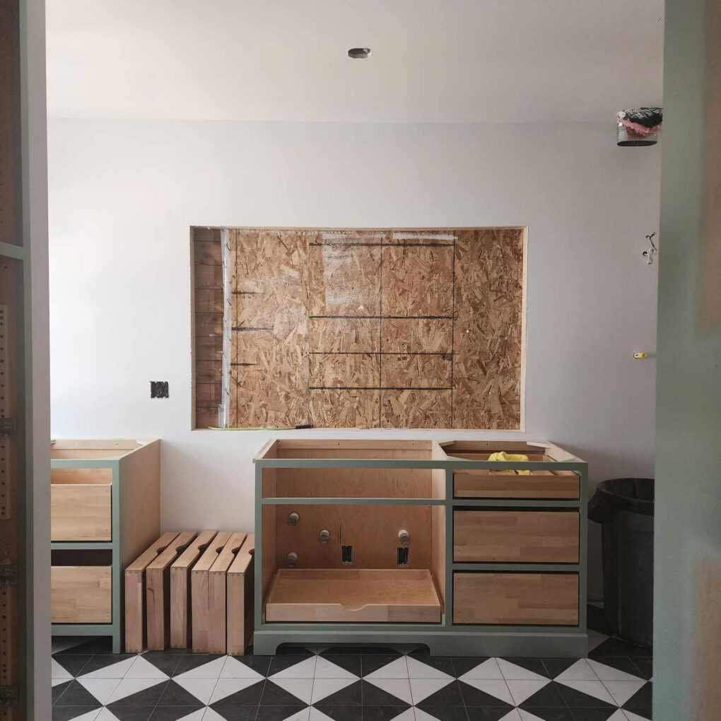
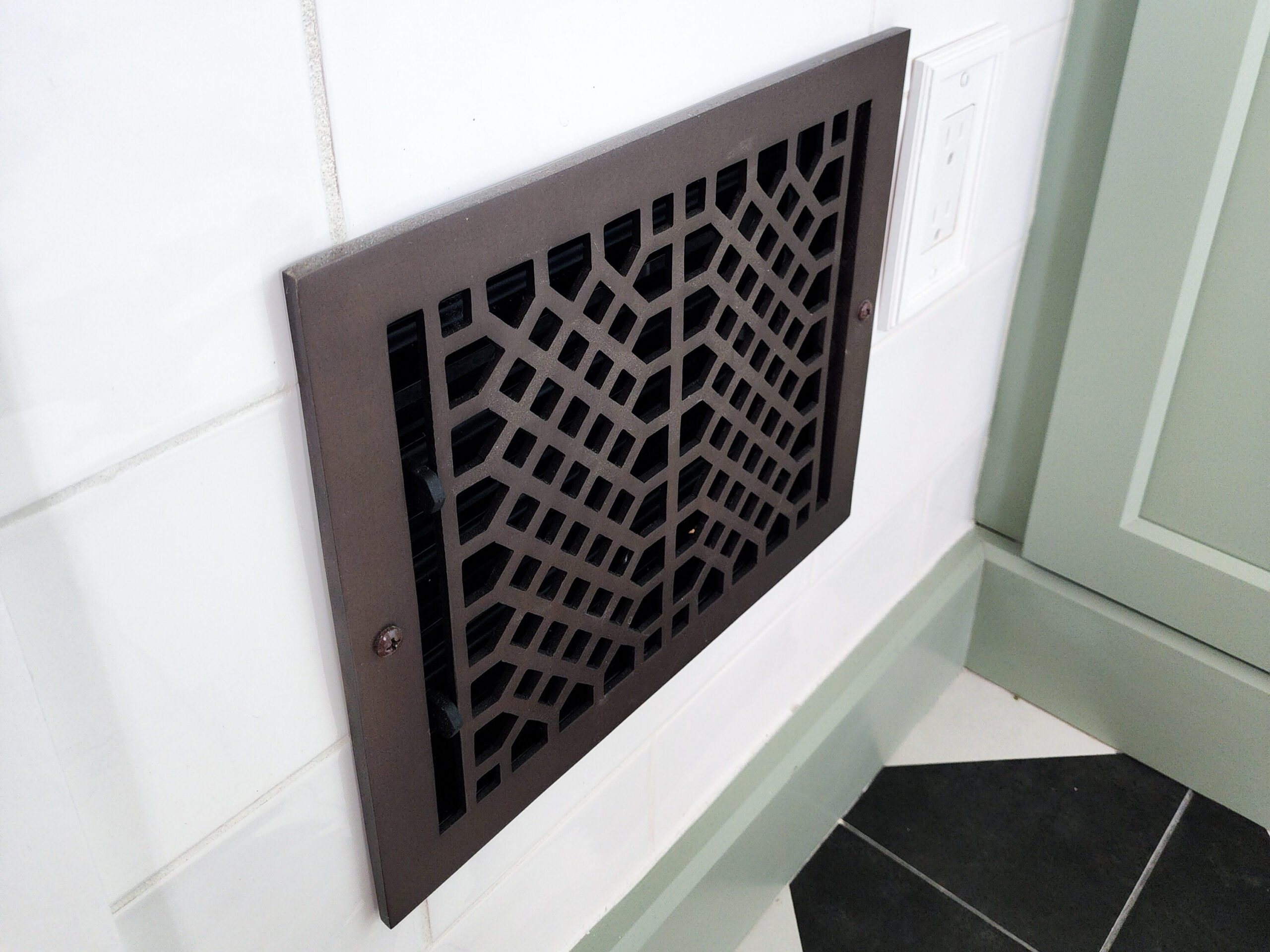
The heat register was inconveniently blocked by the range so we opted to relocate it to the empty wall on the other side of the doorway.
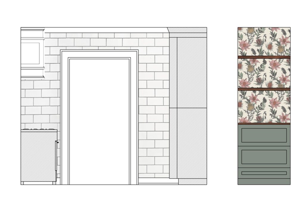
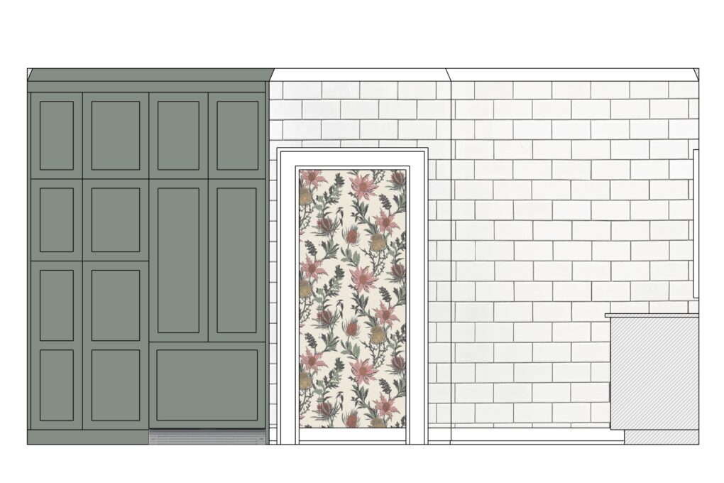
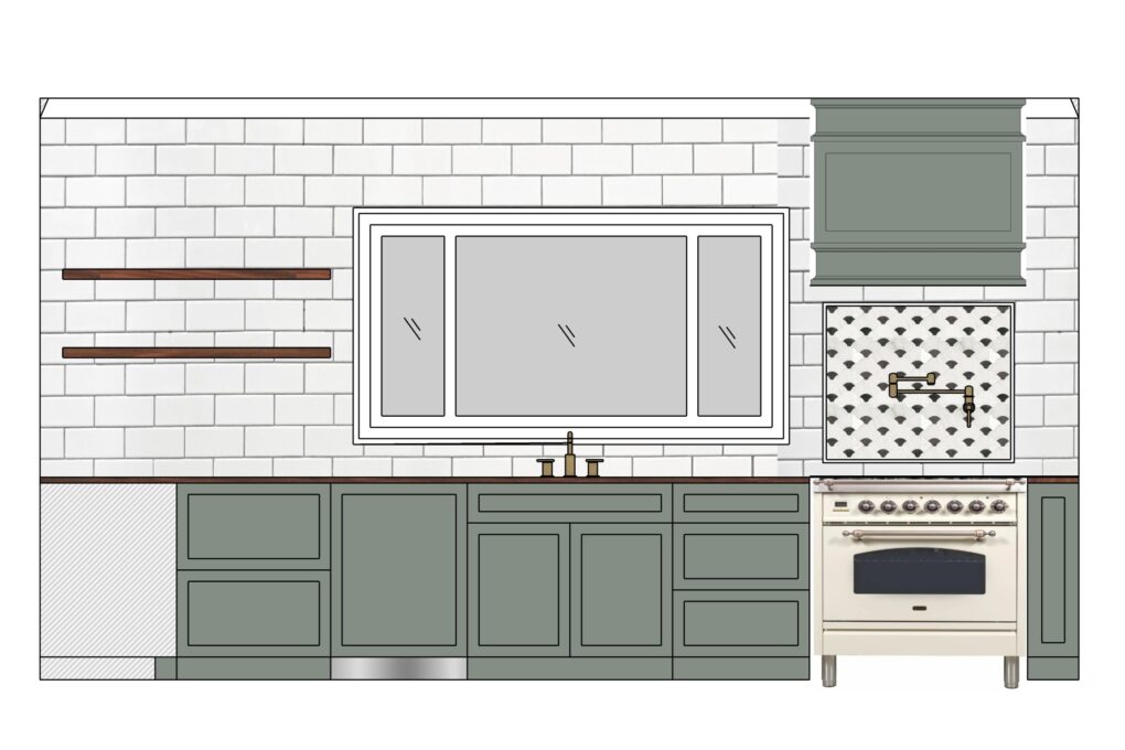
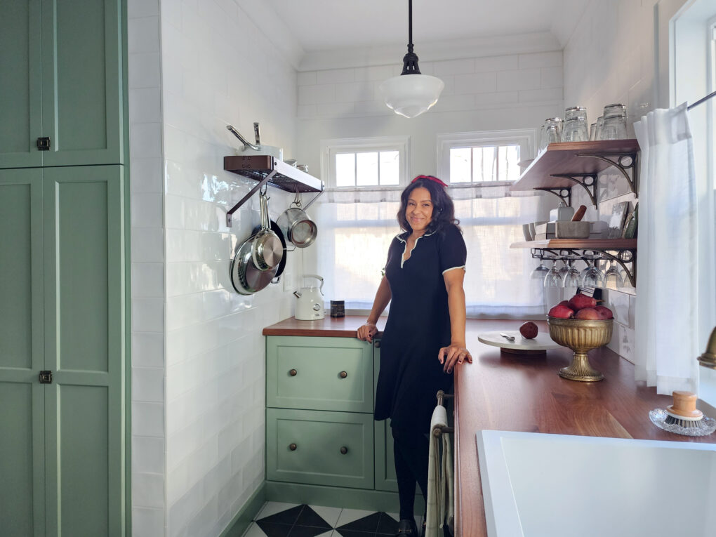
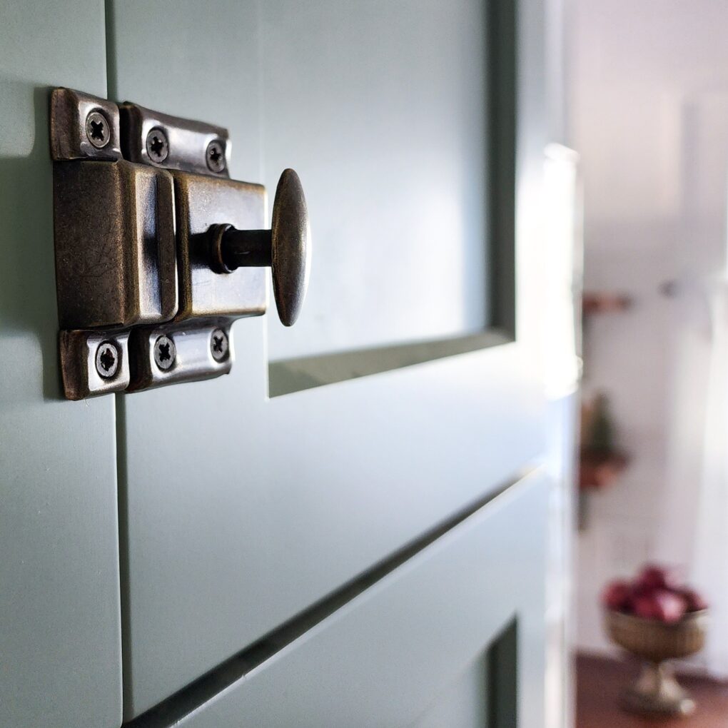
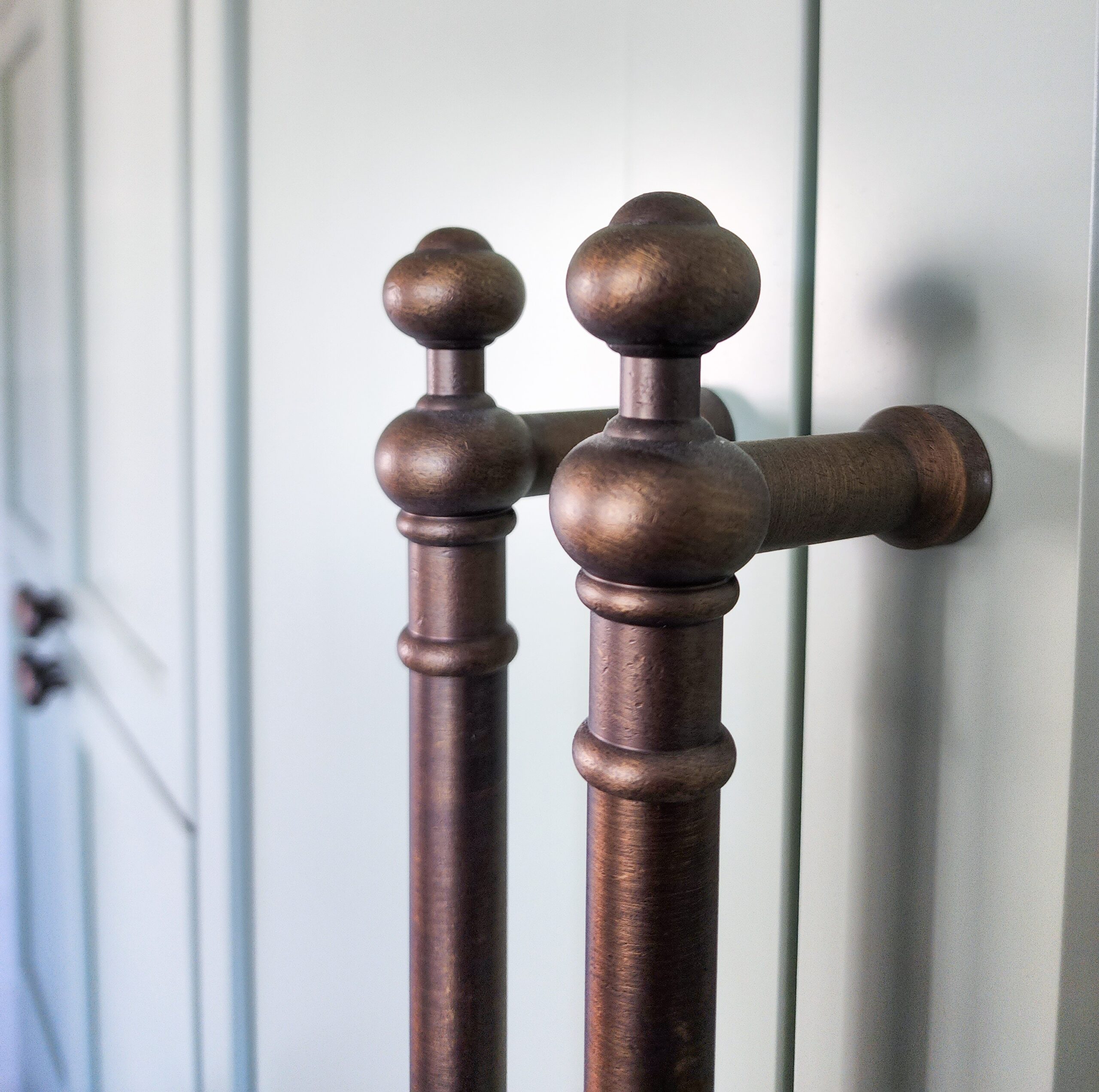
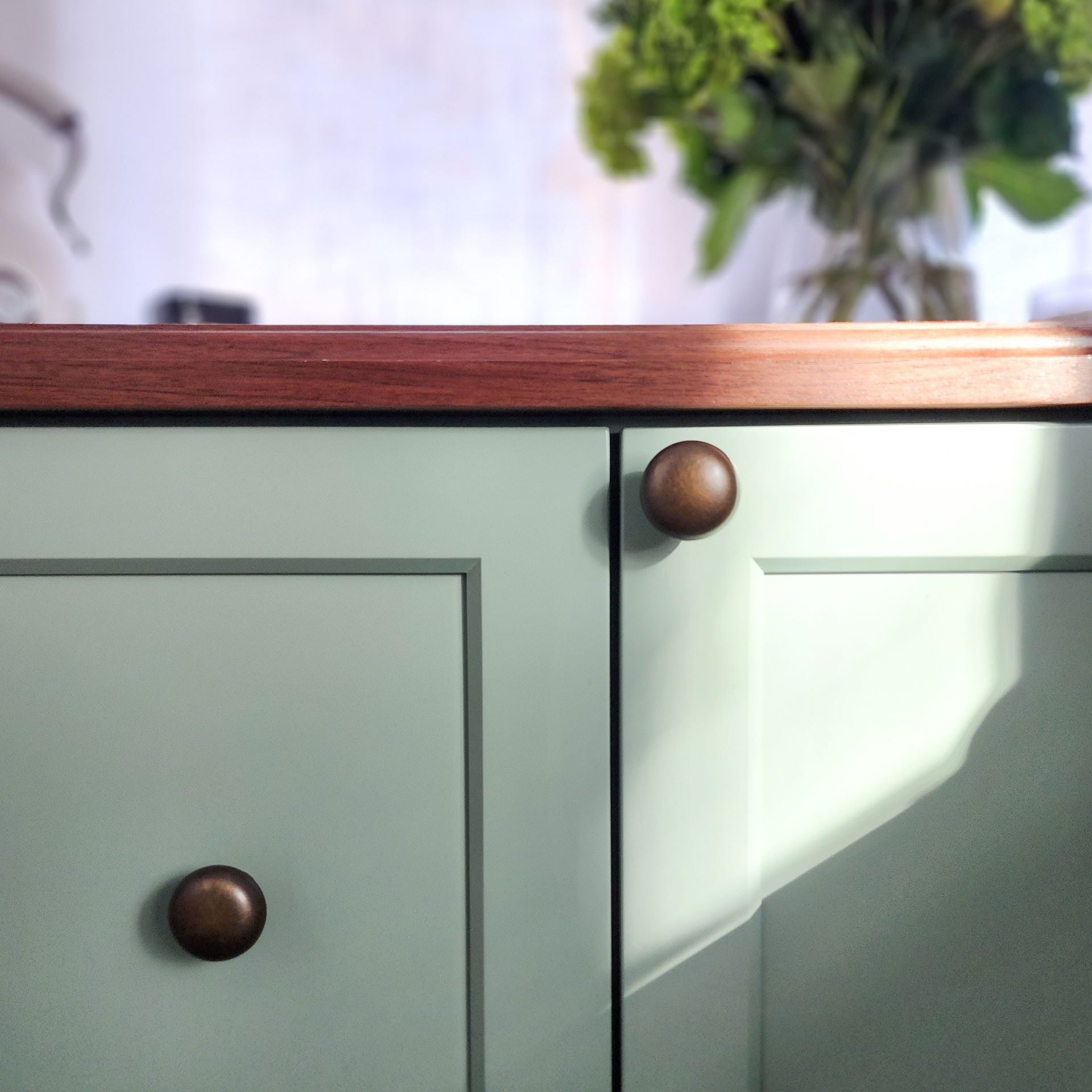
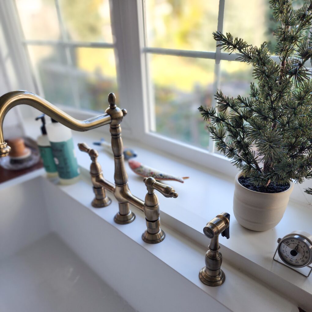
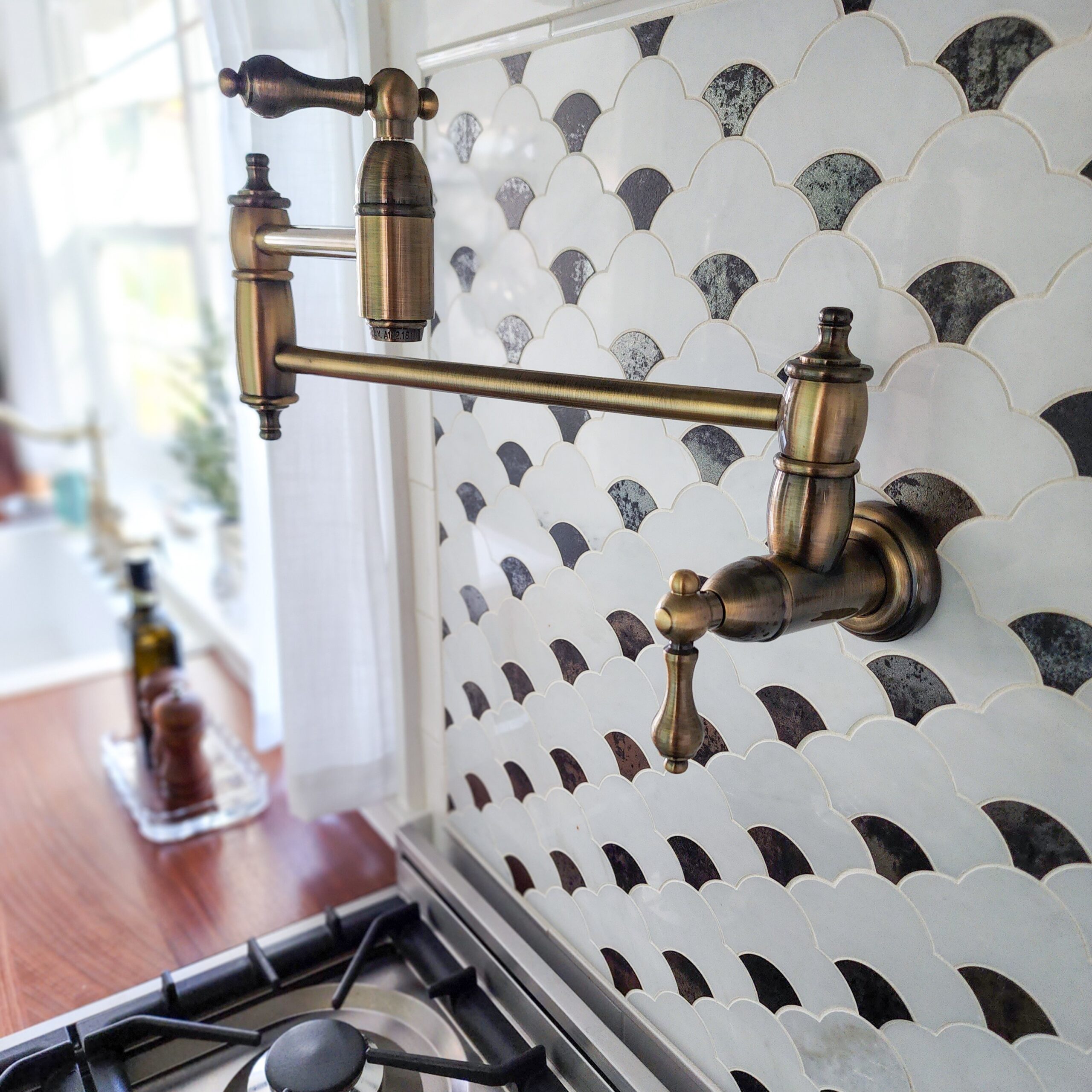
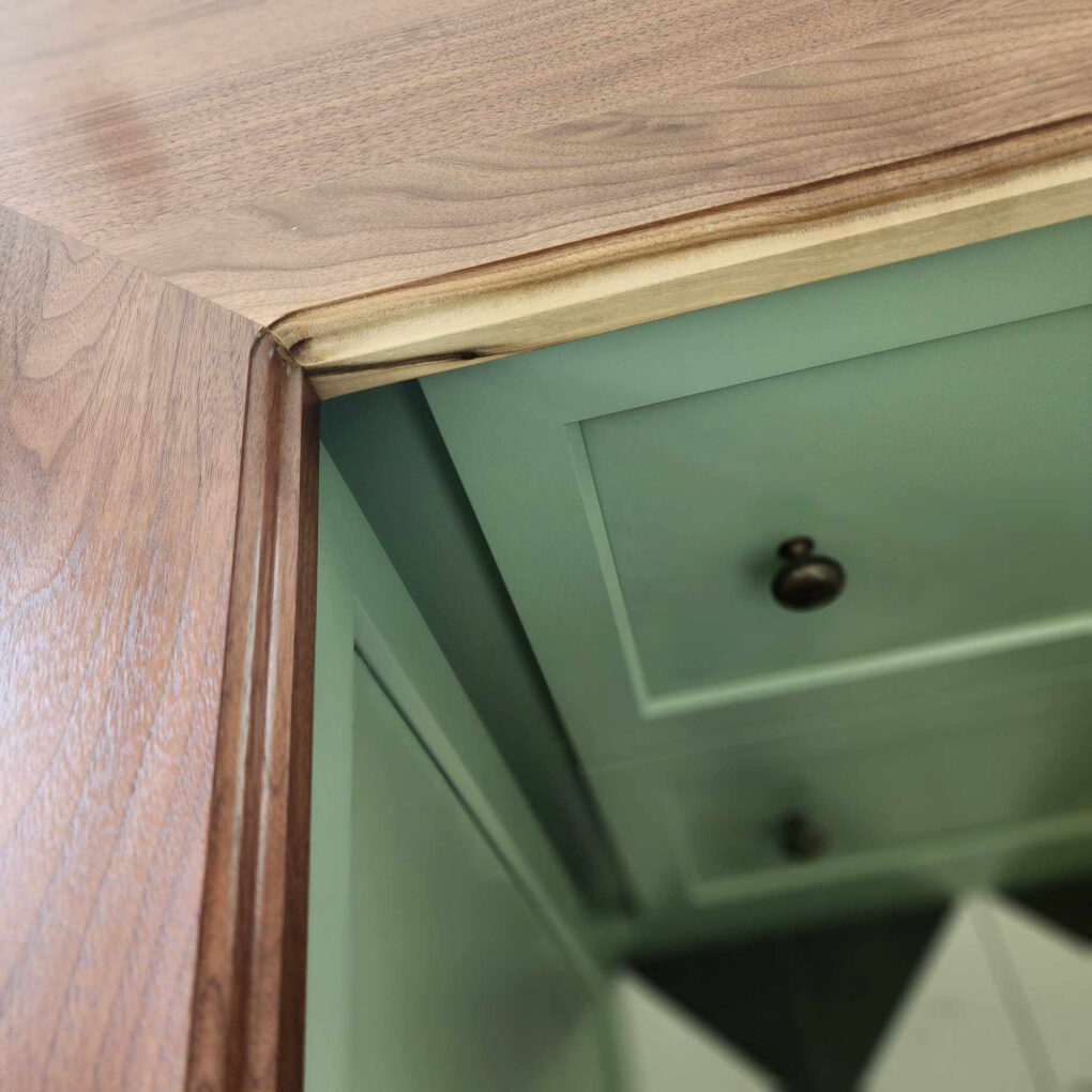
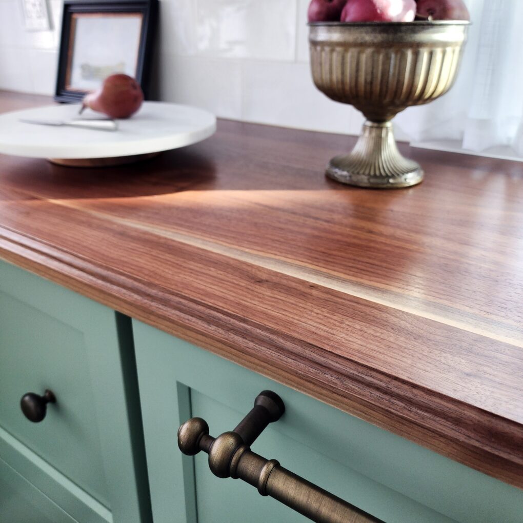
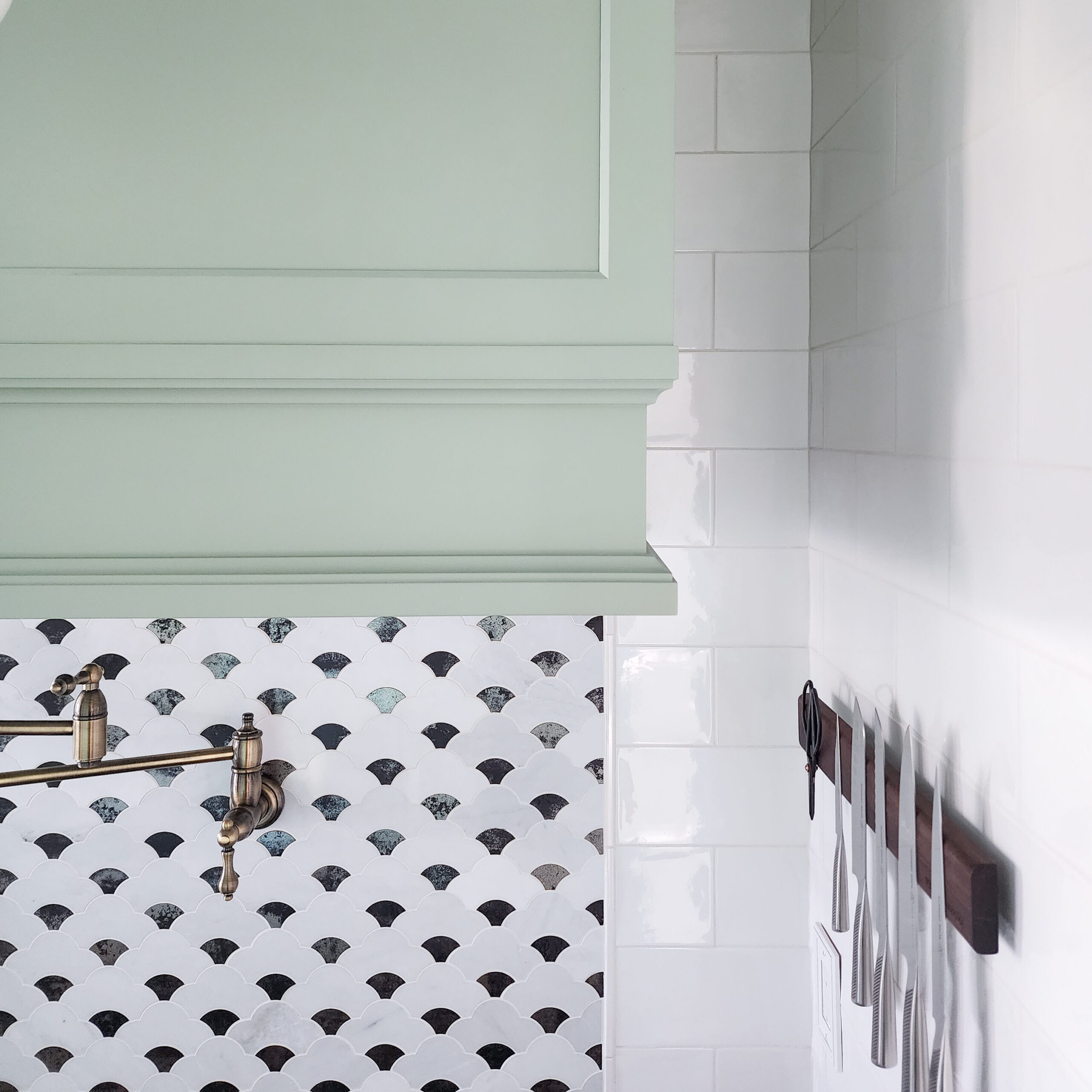
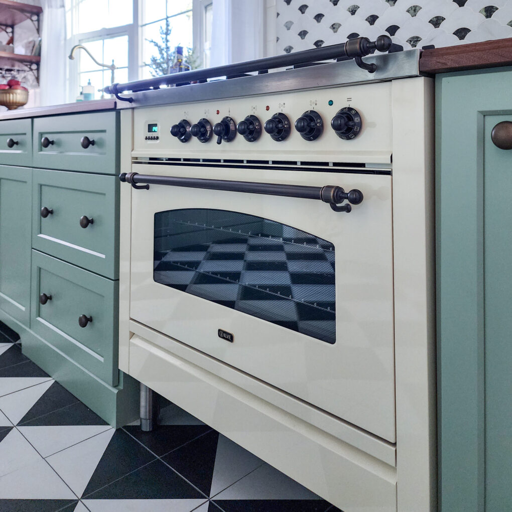
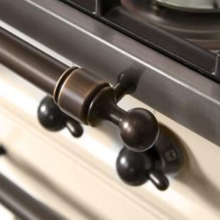
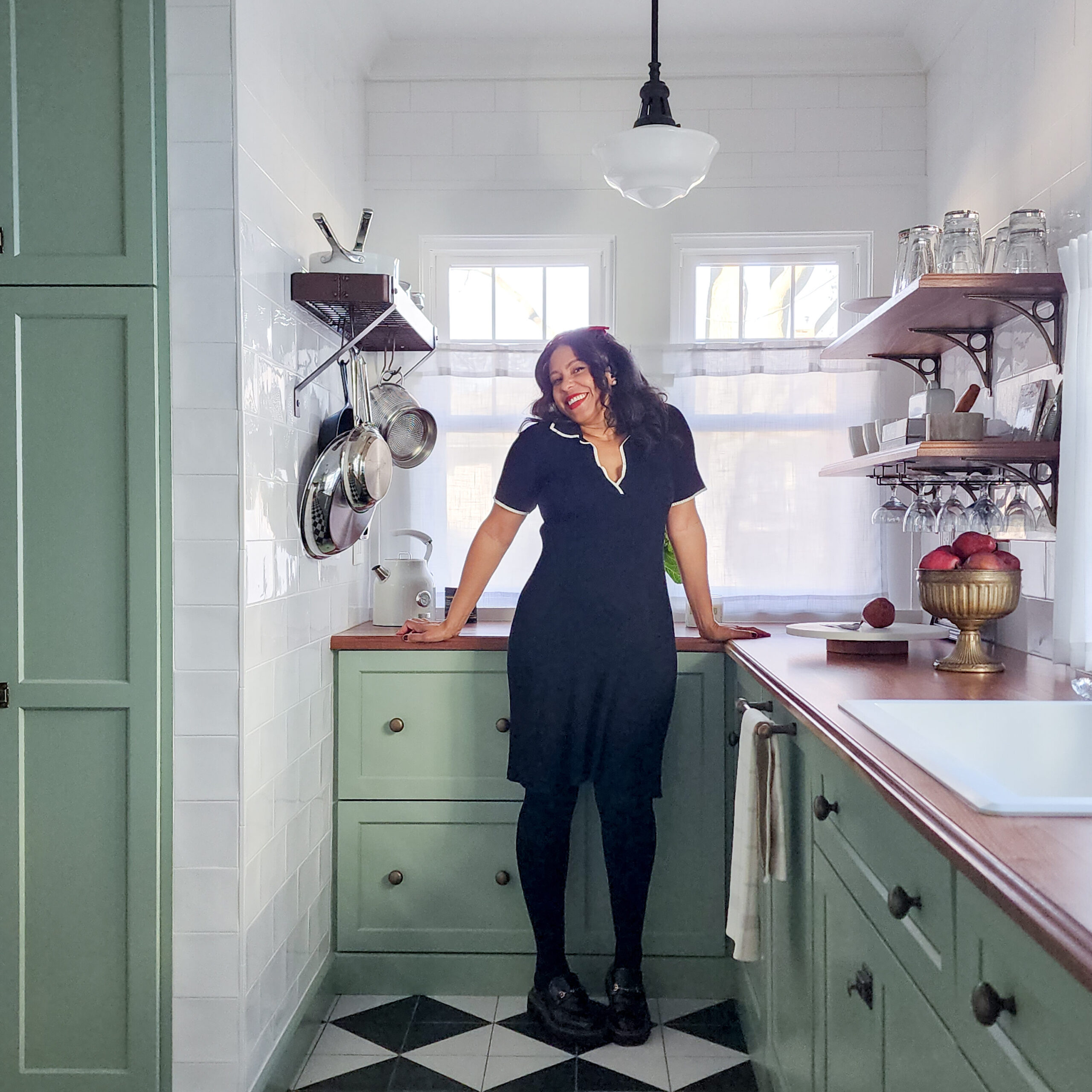
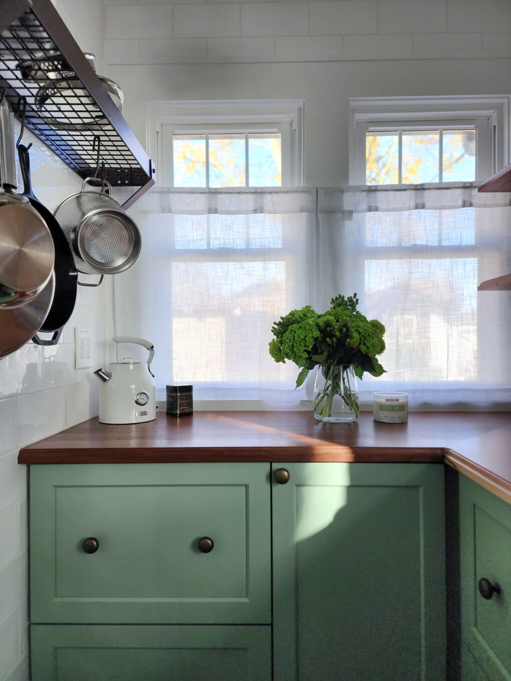
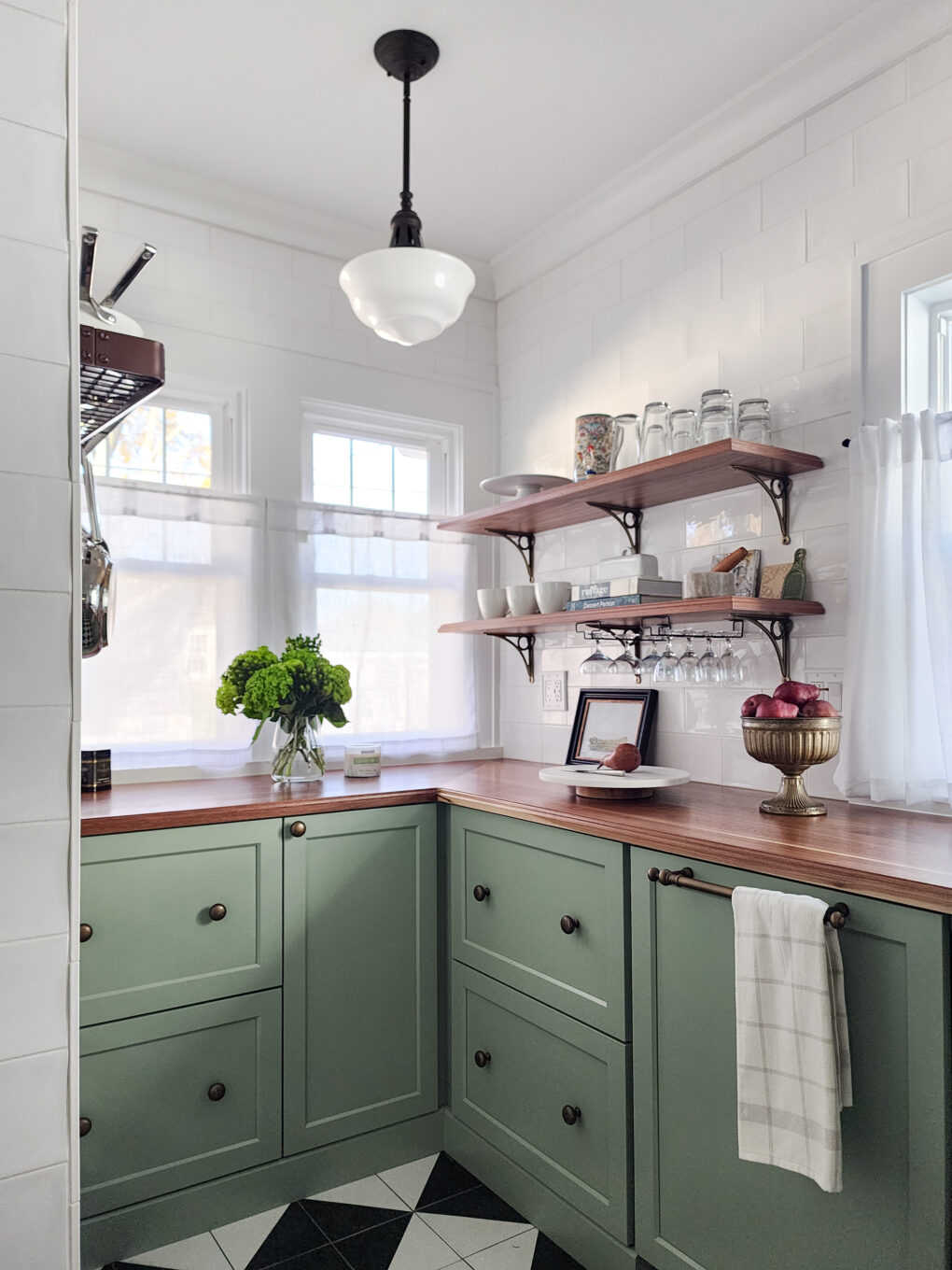
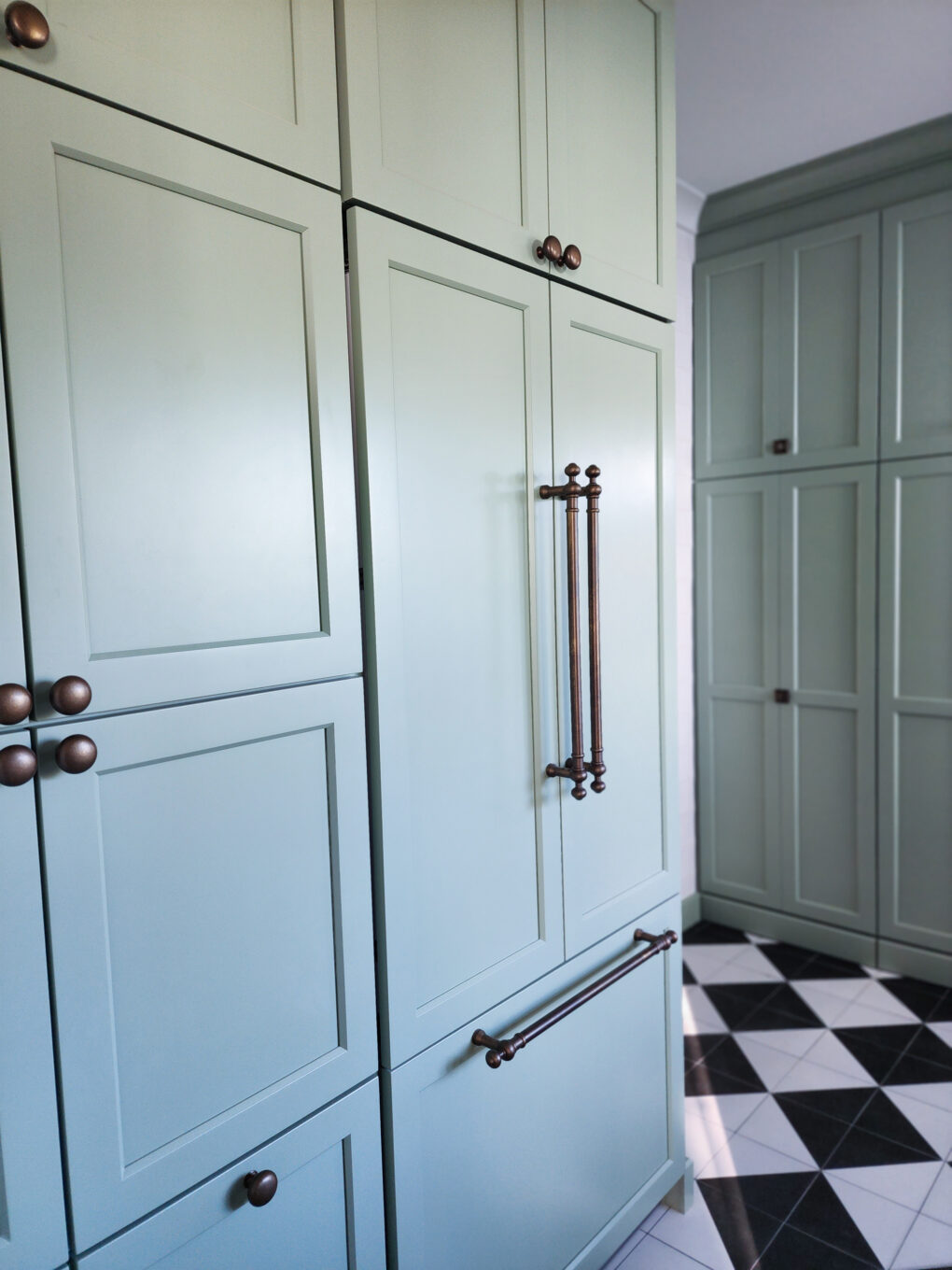
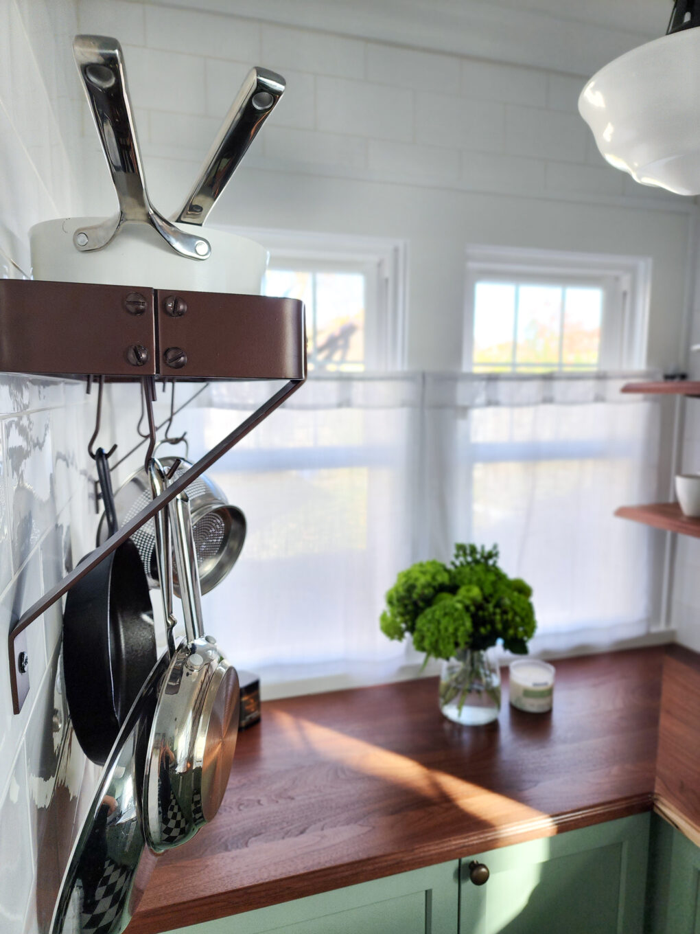
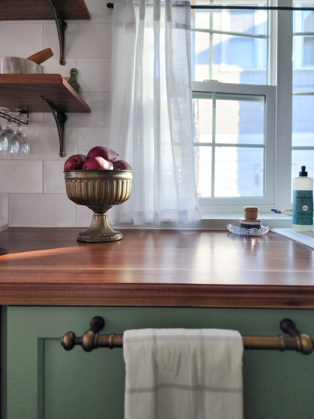
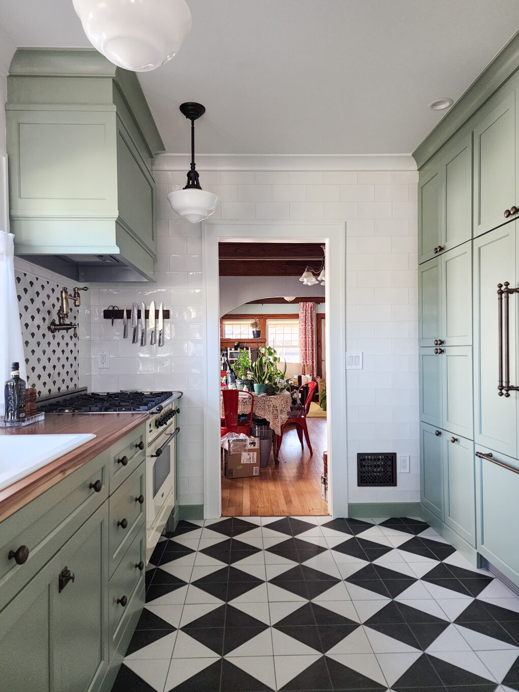
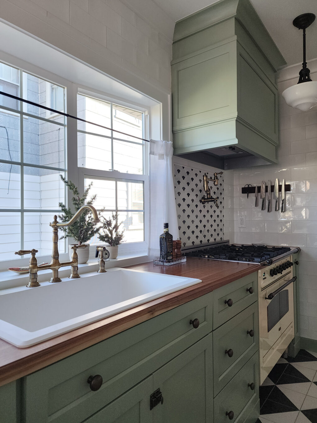
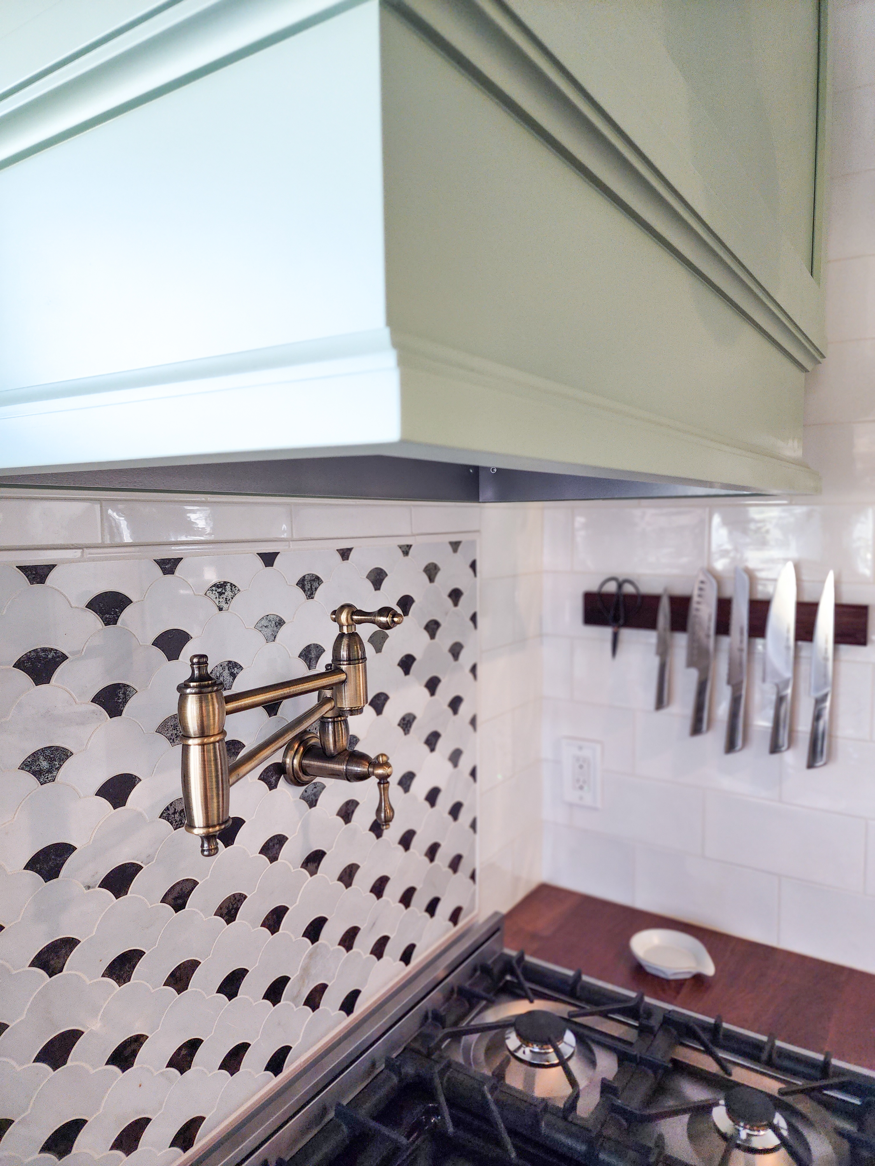
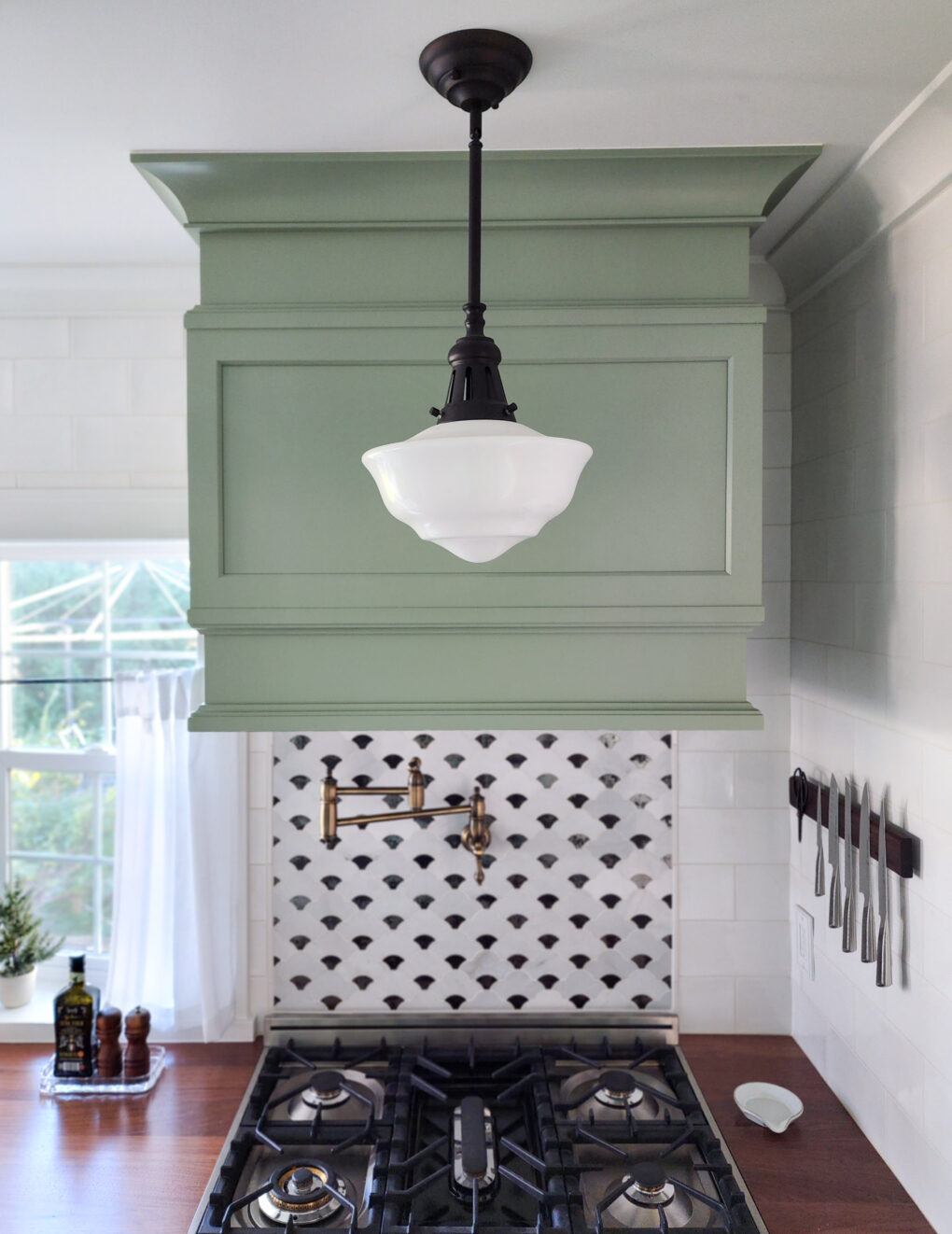
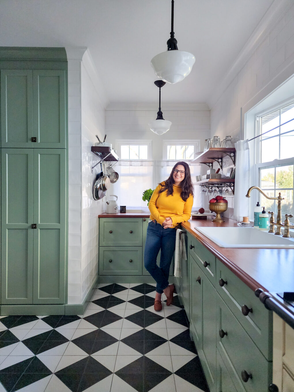
The goal was to keep things bright but also use lots of color and warm tones. I initially chose a powder blue for the cabinetry, but the client wisely pivoted to a sage-y green on second thought. We carried over the black and white details from the original kitchen in the flooring and backsplash and sourced deep walnut butcher block countertops for contrast and old world charm. We also decided to balance the cool cabinets with rich warm tones, bronzes and antique brasses, for the hardware and lighting.
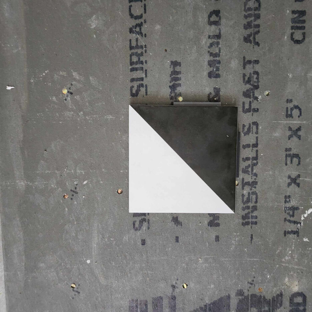
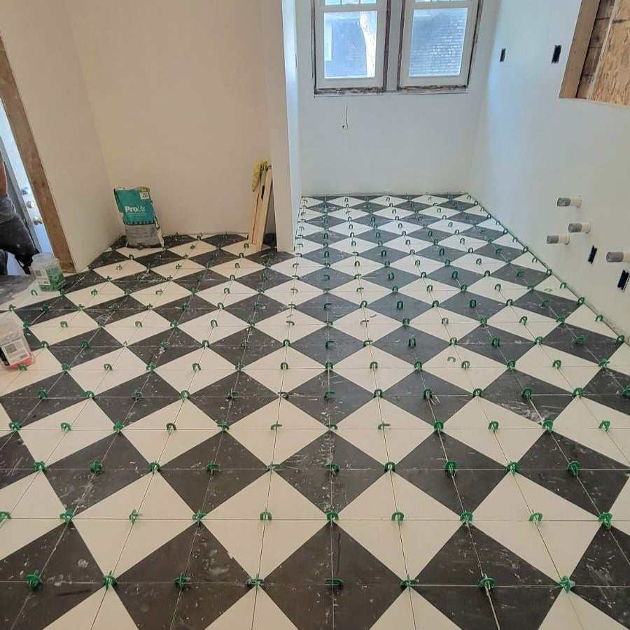
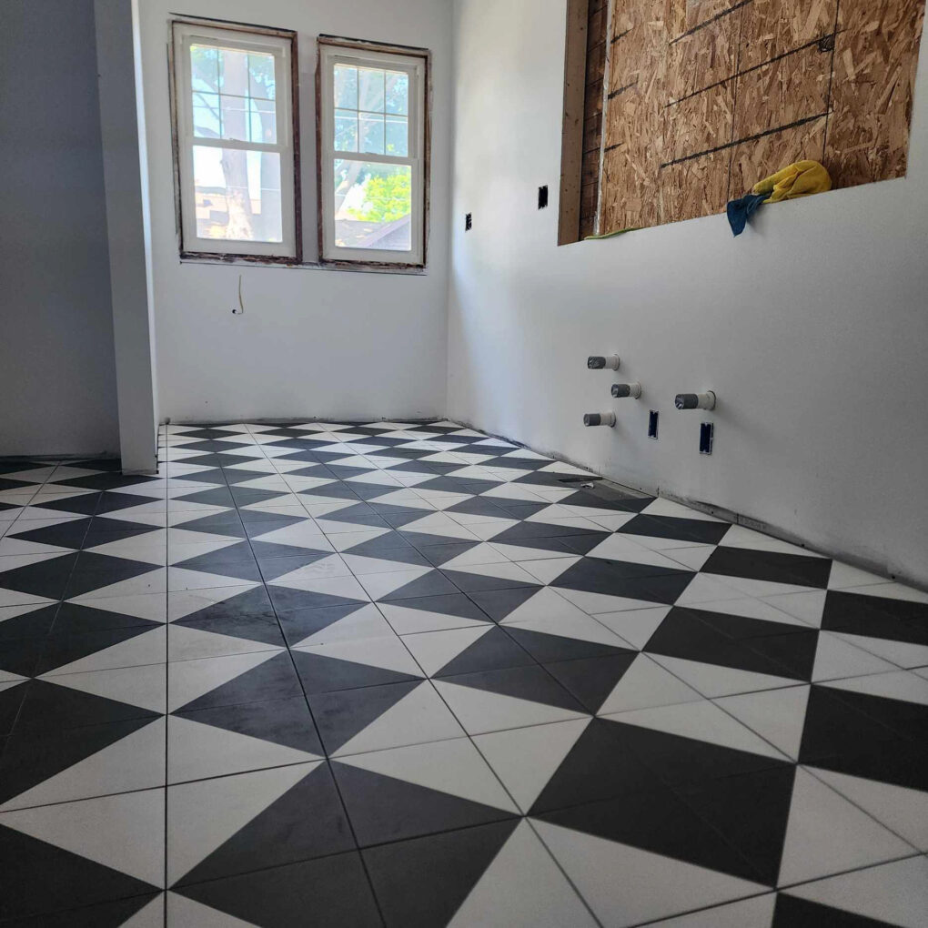
The floor is an outdoor-rated (durable) matte porcelain tile that maintains the checkerboard pattern from the previous floor but with larger squares that are oriented on a diagonal for a more interesting overall effect. It was grouted in dark gray for cleanability.
We landed on some pendants with traditional details and filled them in with recessed fixtures to make sure there were options and adequate lighting in the various workspaces.
In the old refrigerator spot in the back hall, I designed a custom cabinet configuration for a dog station. The small bottom drawer pulls out for food and water bowls and the larger drawers are for food/toys/etc. There’s more open shelving on the wall above, to store small appliances, cookbooks, vases, and any other display items.
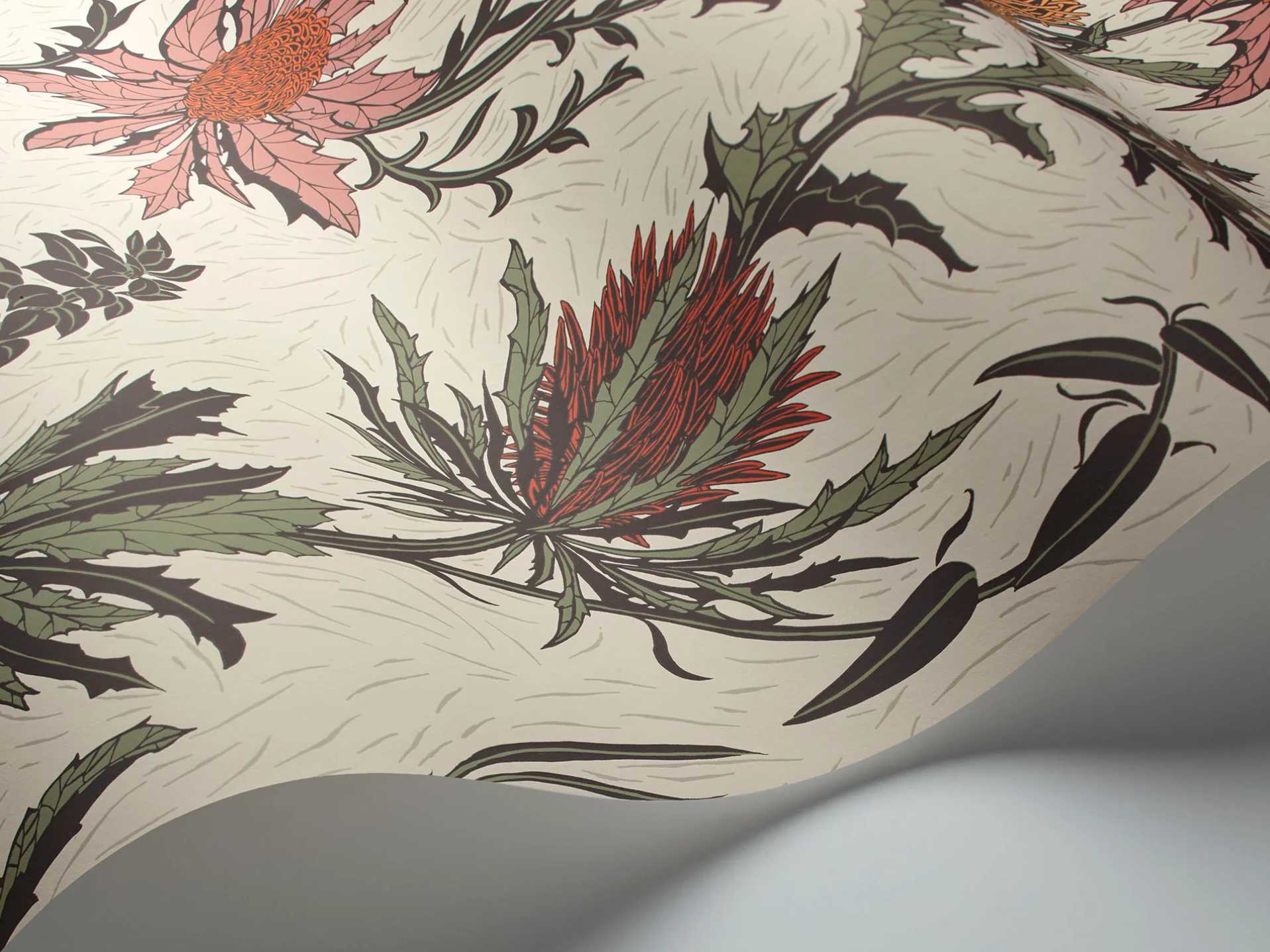
The wallpaper was a saga. I do not blame the client for finding it difficult to narrow down a pattern from the 20 gazillion options. To be honest, even as a designer, this is the hardest finish to source. The options are actually too limitless and if you don’t have something very specific in mind, you can easily get lost in the wallpaper wilderness. In this case, we wanted something with a vintage feel that also tied in the cabinet color but introduced some more accent colors. We were leaning towards florals, but nothing too sweet or poppy. We went all over Tarnation (the internet) looking for the perfect one and we landed on one of our first picks, of course.
All the cabinets, countertops and shelves were custom-made and installed by the same amazing local company. It was the best option, given the non-standard ceiling height and our wacky storage ideas. They did a phenomenal job with the storage and details.
The original footprint had a non-negotiable wall that jutted out next to the old sink. We utilized it with a shallow spice cabinet in front to appear flush with the rest of the cabinets on that wall. The client’s spice collection is the stuff of dreams, so it was warranted. There’s a pantry with a trash pullout to the right of that with a paneled fridge and a cabinet above it.
The counters and shelves are walnut with a decorative ogee edge to them feel more traditional and less rustic or farmhouse than a flat edge. I think that little detail made a huge difference.
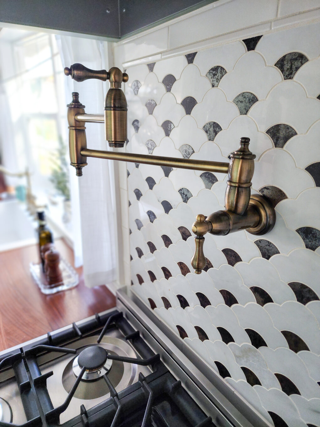
We used a jumbo white subway tile installed all the way to the ceiling for a really rich look. The larger size makes the room feel grand and also minimizes grout lines. We also landed on a marble mosaic feature tile above the range with a little bit of an iridescent glimmer. It serves to frame the pot filler, which was on the client’s must-have list, and anchor the custom hood.

One practical way to make the kitchen feel older was hiding the modern appliances (dishwasher/ microwave/ fridge).
The client fell in love with a gorgeous antique white range that feels both historical and brand new and is pretty much the star of the whole show, if you ask me.
The team did an amazing job of implementing the shared vision, working in all the details, and adjusting to changes along the way!
The Results
🌻🌻🌻
This collaboration was probably my favorite to date. The client’s vision and trust and the unbelievable work, problem-solving, and craftsmanship from the multiple skilled contractors along with my scribbles and hare-brained ideas culminated in a beautiful kitchen that still has elements of its former self but is now flourishing in its potential.
Many Thanks!
Shout out to the folks who made it happen:
Beth Pramme, client extraordinaire!
Scott Hanson
Don and Nick
Scott Goebel
Jim at Conscious Decorating
🌷 Check out my socials for some fun videos of this project! 🌷