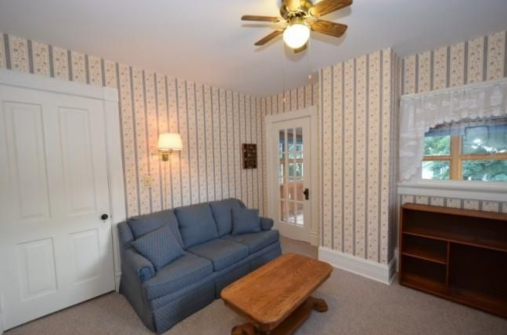
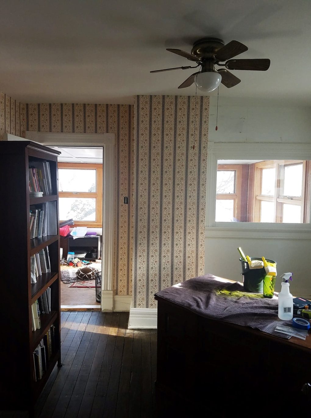
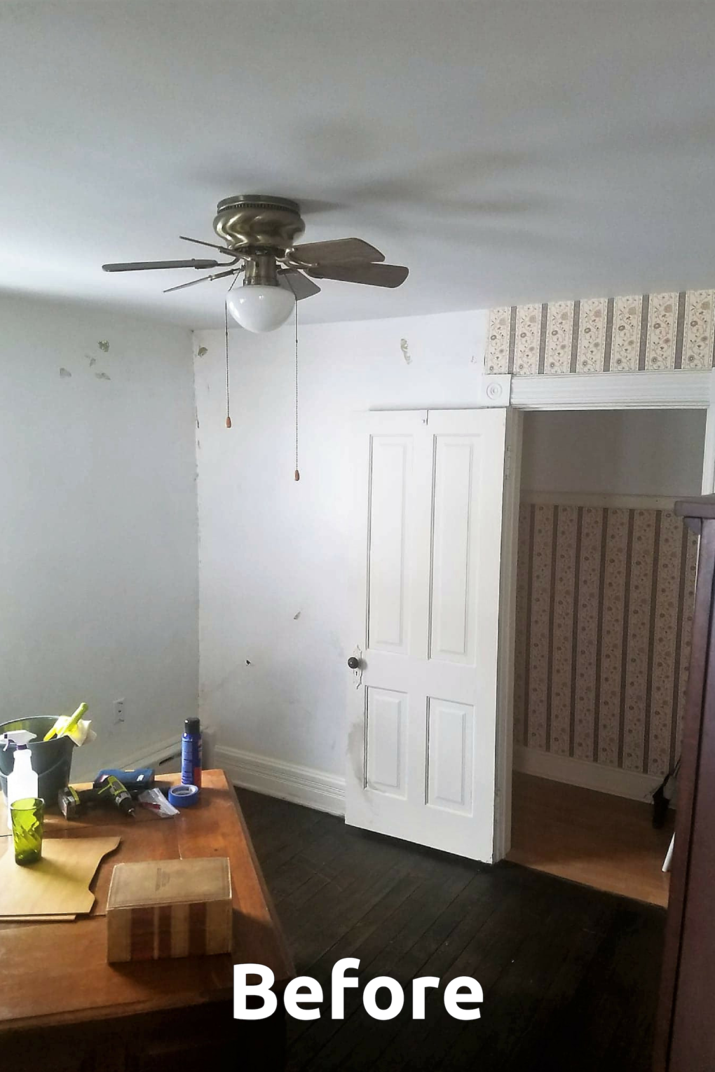
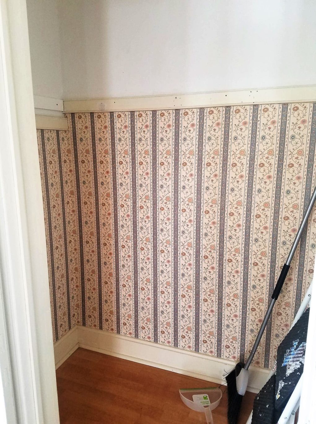
When I sat down with my husband, Nick, to talk about what he wanted out of his new office, I wasn’t prepared for his casual shrug. He has so many interests and so much personality. He’s funny and active and loves music and the arts and is passionate about social justice and his community. The list goes on. How could somebody with such passion have nothing to pull from, no ideas of what parts of themselves they want to pay tribute to? Afterall, this room had gone basically unused aside from collecting crap and holding a gigantic desk that was as swaggerless as it was unhelpful with all its tiny drawers. There was 90’s floral wallpaper everywhere (even in the damn closet) and the worlds smallest ceiling fan which had never been turned on.
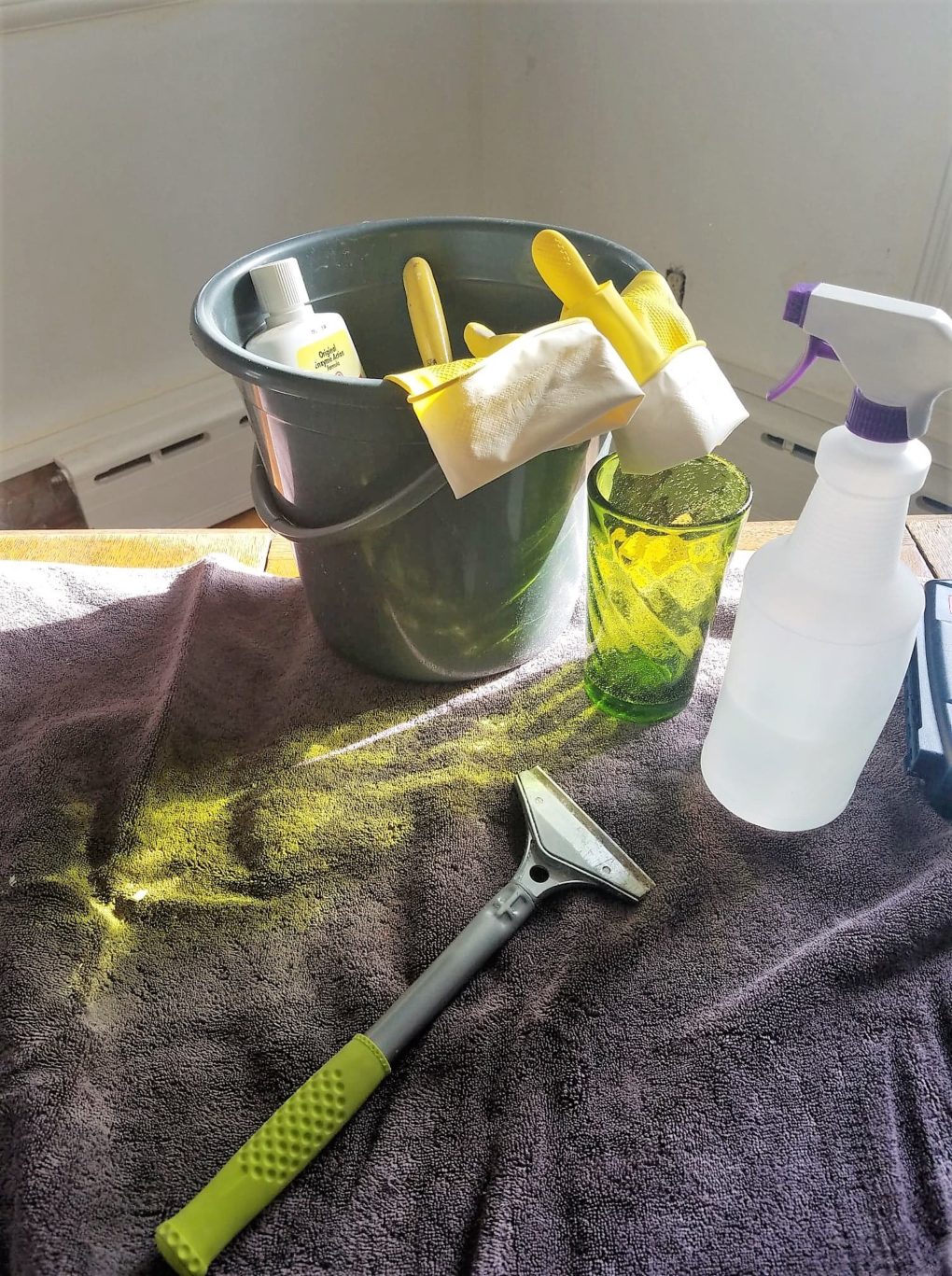
The first official step involved three weeks of elbow Grease. 
Scraping, cleaning, spackling, sanding, caulking, prepping, drinking…
Nick would be the first to say he doesn’t care about design… he could work in a box and not think twice but I challenge that notion. Maybe it’s true that the ugliness and datedness of the room didn’t bother him but the lack of function did. And ultimately, it’s the reason I never once found him click clacking away on his laptop in that room sandwiched between boxes of photos and lamps that needed new shades.
Ordinarily, with such a dud client I would probe deeper, ask more questions until I got a fuller picture. “What will you do in here?” “How do you want to feel when you walk into this space?” I’d ask for some photos of spaces they like and survey them about colors, their loves and hates. But after almost 15 years with the man, I’m pretty sure I got this. And if I’m being honest, I was probably relieved to have free rein. My half – assed questionaire was more of a formality. 😉 (Where my married people at?) #goodasswife
So I got to work.
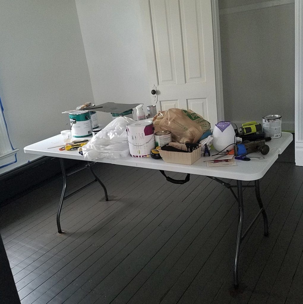
The chaos before the cuteness…
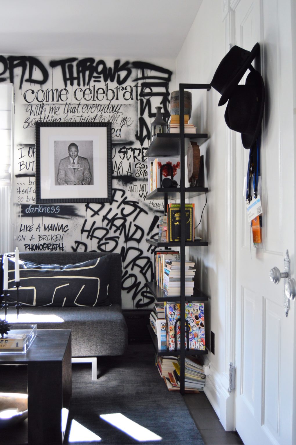
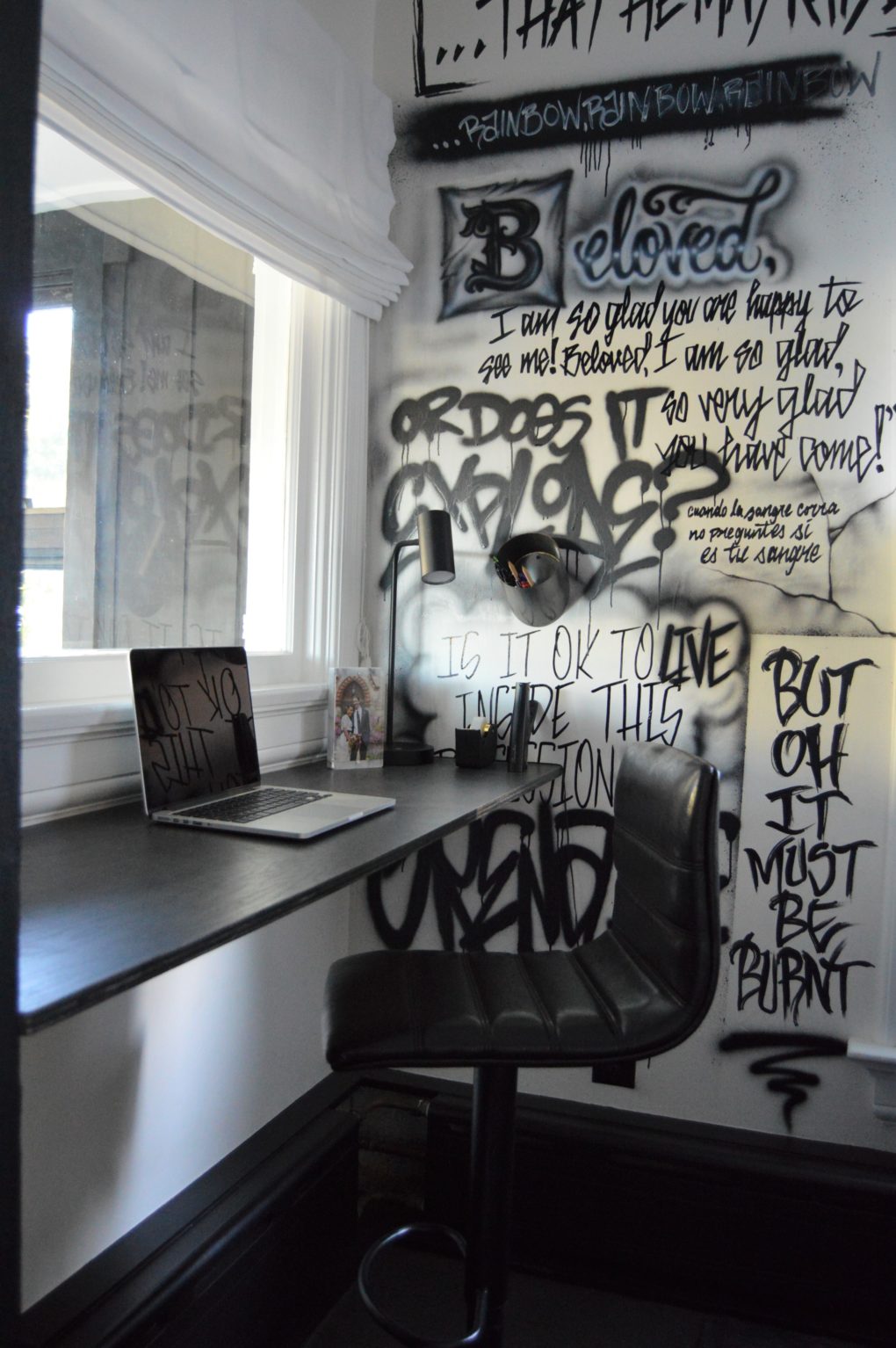
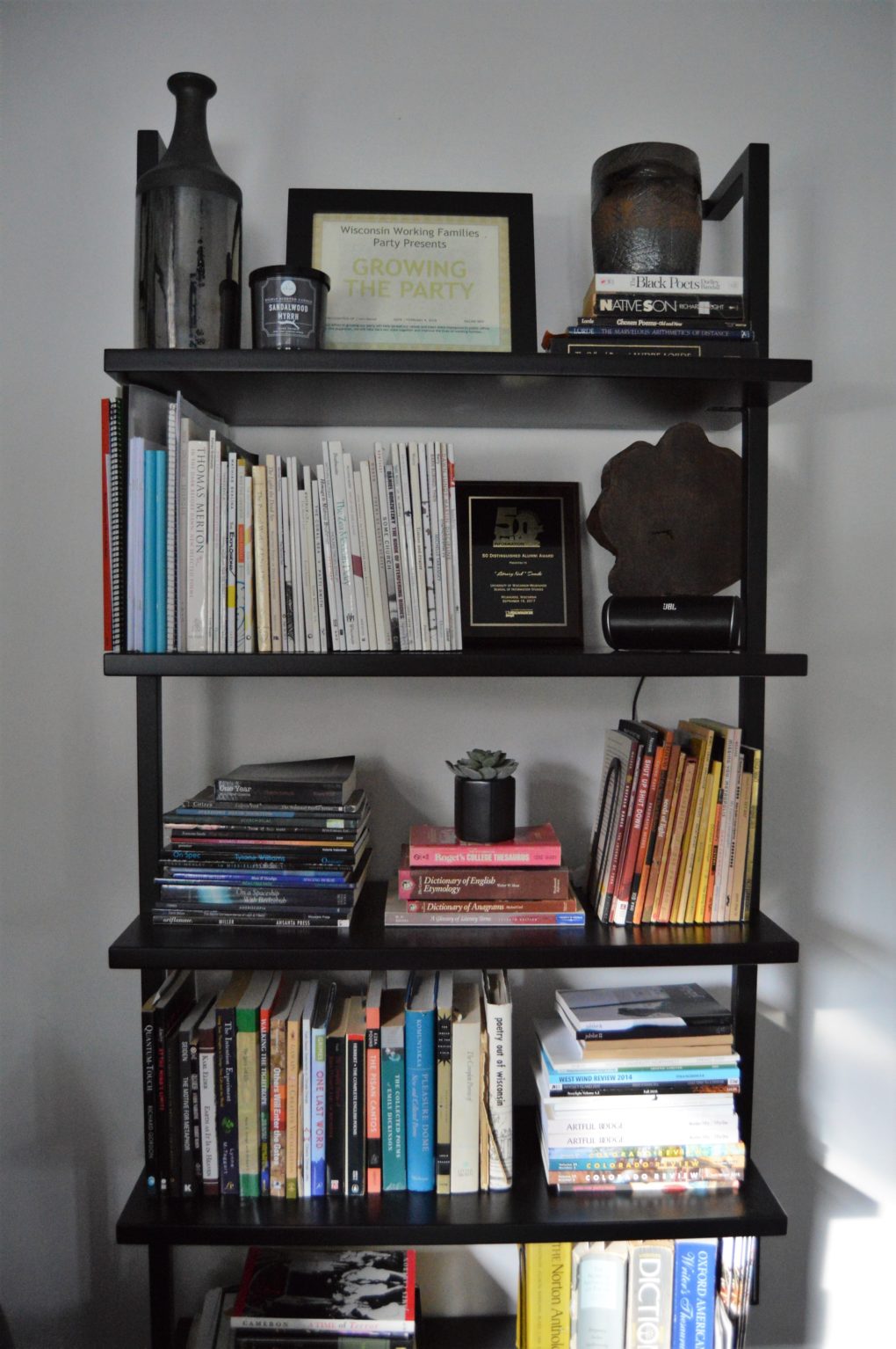
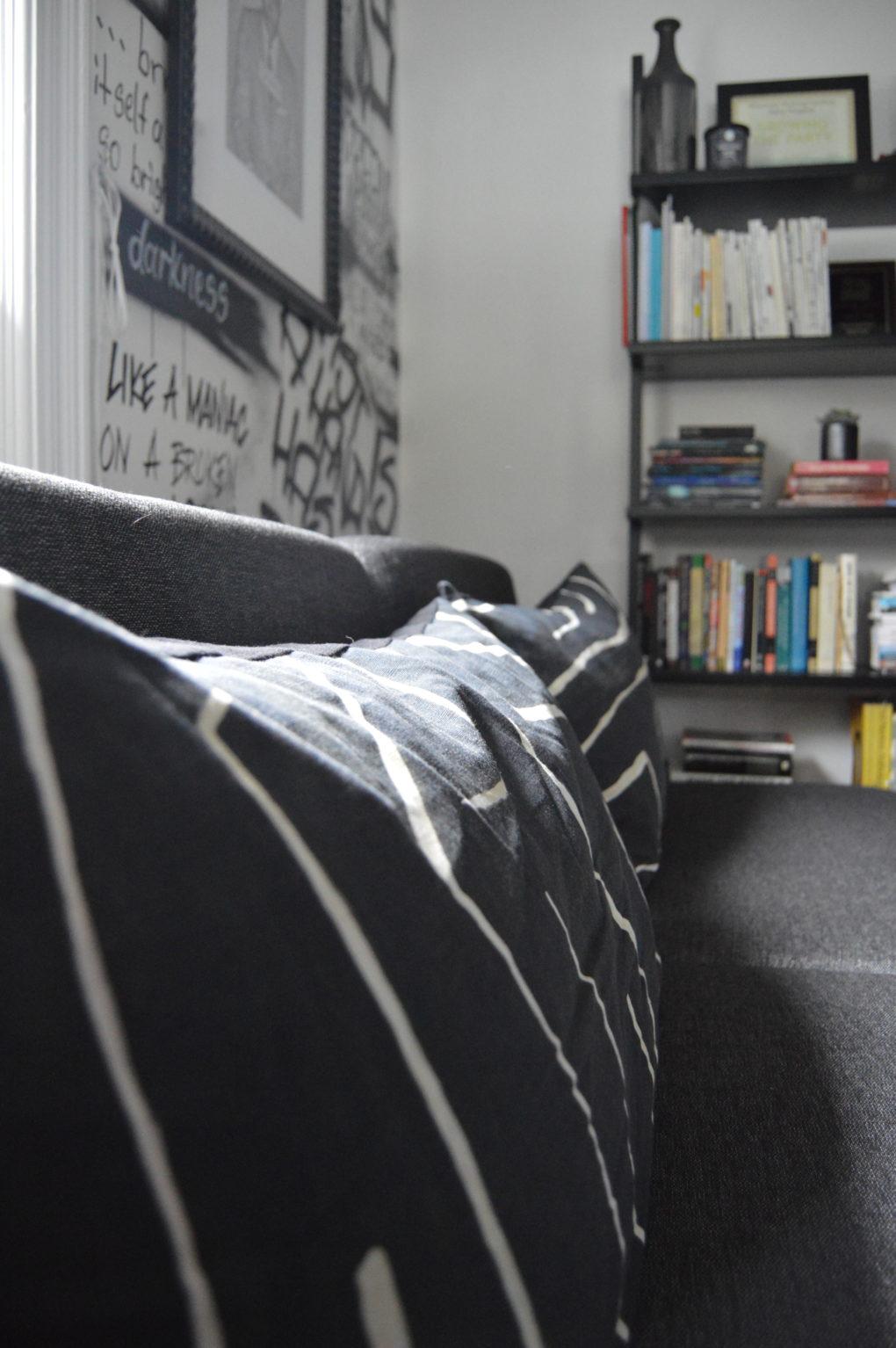
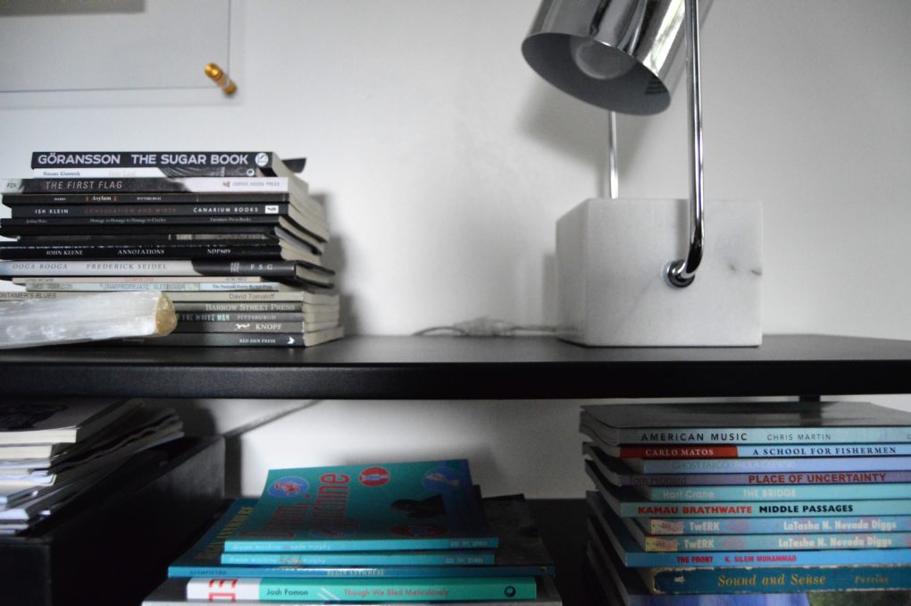
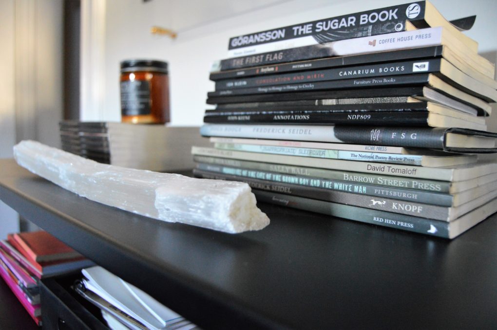
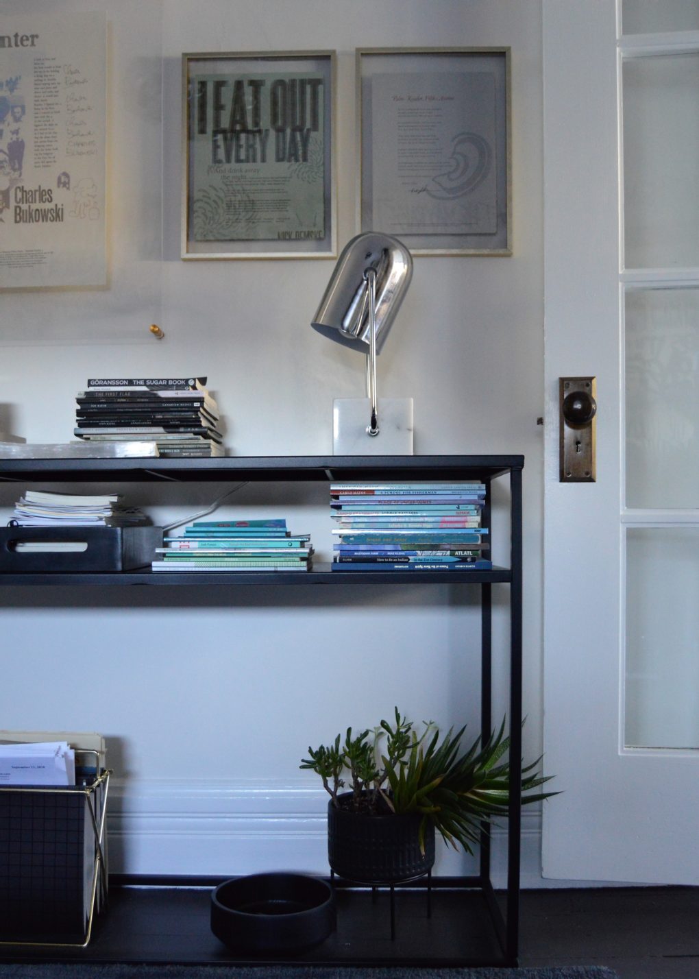
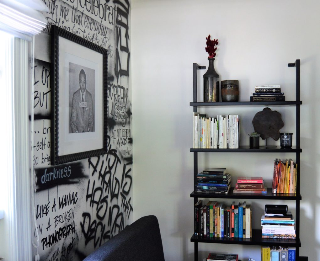
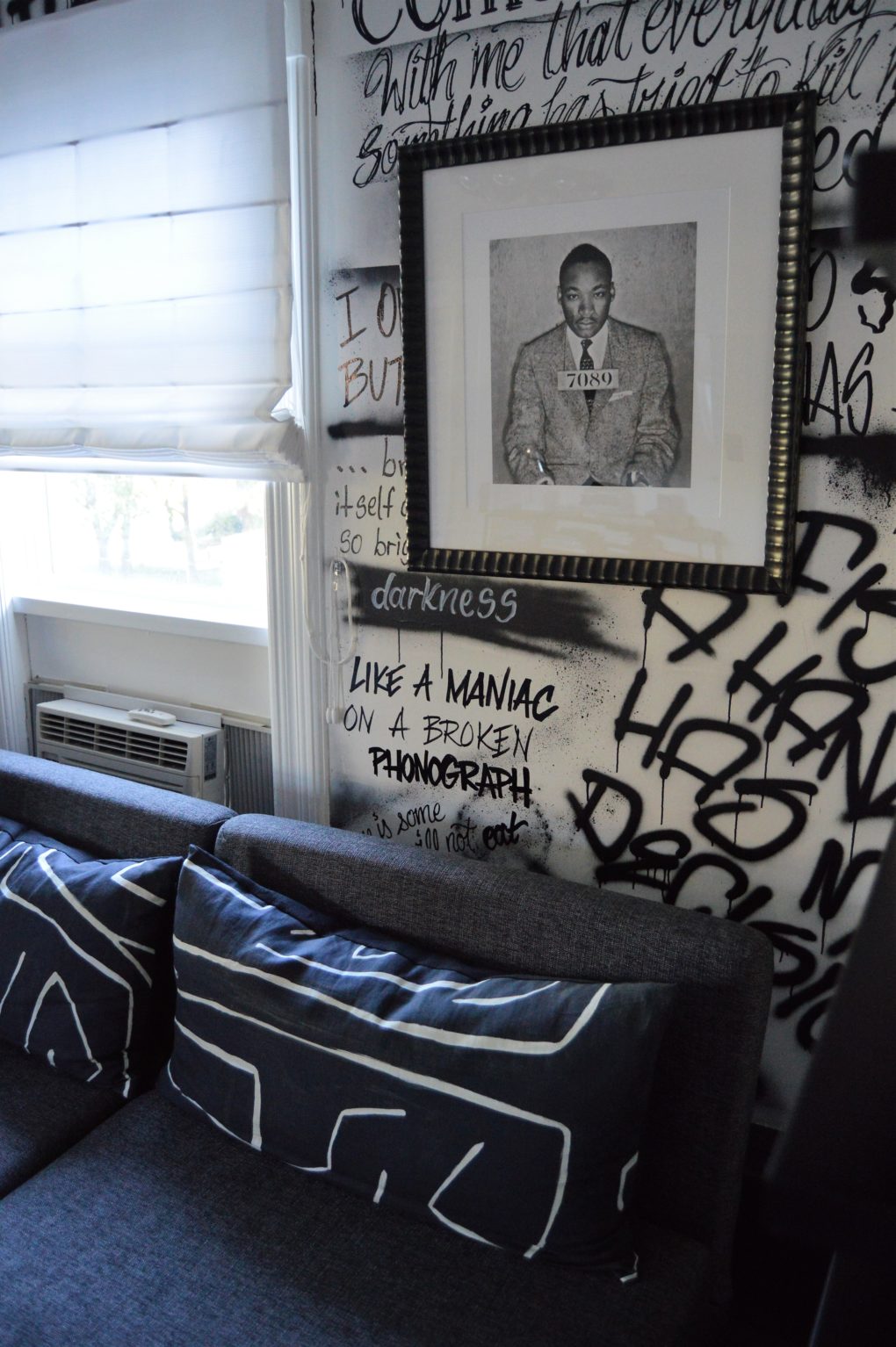
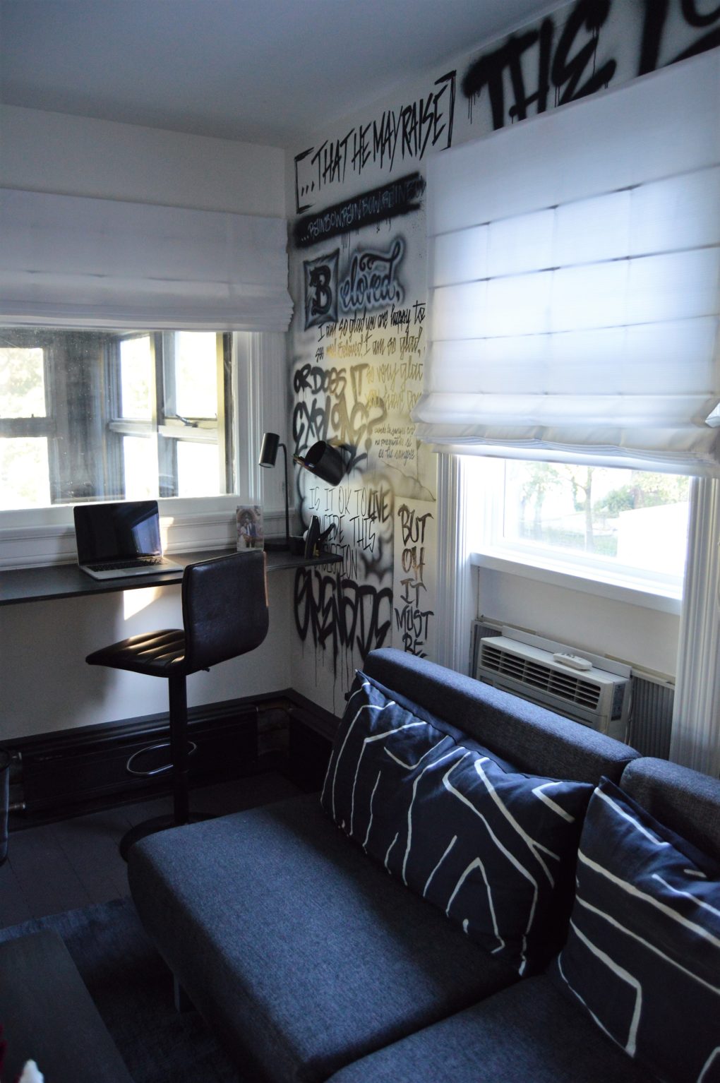
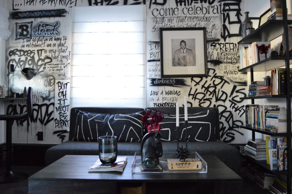
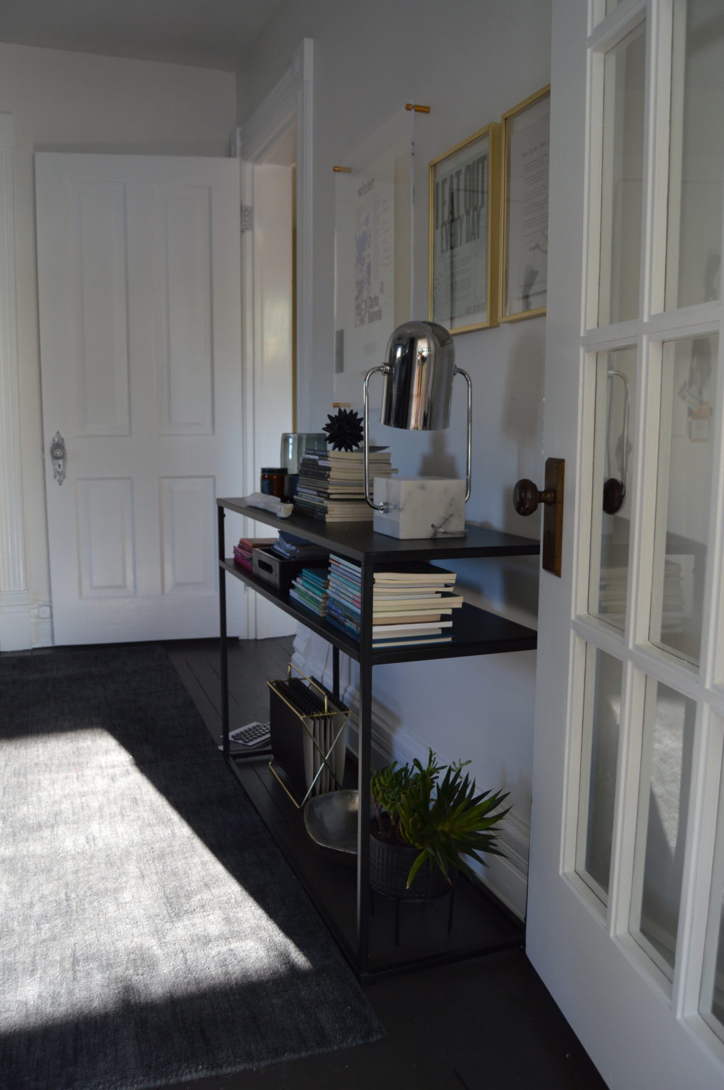
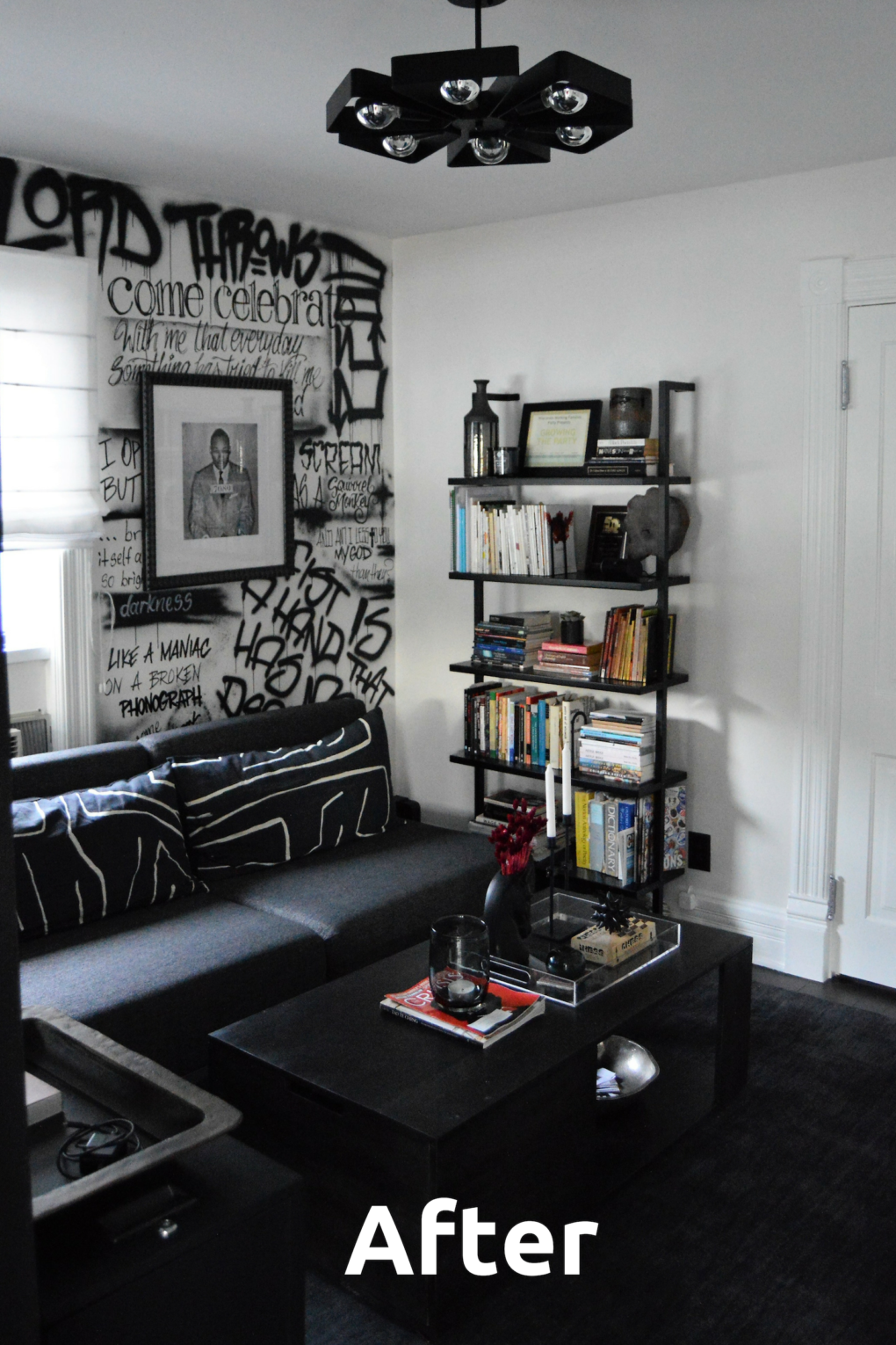
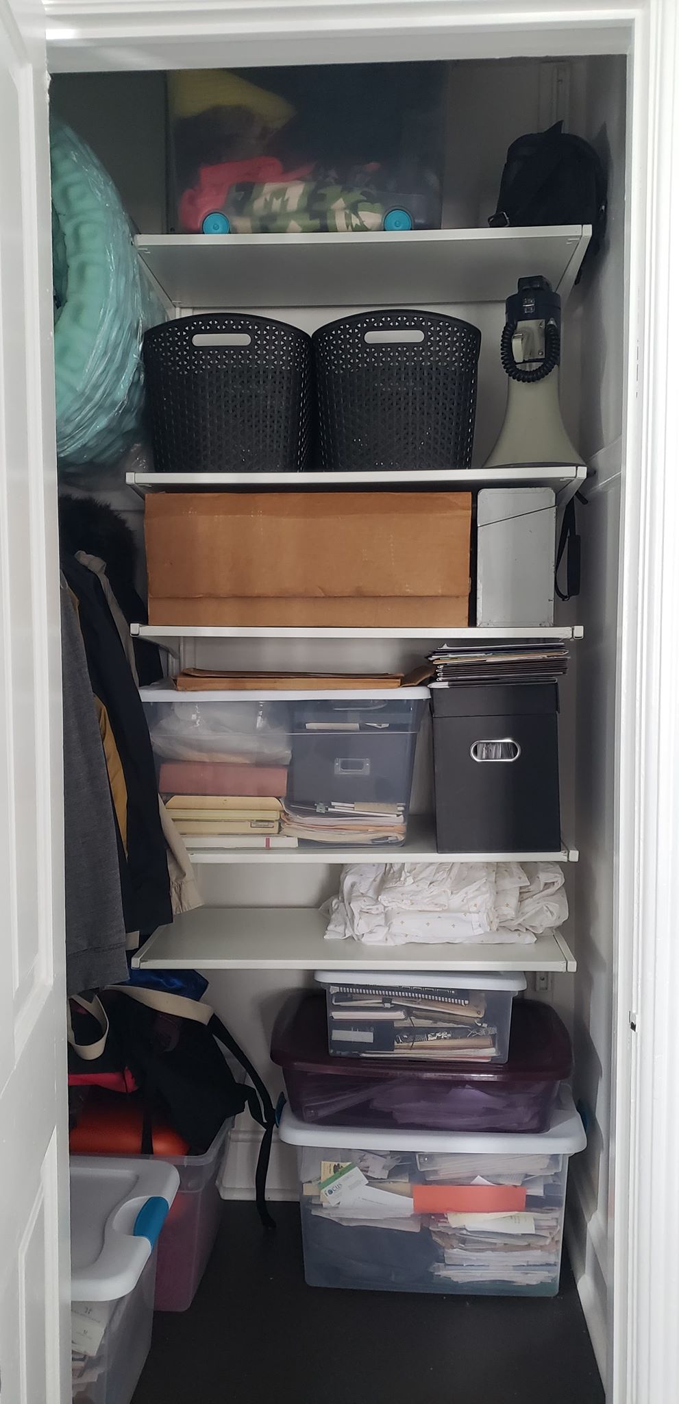
Nick didn’t want a desk at all. He likes to sit on something comfy to work. So I got a fold out sofa because we want the room to be able to morph into a guest room. He has a standing desk at work that he likes so I built a counter height “desk” with a piece a plywood that faces the window with the view. He can stand or use a stool. He needed book storage. He needed file storage. He needed hidden storage. (Actually I needed him to have hidden storage for the daily pieces of paper, business cards, weird event swag, etc that he amasses and leaves in shitty piles throughout the house.)
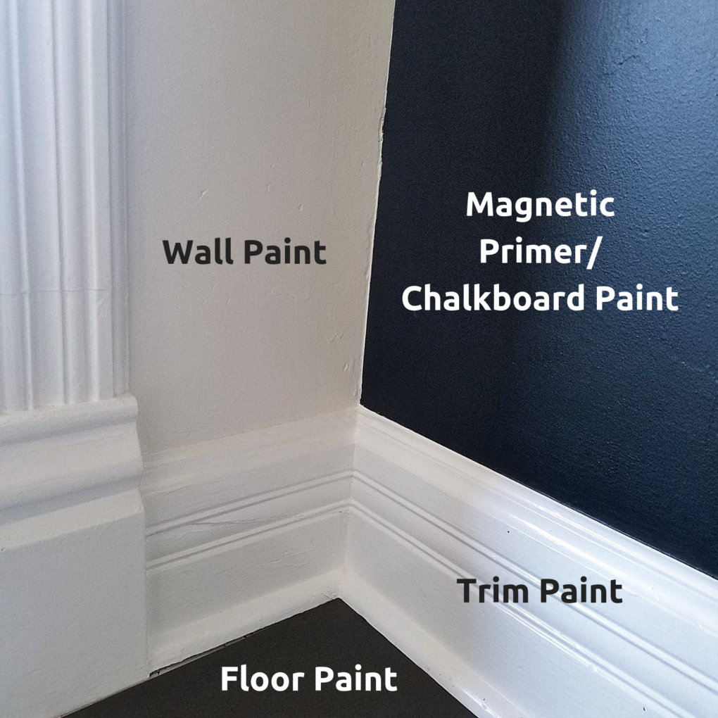
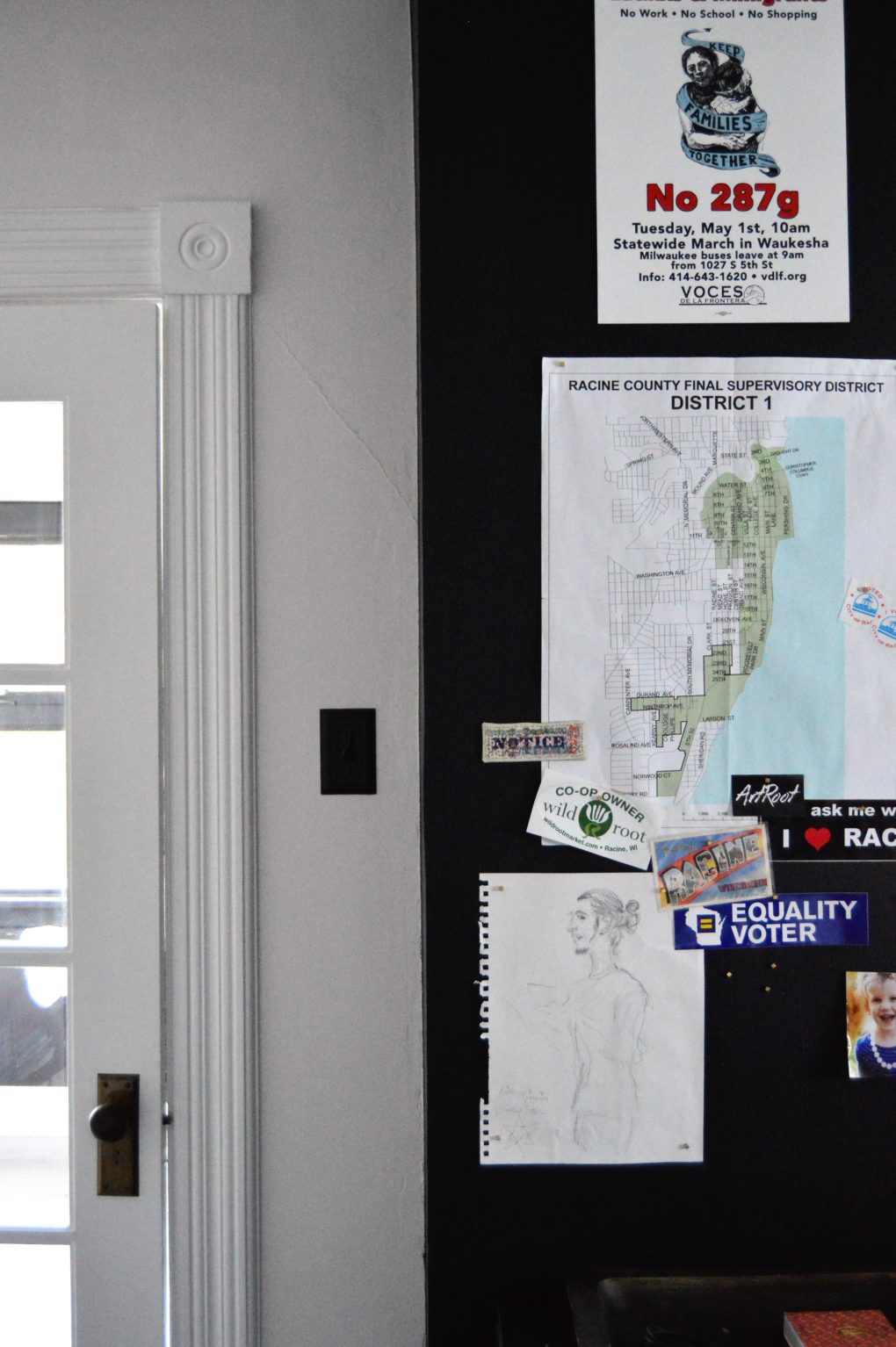
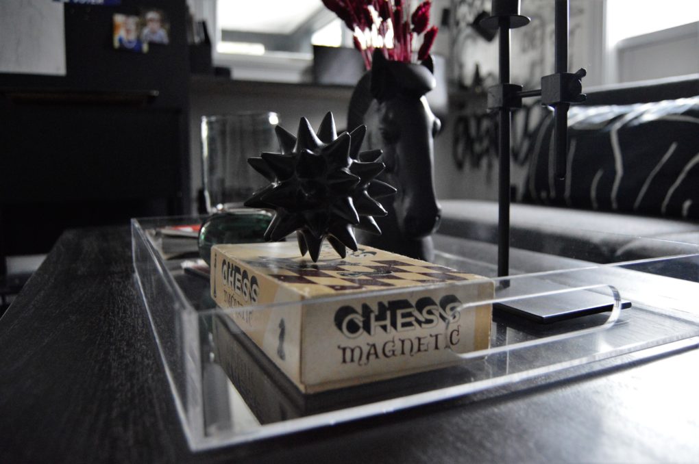
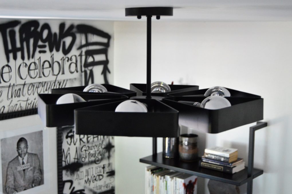
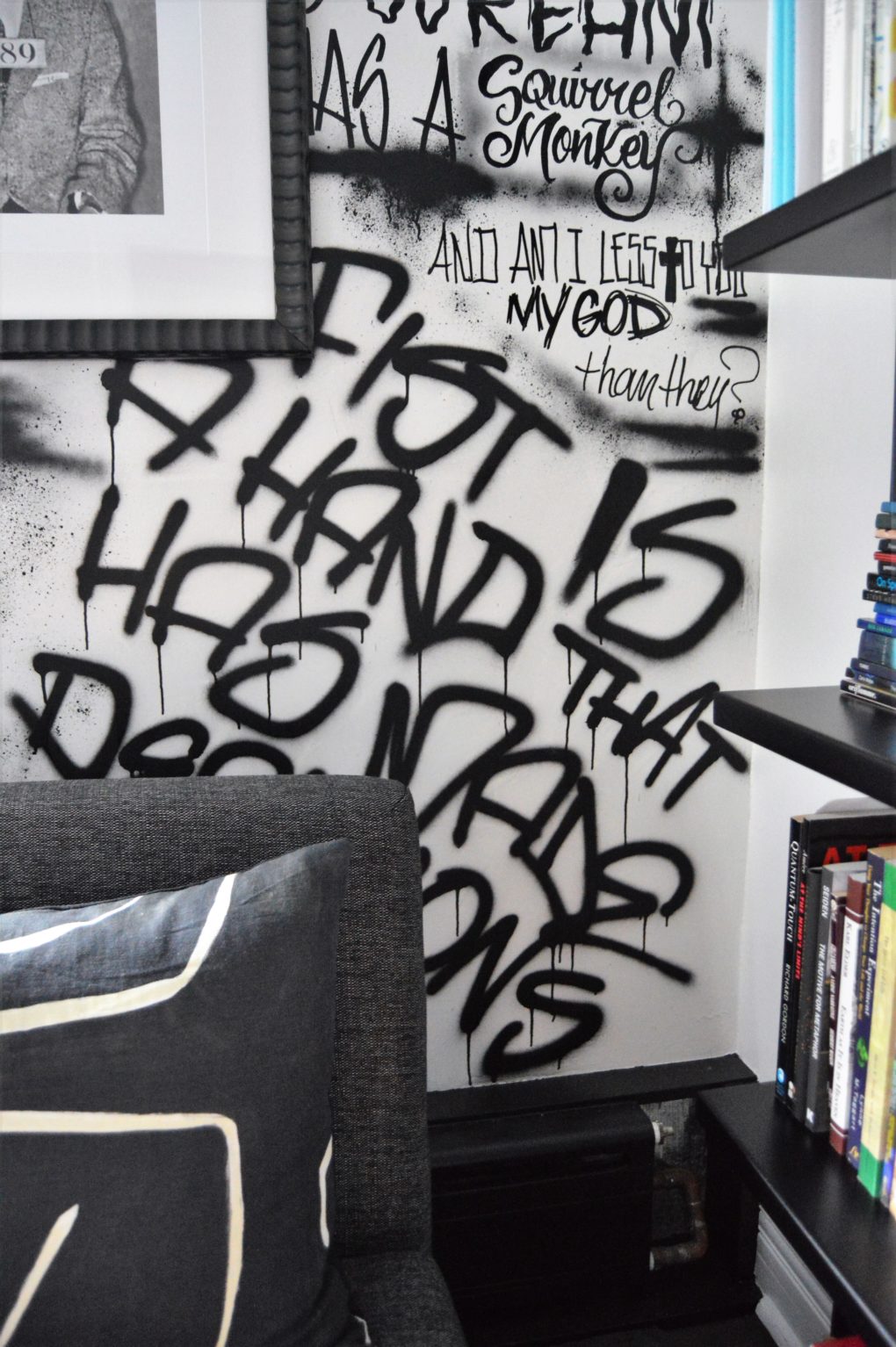
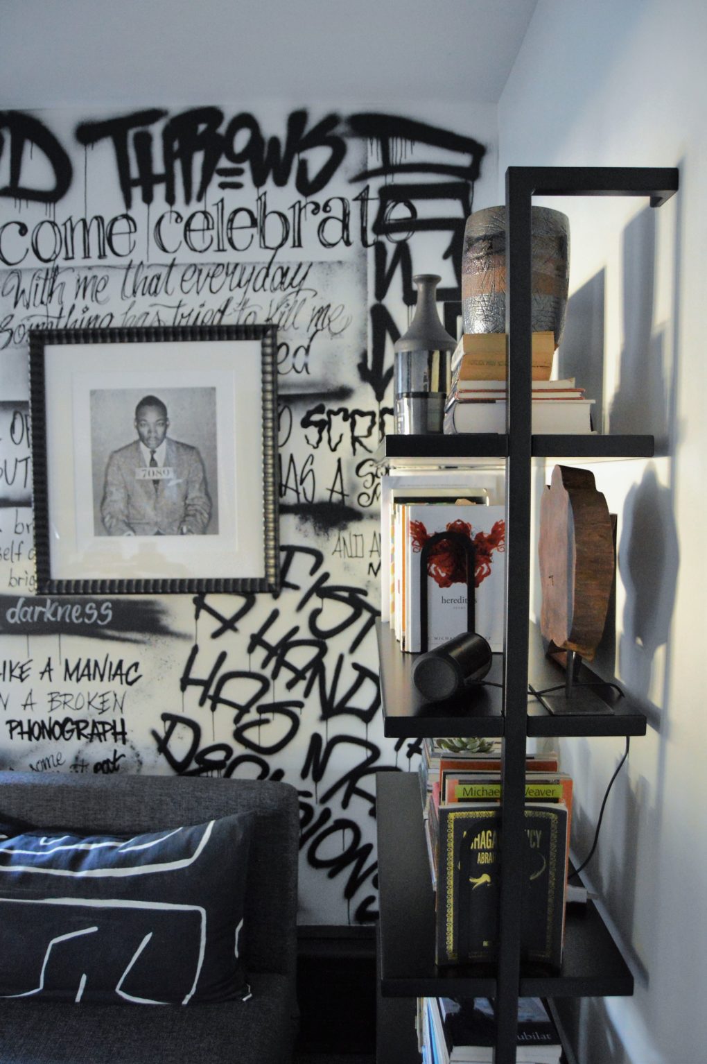
And the rest was personal. A print of his hero, a reminder that the hard thing is often the right thing, a wall mural done by a friend and paying tribute to his favorite poetry (If you missed my previous post with the 411 on the mural, check it out here.) framed poetry broadsides and a magnetic wall to display meaningful community momentos … all of it done with intention, thought and love. This is what design is to me. It’s not about making Pinterest- pretty spaces. It’s about seeing yourself reflected in your built environment and finding ease in your spaces where your mind’s work and your body meet.
Nick absolutely loves his office and brings it up all the time when he’s working in there. It is not the office I would design for myself and that’s pretty much the point, isn’t it?
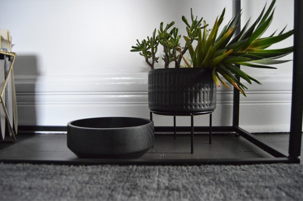
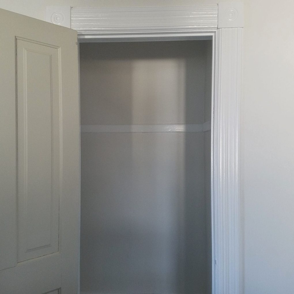
Perhaps the most boring and simultaneously most important piece of it all… a place for the junk!
Let me know what you think!
What parts of yourself would be included in your dream space?
What room in your house best reflects you right now?







Wow! I love all your work, Angela….but this workspace/office for Nick is absolutely amazing! I laughed when I read his initial shrug and can just picture his response. The room is so encompassing of your amazing schnookums and captures so much of his spirit. It is absolutely inspiring. You two are such perfection – in your individual endeavors and partnership. Love seeing what you do.
Absolutely inspiring use of heart, color, texture and ‘need.’ I enjoyed the original blog on the graffiti, enjoyed reading the poetry and why it was chosen. (Never would have guessed that John Donne was a favorite of Nick’s.)
In my opinion, you should submit this makeover to one of the biggies (NYT, ArchDigest?). So creative, so beautiful and gutsy. How many rooms are so uniquely personal even as they are works of art that everyone can appreciate? This is the first I’ve seen, and I follow a few magazines purporting personal design; most of it is interchangeable and hardly personal at all.
Thank you so much for such thoughtful feedback and for the suggestion. It means the world. Honestly, I’m just happy I’m not blogging into the void. lol. You are appreciated. Happy New Year!!!