My sweet friends Steve and Bridget’s house has everything a house needs. It is welcoming and filled with love and laughter. It is tidy and comfortable and built on memories. But they were ready for an update. I’m not saying the family room and dining room were stuck in the 90’s but they did make me want to curl up with some Pizzarolls and pop on some TGIF.
Bridget lead the charge on this makeover. She gravitates towards global prints and rich colors but we also had to incorporate the wood tones in the existing woodwork and trim. The two spaces are open to each other so the visual flow was important.
There are always considerations that make every client’s design goals specific to them. In this case, Steve was adamant about keeping the good ol’ vertical blinds so Bridget and I brainstormed ways to disguise them. They also have an adorably over-sized Golden Retriever, so dog hair mitigation was a factor in material choices. This meant the leather had to be hard to scratch, the rug had to be easy to vacuum and nothing could look too tasty. There was also a cherished reclining chair that I was tasked with incorporating.
I’ll take you through some of the things that weren’t working in the room and show you the solutions.
The Family Room
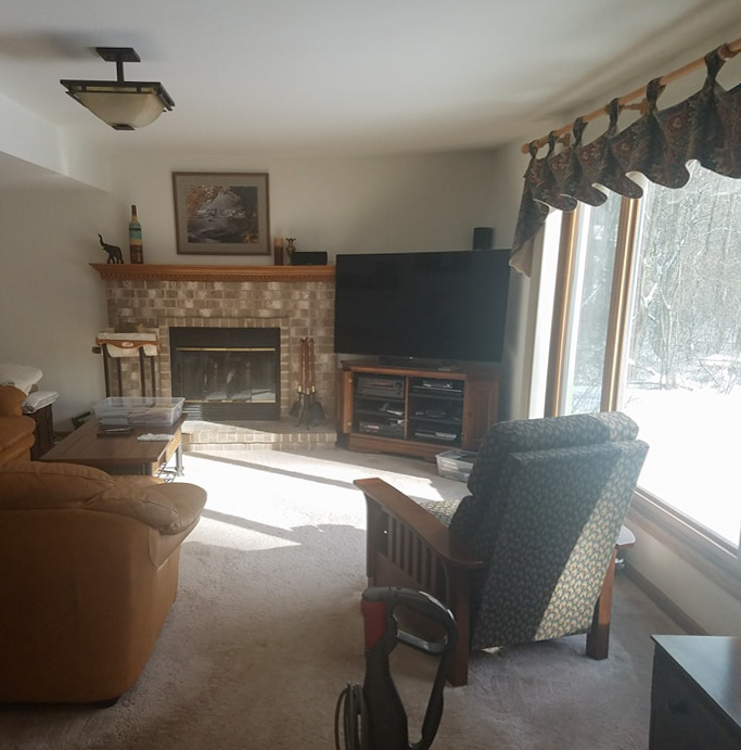
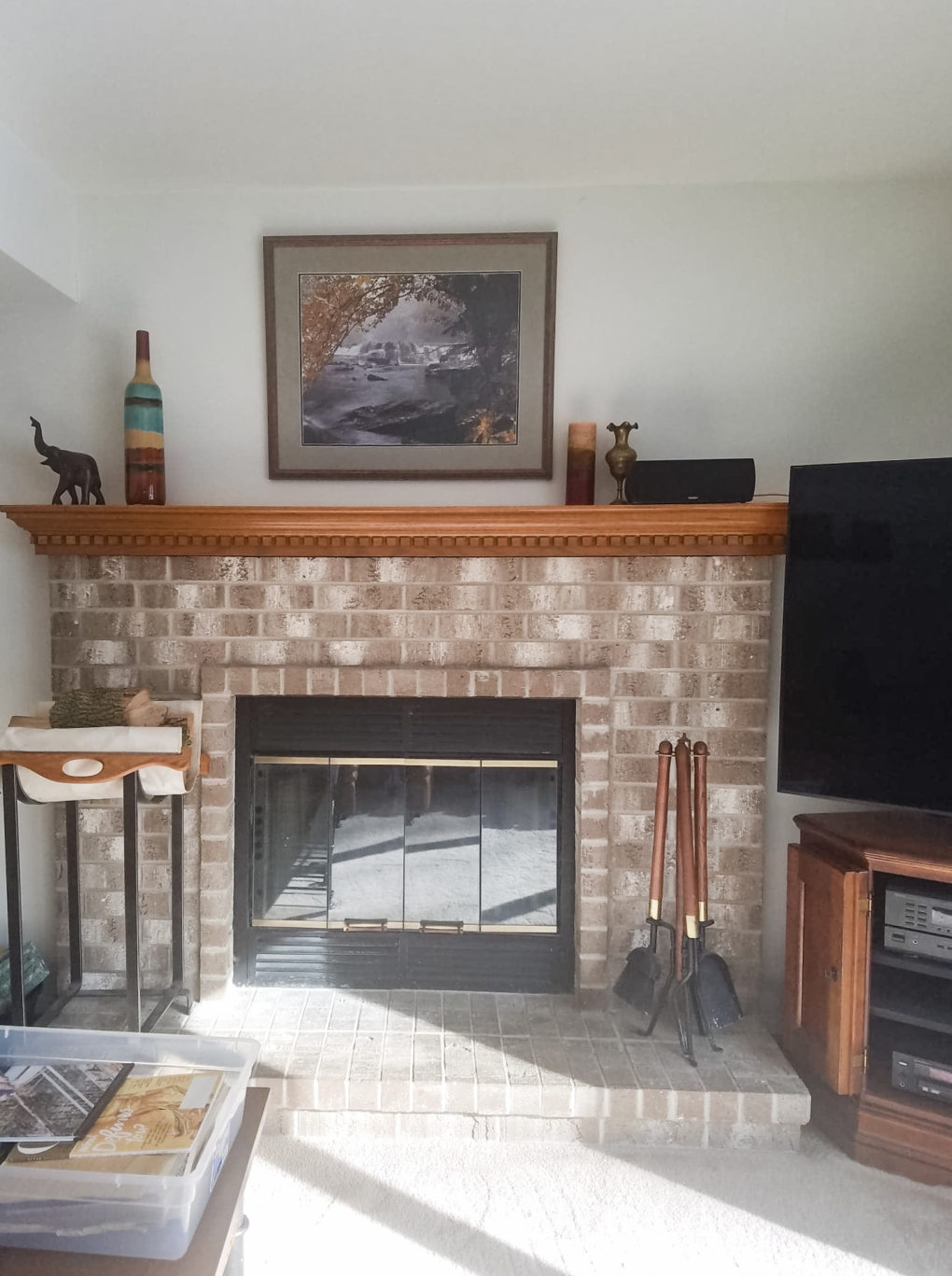
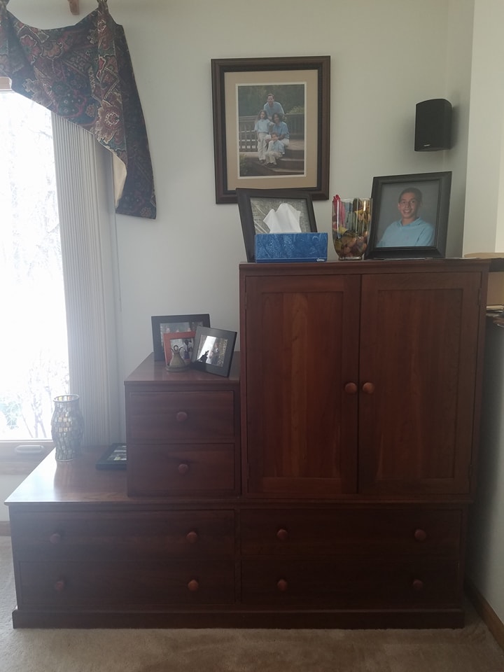
The issues:
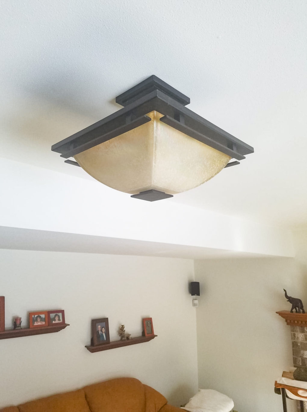
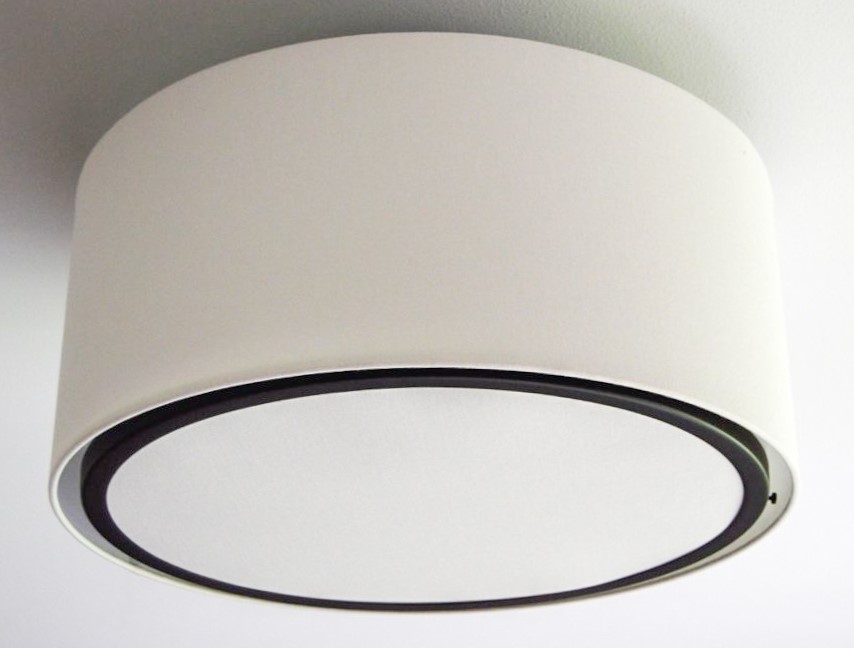
*The light fixture was too small for the room and was an uplight, which deflected most of the light to the ceiling.
*The window valances were “of a time” and did nothing to downplay the vertical blinds.
*The fireplace surround was busy and dated.
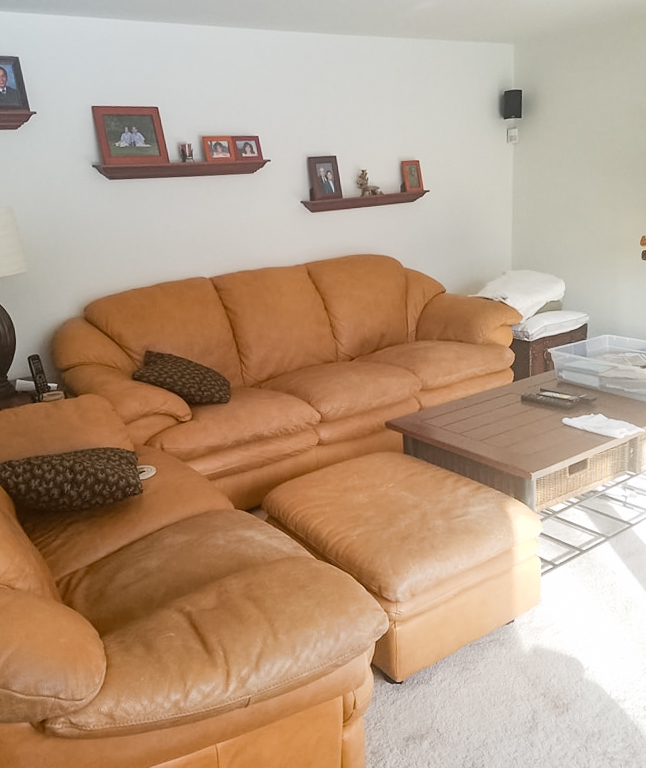
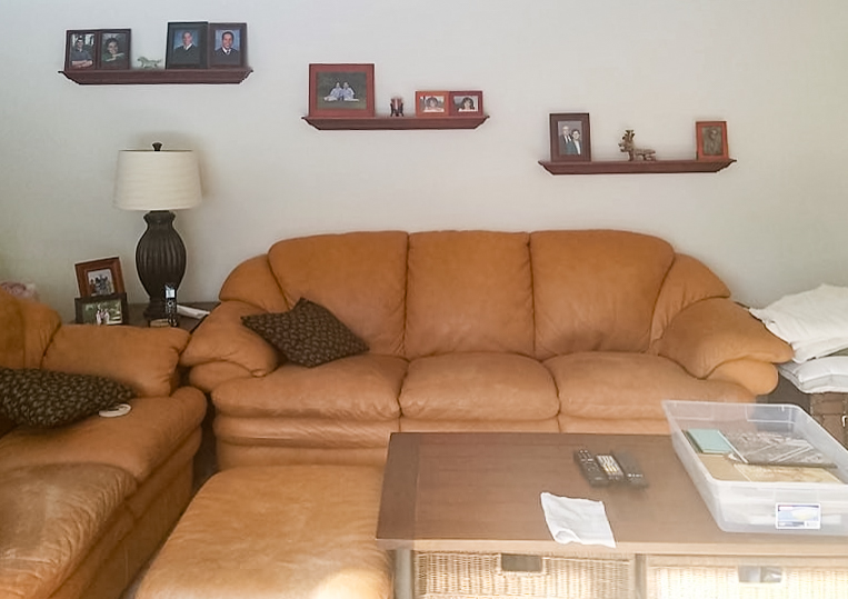
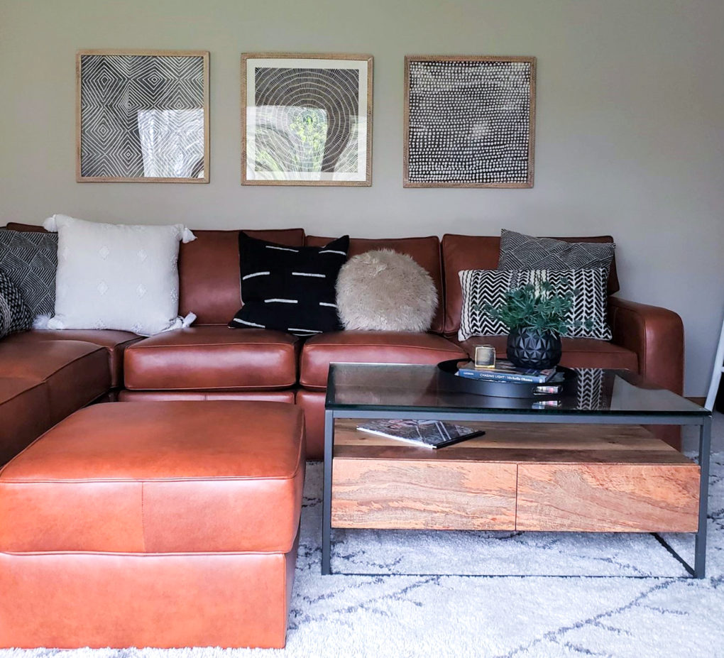
*The sofas were out of style and past their prime.
*The carpet was worn and had a little too much pink in it to be neutral.
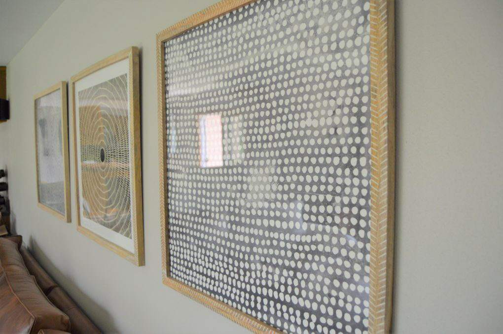
*The wall arrangement was too small for the scale of the wall.
The Plan
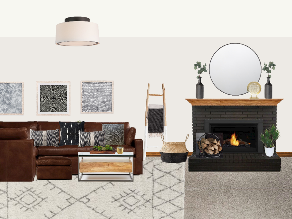
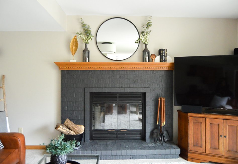
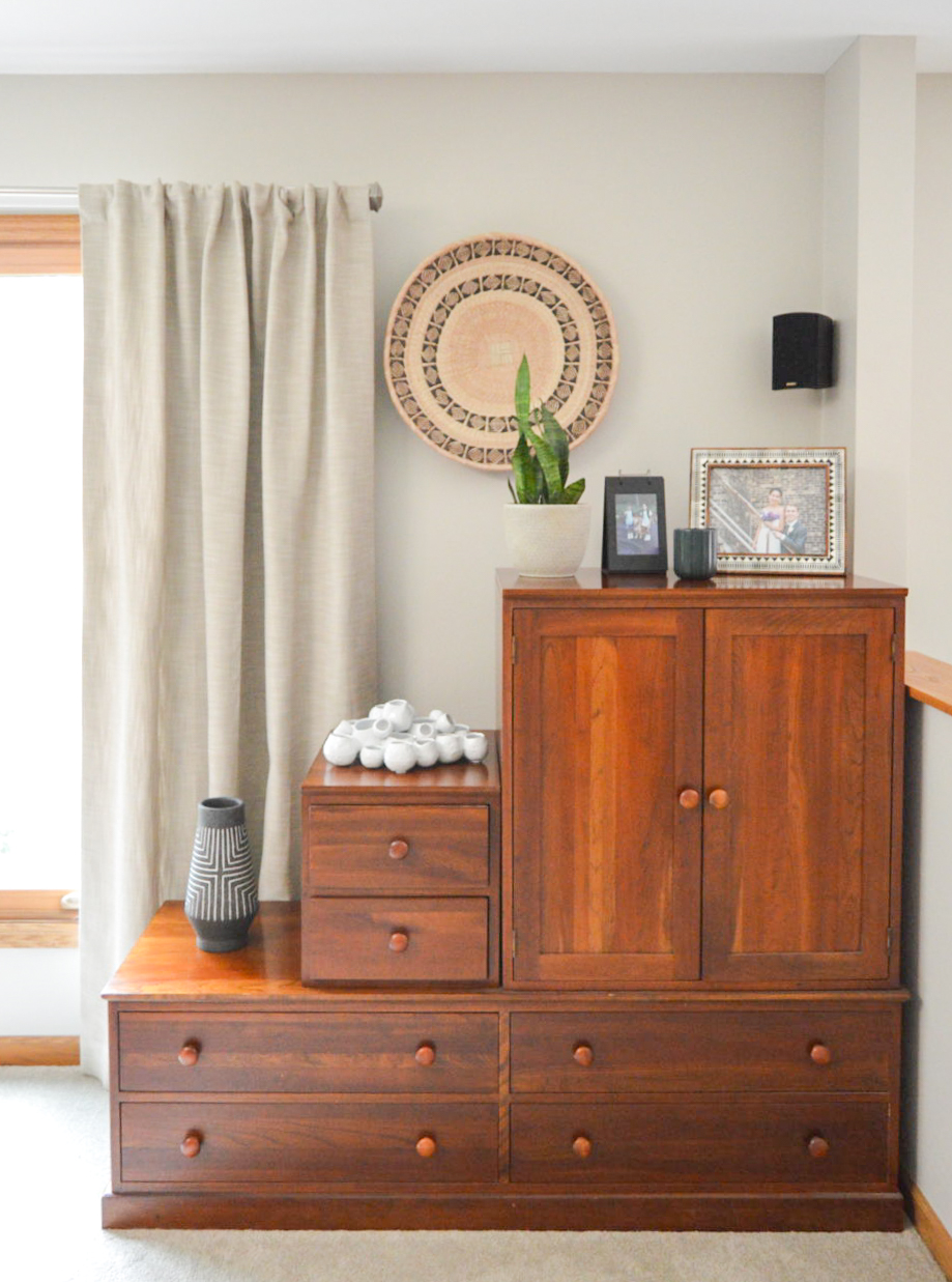
Solutions:
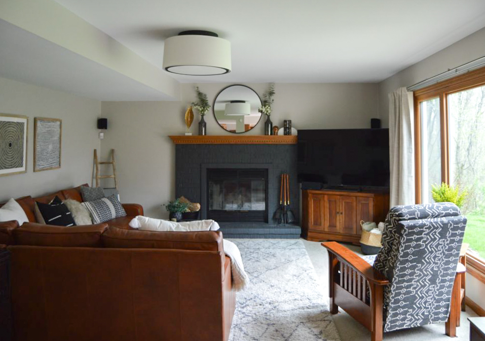
*I sourced a larger diffused flush mount light with two sockets instead of one. There’s a really good tip for figuring out how big your fixture should be for the room size: Measure the length and width of the room. Add those two numbers together and then convert the total into inches. So if your room is 10 feet by 12 feet, the ceiling fixture should be 22 inches wide.
*For the windows, we used a product called NoNo Brackets, which just clip onto the blind’s headrail and allow you to use a curtain rod in front of them. This way, the blinds are hidden when they are stacked back.
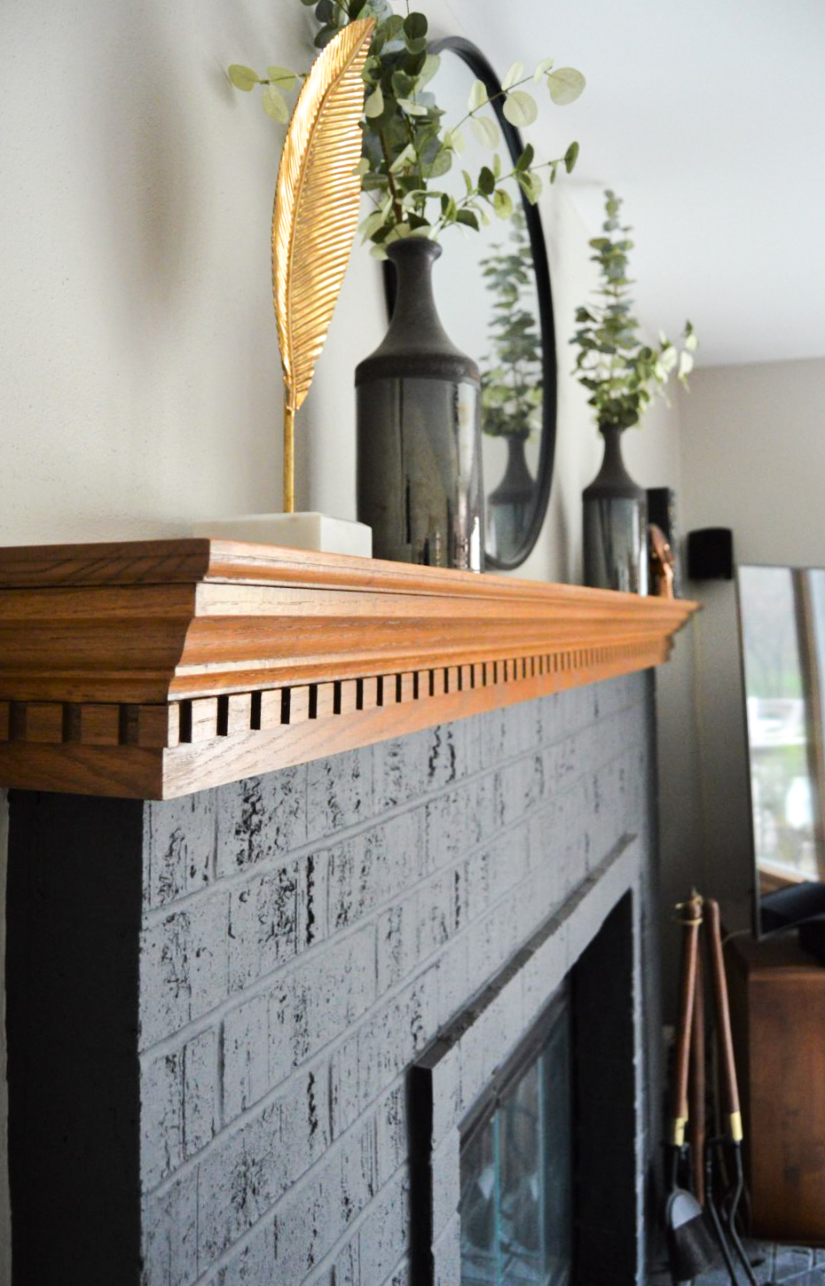
*The fireplace was painted. We went with Sherwin Williams Iron Ore for a nice contrast and focal point in the room. We also painted the brass heat screen black.
*We replaced the sofas with a sectional that maintained the layout of the room. We modernized the profile and chose a rich leather color that worked well in with the brown tones in the room.
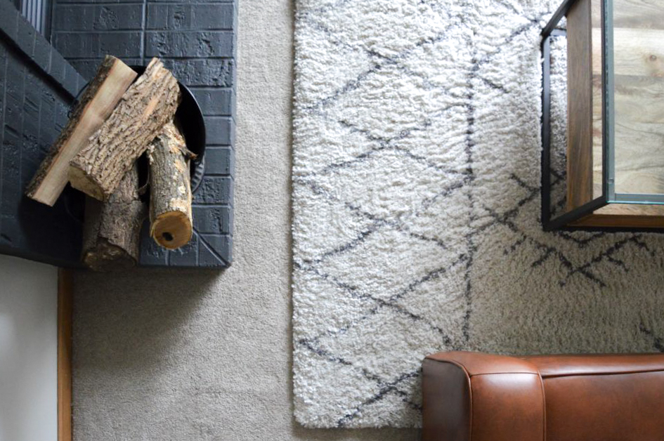
*The carpet was replaced and I sourced an area rug to float over it in the sitting area. It helped define the space and add some layered dimension.
*I sourced larger scale art (from Minted) for the wall above the sofa and we moved small framed photos to the top surfaces around the room. Those items work best as part of an arrangement with varied sized pieces.
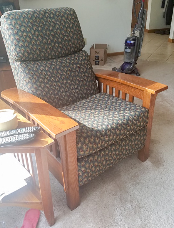
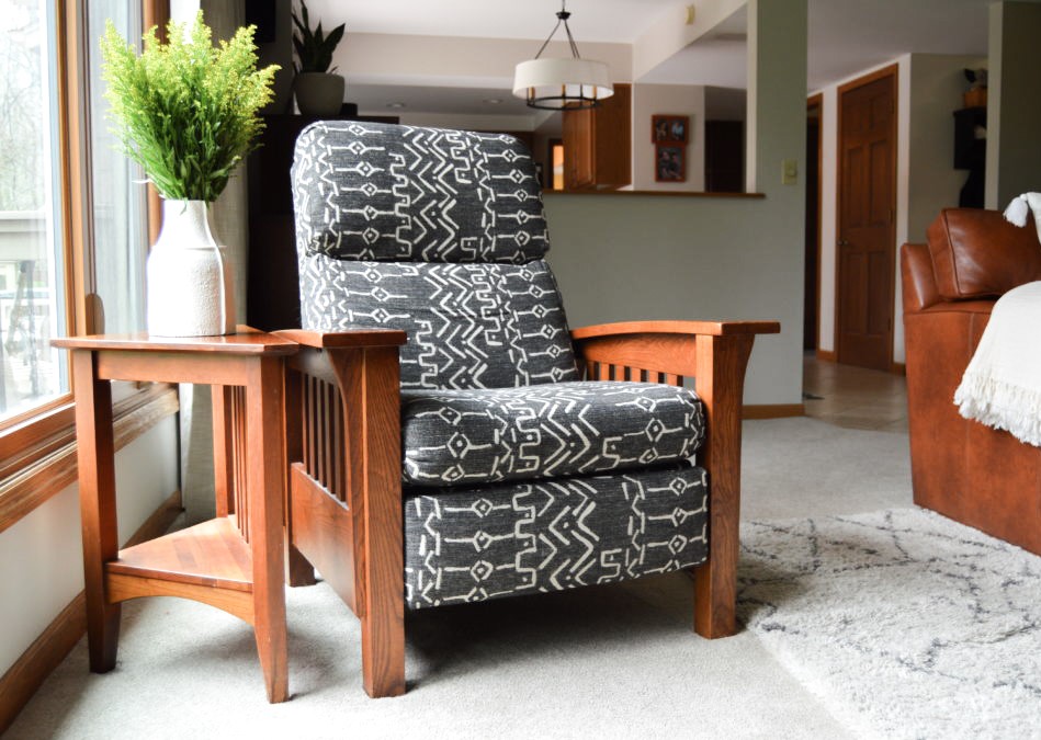
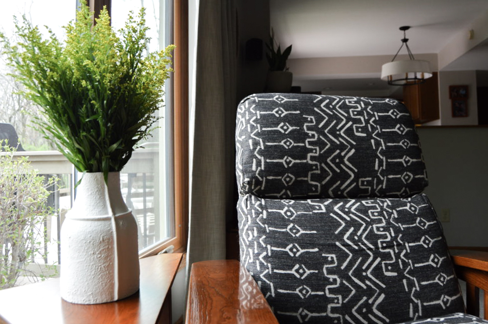
We had the chair reupholstered in another durable fabric but one with more neutral colors and with more context within the room’s overall design.

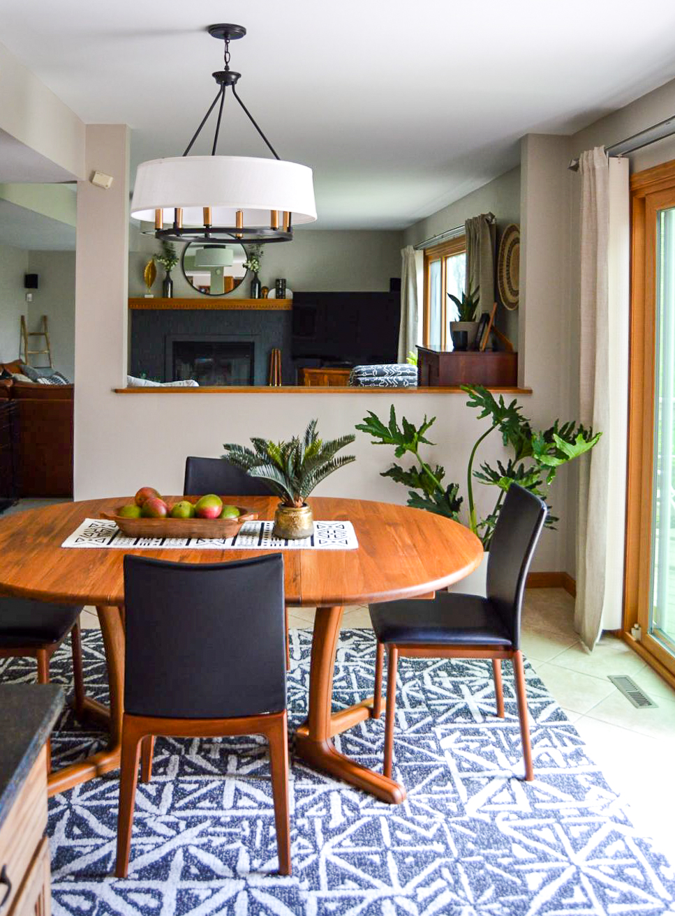
The Dining Room
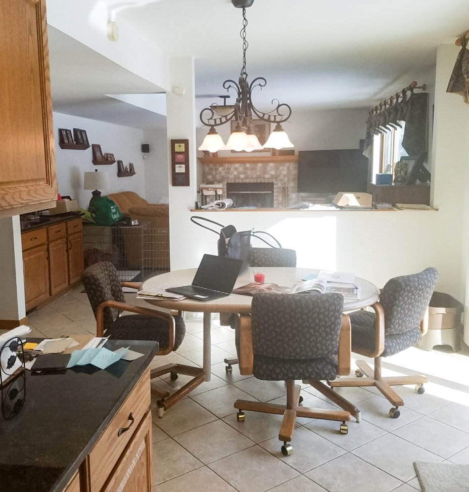
The Issues:
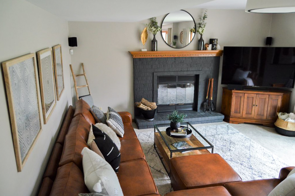
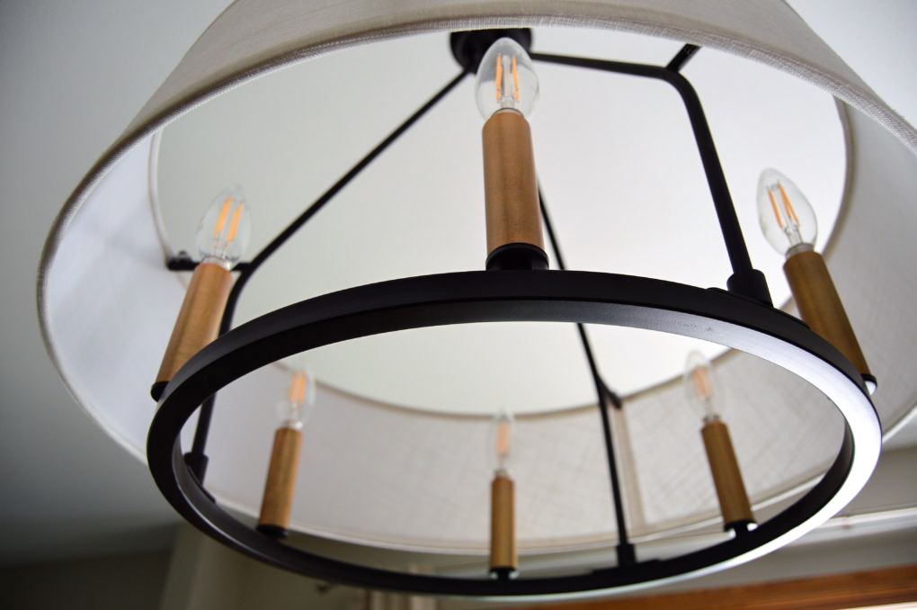
* This room had the opposite problem as The Family Room. The chandelier over the table pointed down and was too direct.
*The dining set was comfortable and resisted dog hair well but it was just generally dated and ready for a change.
*The tile floor, which extends from the kitchen, felt cold and unwelcoming in the dining area.
The Solutions:
* We chose a fixture that actually gives off more light but it is directed upwards and diffused by a drum. We also raised the height slightly to avoid the light being directed to the eyeline, which was an issue with the original fixture.
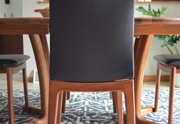
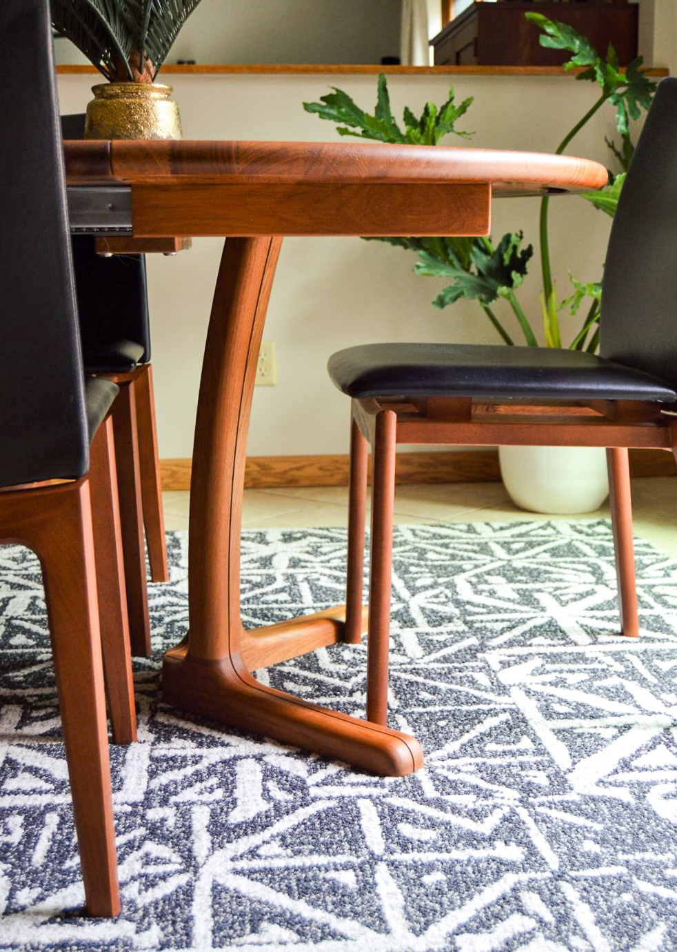
*How beautiful is this dining set from Racine’s own Hansen Interiors? It has 2 leaves that extend it for large gatherings. The lines are to die for and the wood works nicely in the space. The leather chairs are comfortable and easy to wipe down.
*Of course I used Flor tiles (again) because they are magical. But seriously, they stay put even under a table where you’re sliding chairs in and out, they vacuum and scrub up easily and this pattern couldn’t be more perfect to tie it in with the adjoining Family Room.
That’s it. Thanks for giving it a look! And a big thanks to Steve and Bridget for this fun project and for allowing me to share it. Love you guys.
To get going on a project of your own, reach out on Facebook, Instagram or email me at angela.malone664@gmail.com
That dining set is gorgeous!! Also love the painted fireplace (I never think of that) and the reupholstered chair!
Looooooove!
Soooo fabulous! I love everything about it!!
WOWZA! Beautiful job!
That dining set is simple and gorgeous…I’ve wanted to checkout Hansen for years. More motivation to do so!
Nice work! I’ve painted brick before, but never thought of doing it a dark color like that. It looks very sleek and pops.
Love the furniture pieces, and that is an awesome recliner – wonderful that you could pick such a great fabric to bring it to life.
Dang woman! The dining set is to die for! Love that light fixture too! You rocked it!
Wow, a beautiful new look. And the pictures do a great job of showing the transformation.