I approached this bedroom and en suite bathroom with a focus on light and balance. I wanted to bring a new openness and freshness to the space that many of us see as our sanctuaries. In their original state, they were definitely vibrant but did not feel cozy or especially comfortable. I set out to lean into the client’s expressive instincts but to infuse the rooms with a bit more luxury, functionality, and maturity.
Bedroom
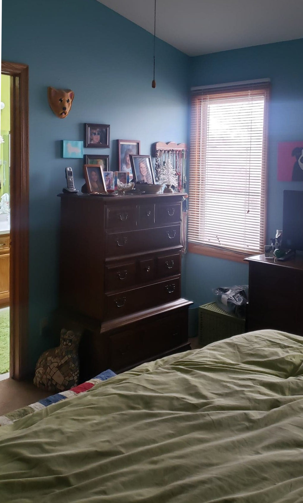
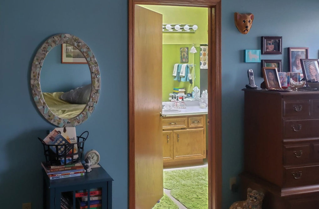
The Problems:
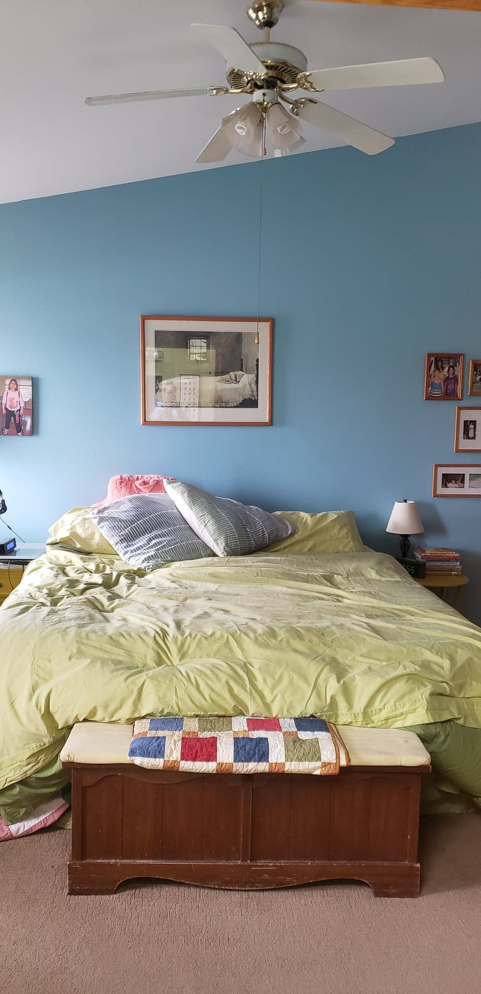
There was a lack of an established focal point.
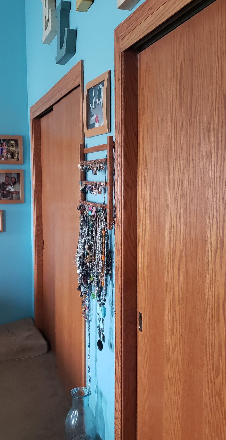
Storage was haphazard.
The paint colors were distracting and not engaging.
Art and decor were not arranged or coordinated.
Windows were sparse and minimized by treatment.
The Solutions:
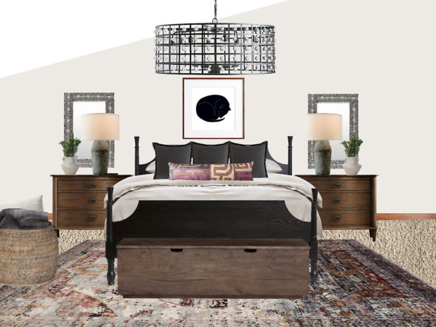
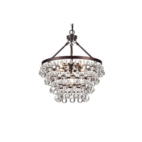
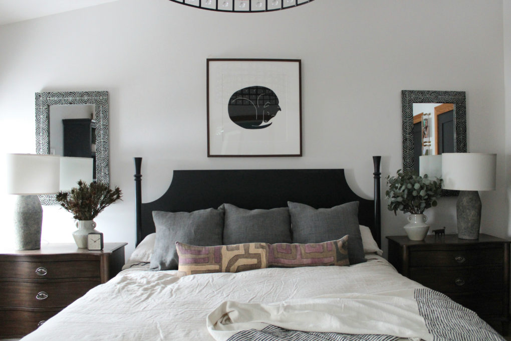
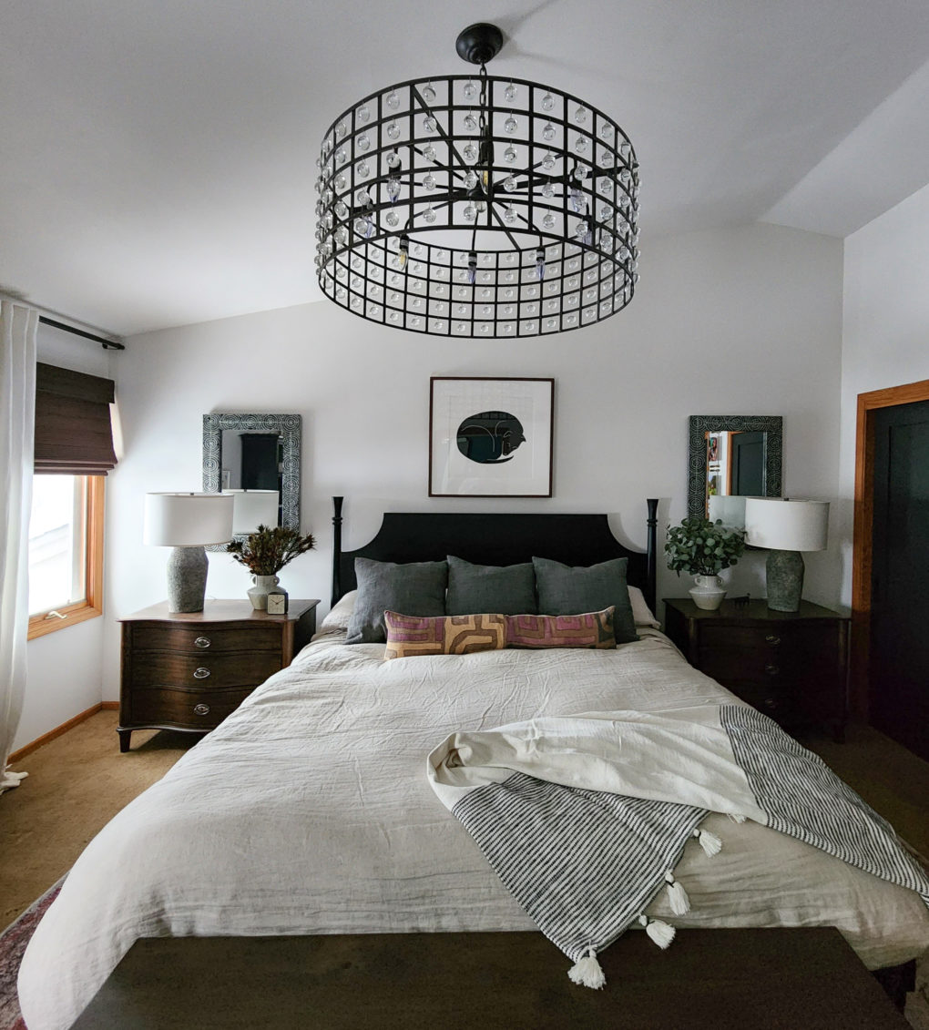
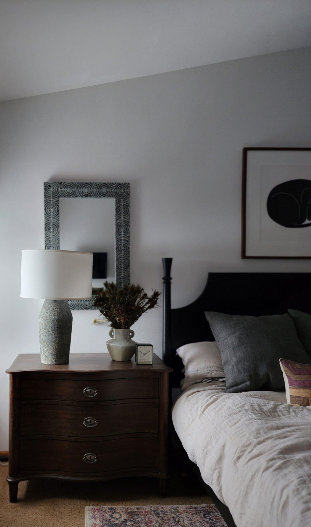
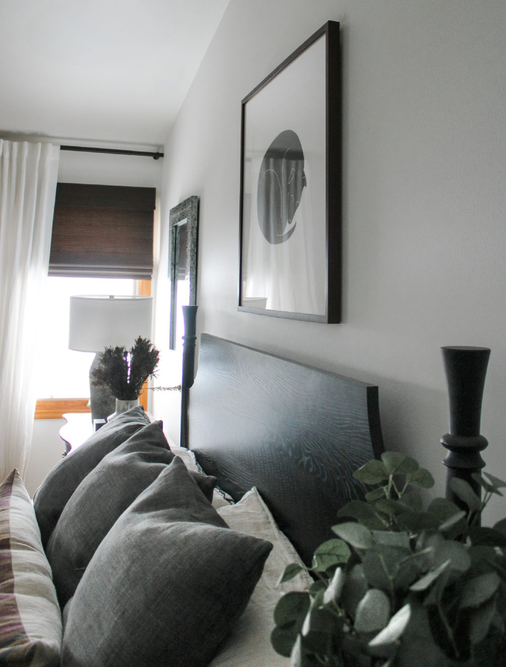
I focused on symmetry around the sleeping area, anchoring the space with a large chandelier and a large piece of art over the bed. I also sourced a substantial headboard that would not feel puny under the tall ceiling. It helped to establish the bed as the feature in the room, from which I was able to design outward. The larger scale beside tables and lamps also helped to establish some presence and intention, creating a clear focal point in the space.
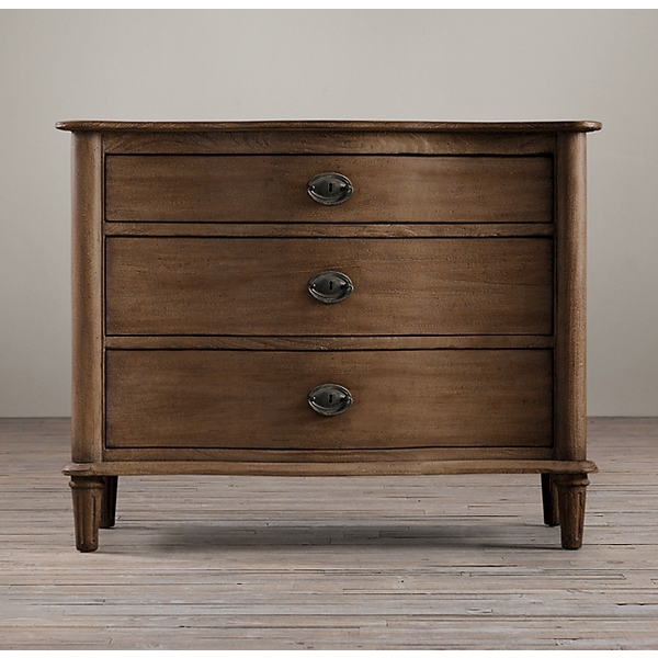
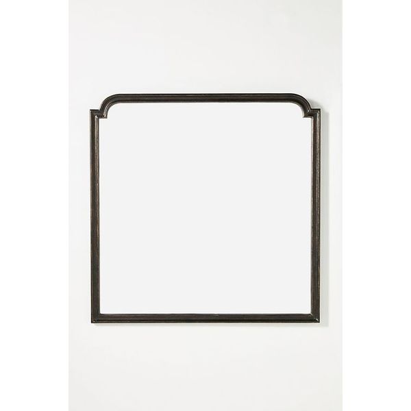
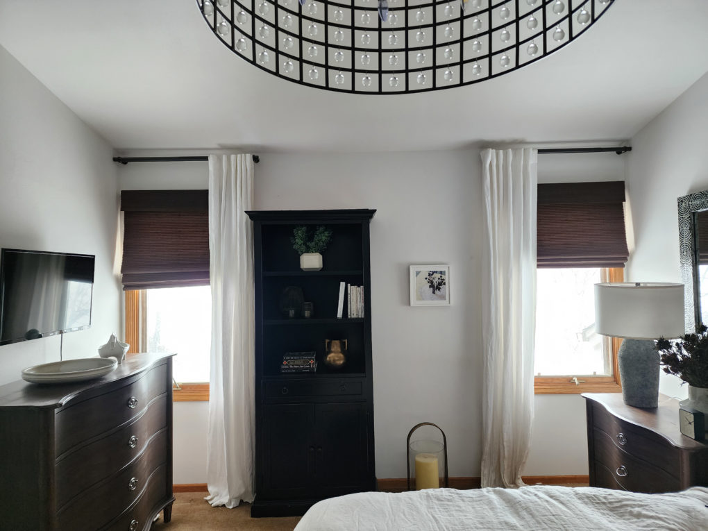
There were too many dressers in the space, so we ditched one of them and made up for the storage with three-drawer bedside tables and a larger storage chest at the foot of the bed. I also sourced a mirror with hidden jewelry storage for a cleaner look. Hidden storage is an antidote to clutter!
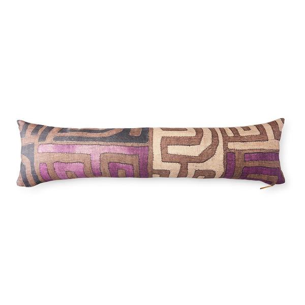
I opted for a warm white paint color to keep the room bright, relying more on layered texture for interest with a bit of subdued color in the rug and decor.
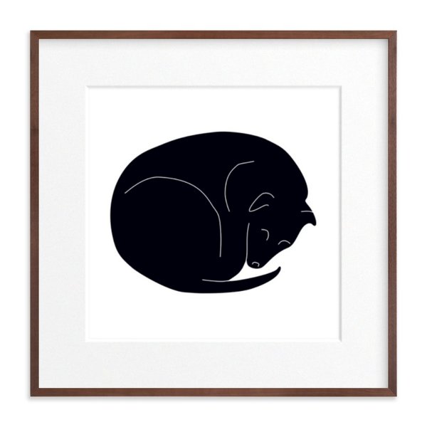
As with the rest of the house, I pared down the wall decor in both rooms to just a few larger pieces. I always recommend swapping things out as frequently as you want rather than cluttering your space with everything you’ve ever wanted to look at, at once. I just think you reach a point where it just becomes noise and nothing is really particularly noticeable anymore.
I opened things up with shades and tall linen curtain panels. It lengthened the windows and made the incoming light more prominent than the windows themselves.
En Suite
The Problems:
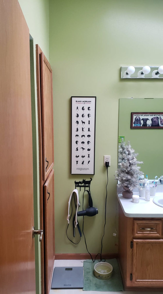
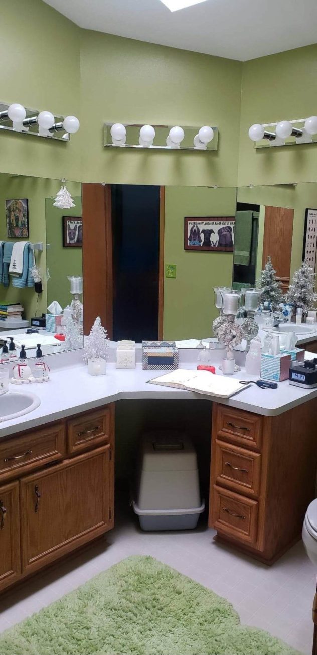
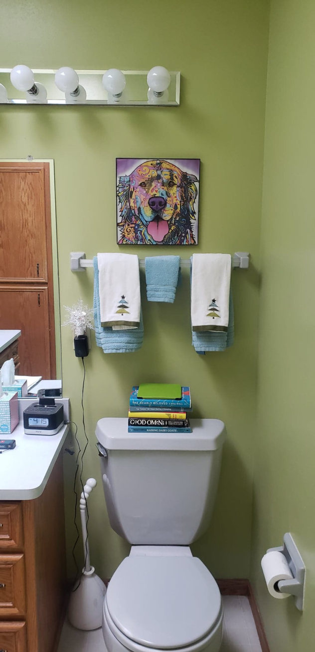
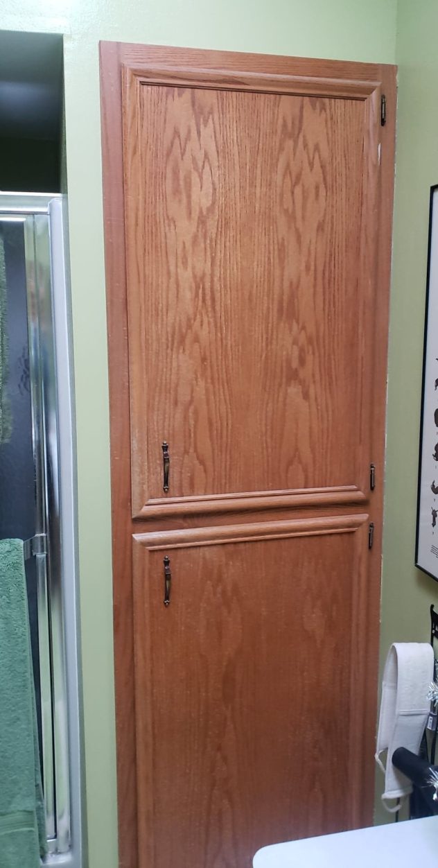
Dated. From the gray toilet to the Hollywood-style vanity light and honey oak cabinetry, the finishes called for an overall update.
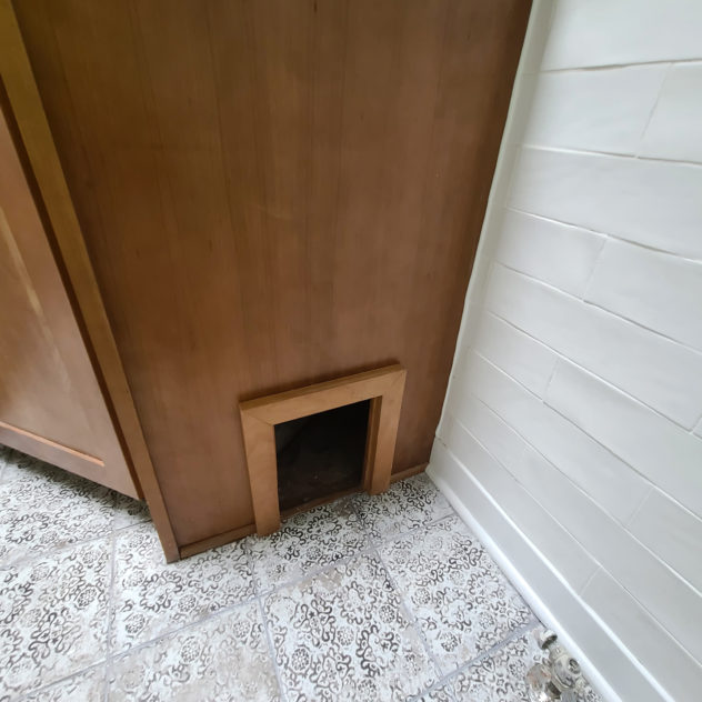
The vanity was not functional for the client’s needs and exposed an eyesore litterbox.
The lighting was harsh and overkill.
The shower was dark and cramped.
The Solutions:
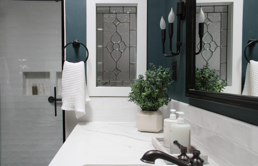
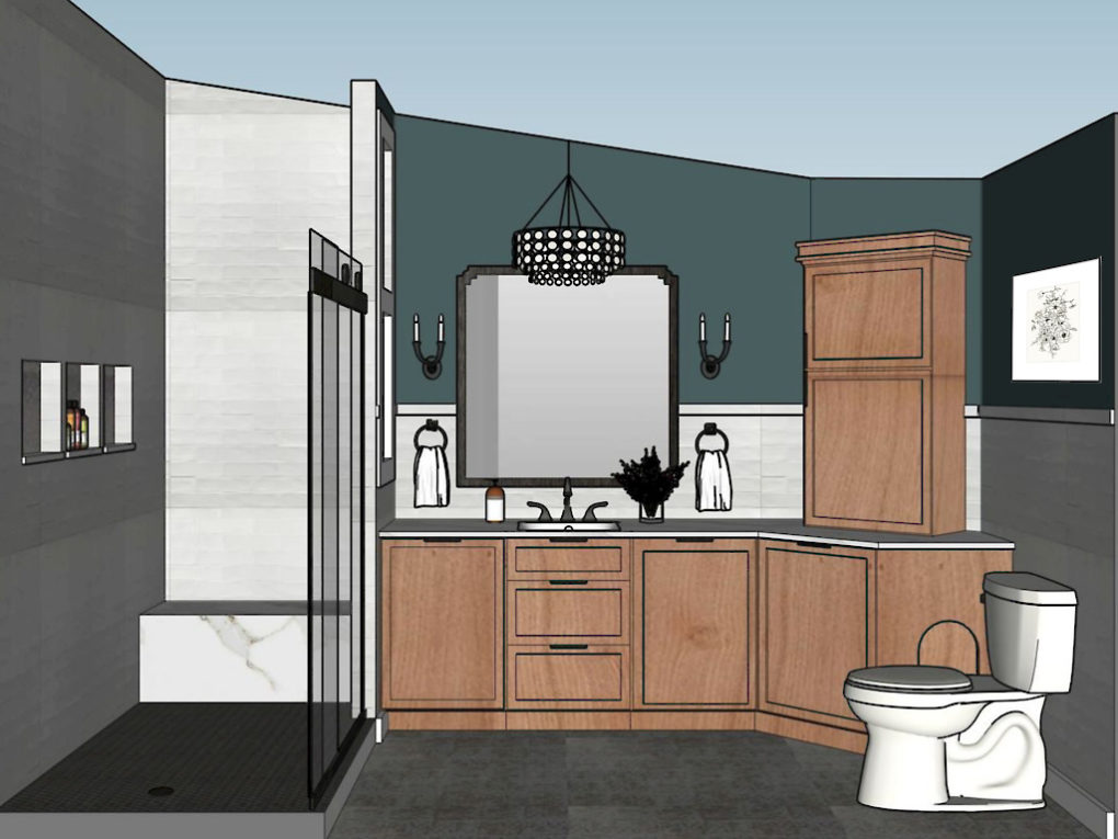
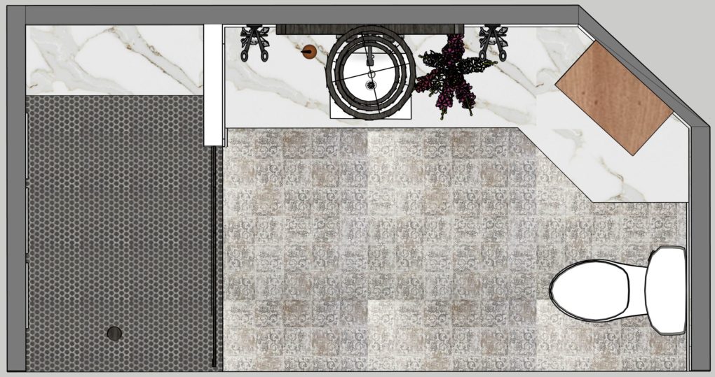
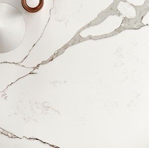
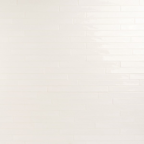
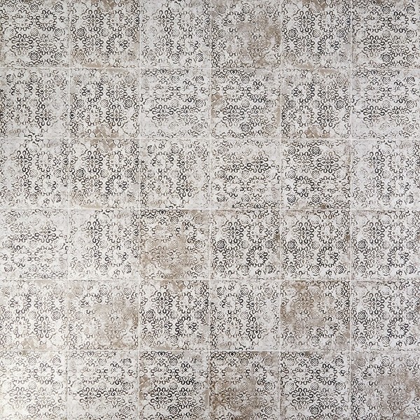
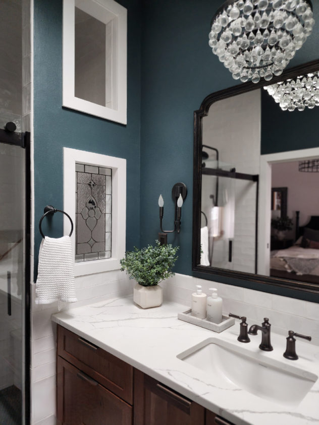
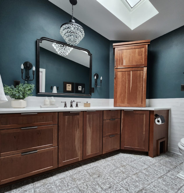
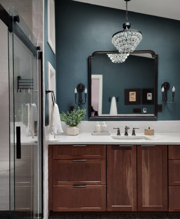
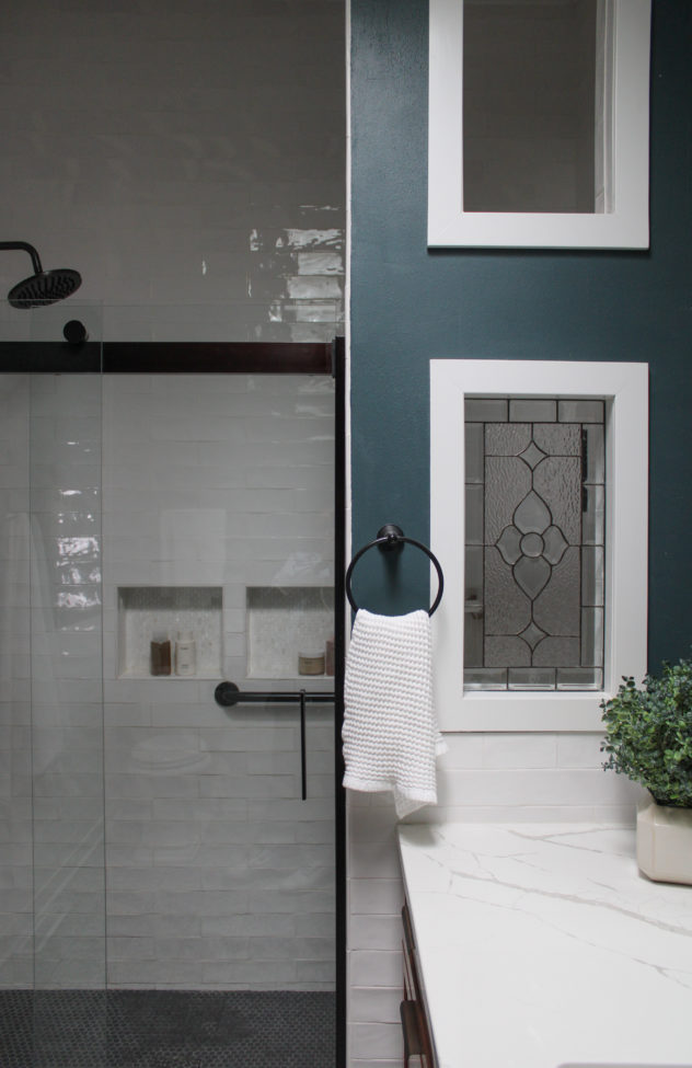
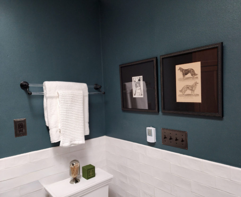
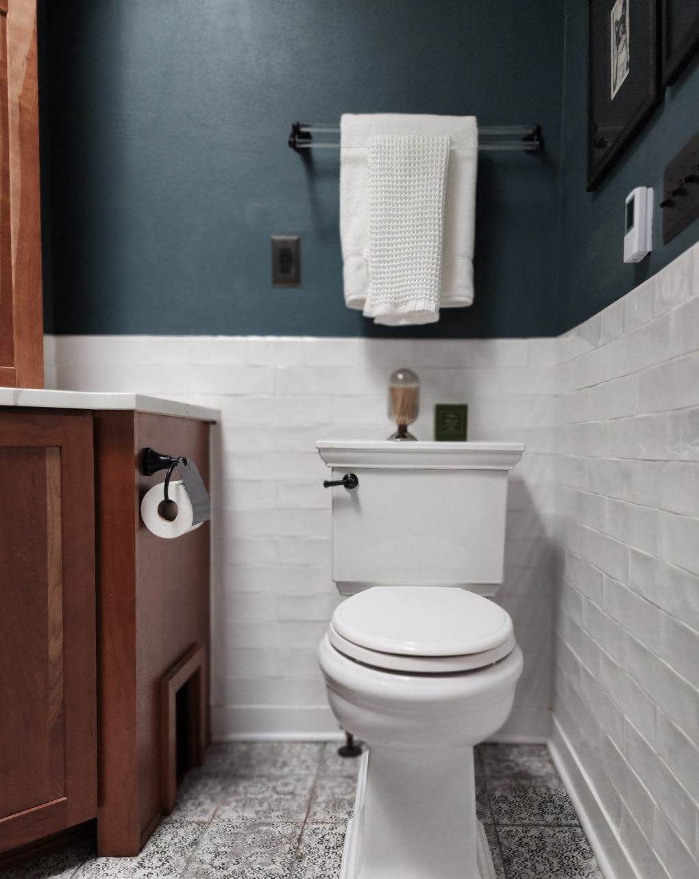
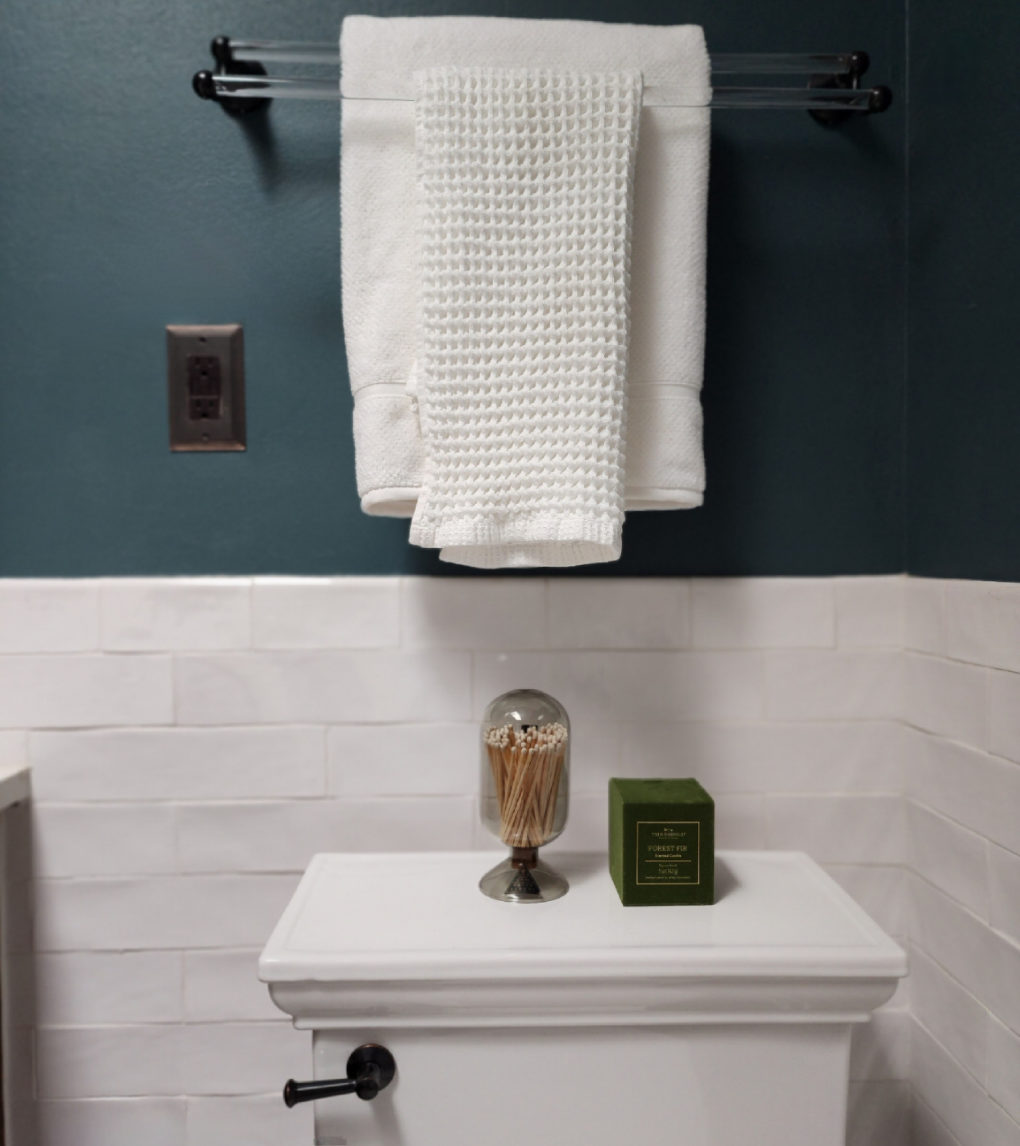
I added bright white fixtures, a semi-custom vanity in a slightly more contemporary finish, and a neutral but fun patterned porcelain HEATED tile floor. Paired with fresh white subway tile and a deep bold wall color, the space feels updated without feeling particularly trendy. This is a balance I’m always trying to strike. I think that, unless a client is intent on a specific vintage era, spaces should feel timeless but current. I’m always reaching for that sweet spot.
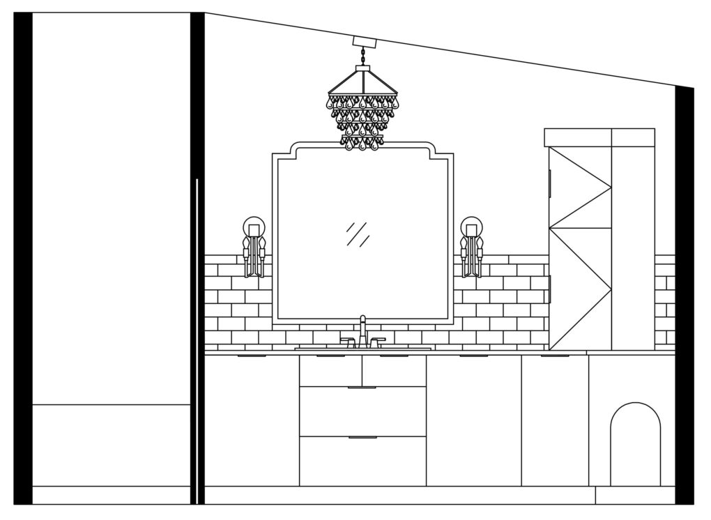
I designed a new vanity, utilizing more vertical space with a wall cabinet and added a hiding spot/ door for the litter box.
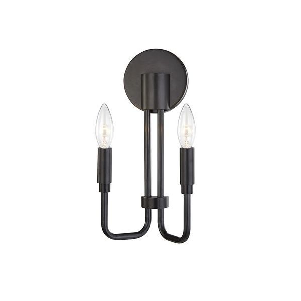
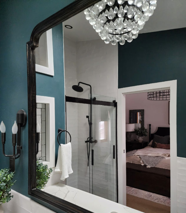
I layered the lighting to include a pendant, sconces, and an updated light in the shower.
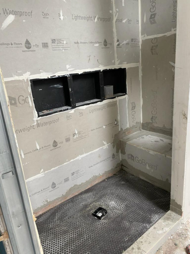
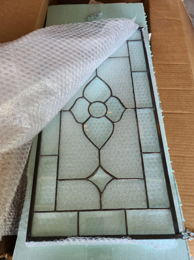
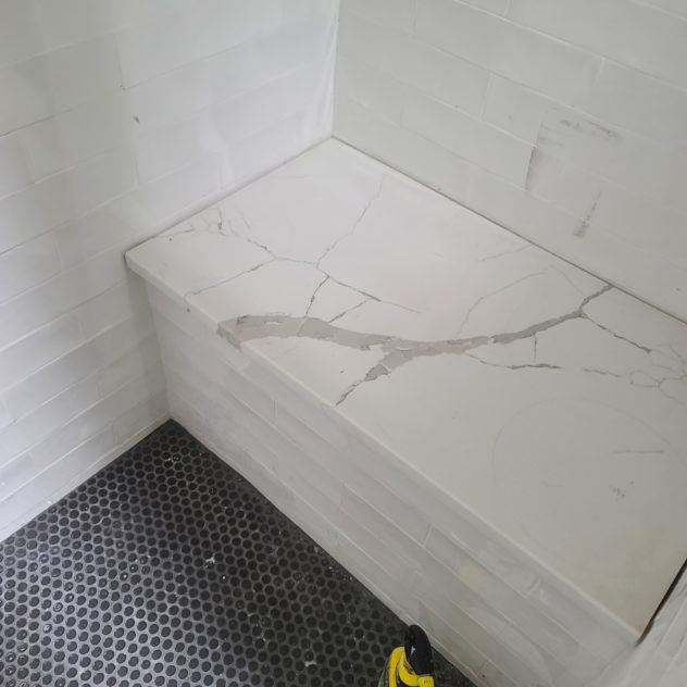
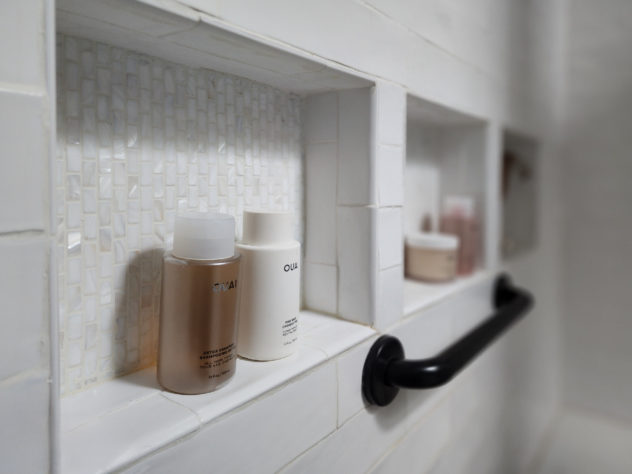
We ditched the linen cabinet in order to expand the footprint of the shower. It now boasts a shower seat and a cutout to let in the natural light from the skylight. I also sourced a decorative beveled glass pane to play off of the light fixtures and a reflective mother-of-pearl mosaic accent tile for the storage niche. I love the way the light now glints off of the slightly wavy texture of the subway and mosaic. One of my favorite parts of lighting a space involves thinking about how it can bounce around and reflect. It can add movement and drama in very subtle ways.
The Plan:
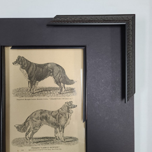
A Few Faves:
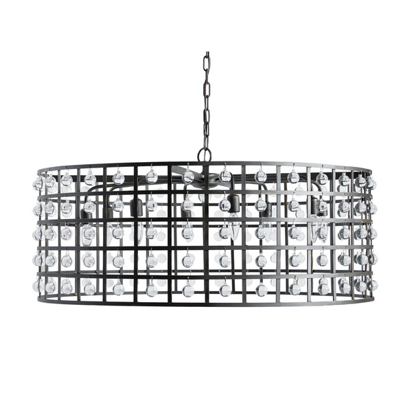
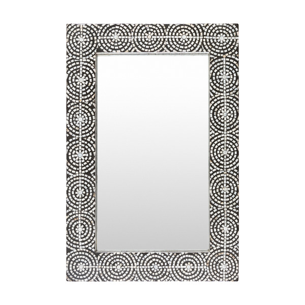
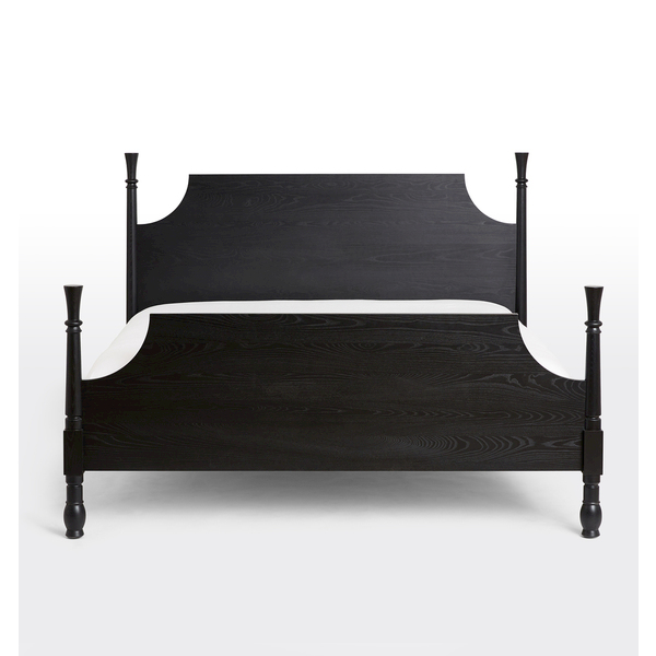
The Results:
This project was a fun challenge and the finished spaces feel more functional and balanced. Thank you to the Jensen family for your trust and collaboration.
Browse the blog to see the other rooms in this project and more and subscribe to be updated on any future transformations!