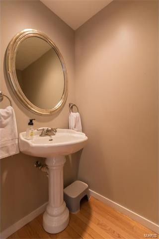
Recently, I got to design a powder room for my Brother and Sister in-laws. And since the are the actual coolest, there was no beige in sight. (It can be done.) In fact, we started with beige and we killed it. Hard.
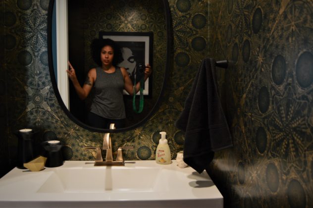
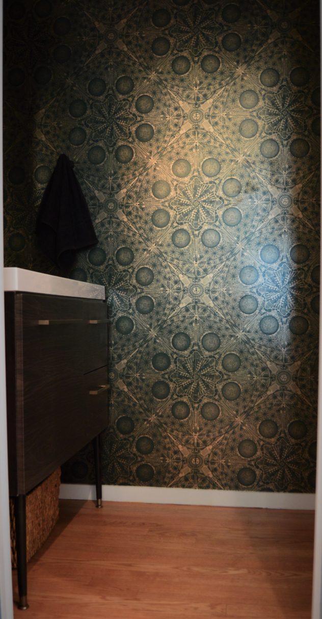
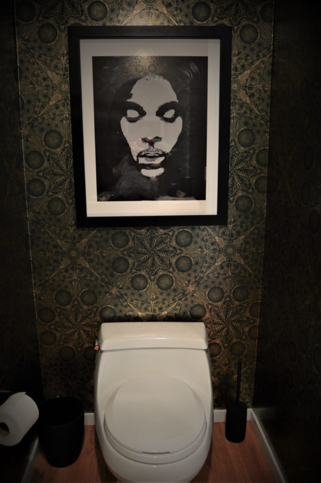
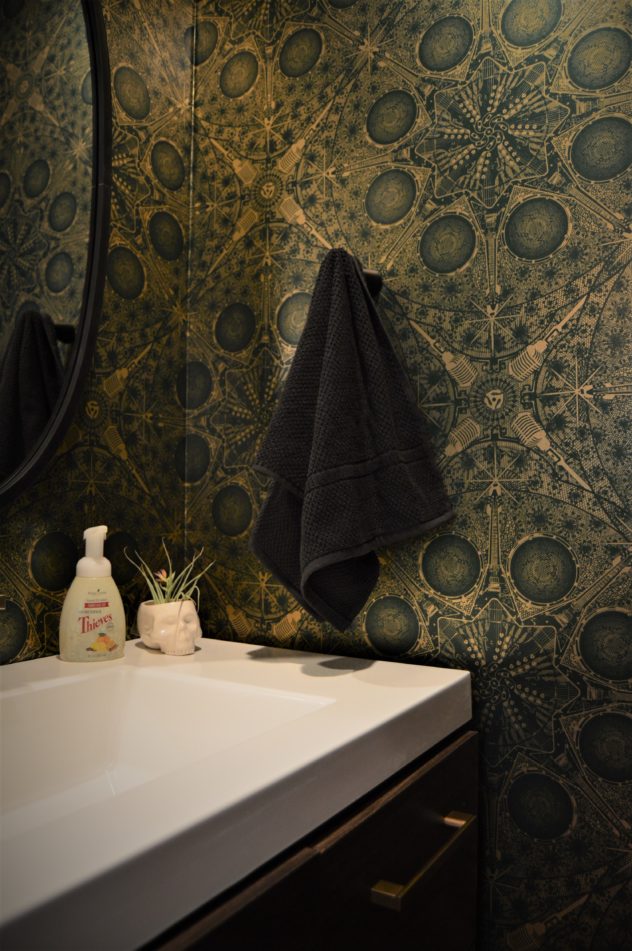
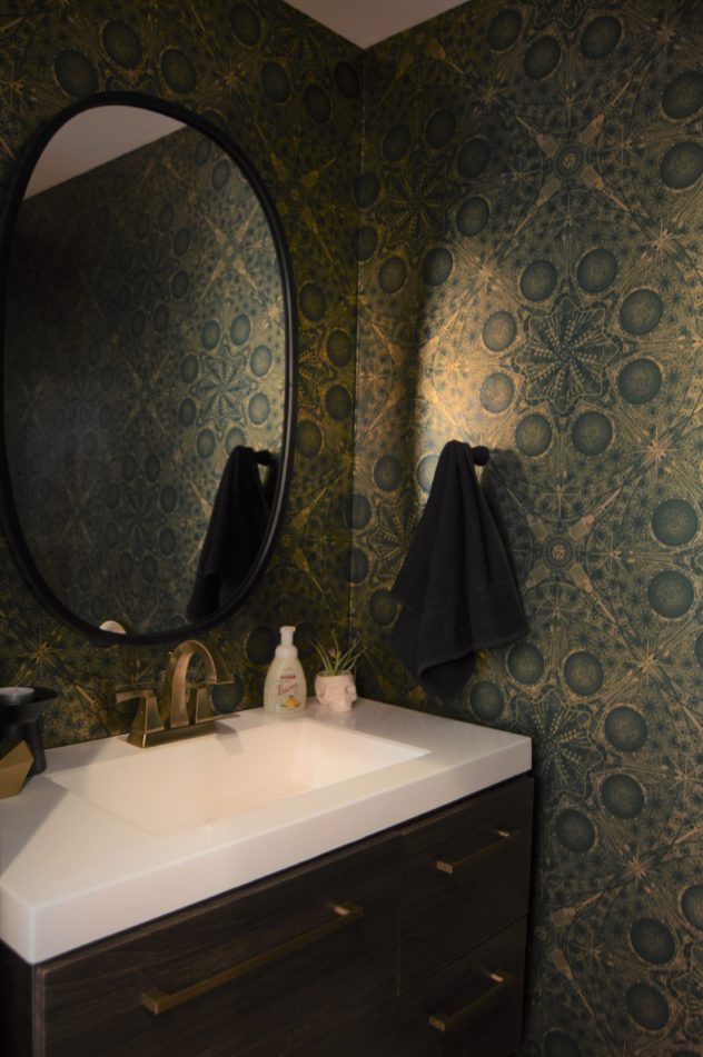
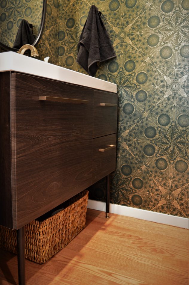
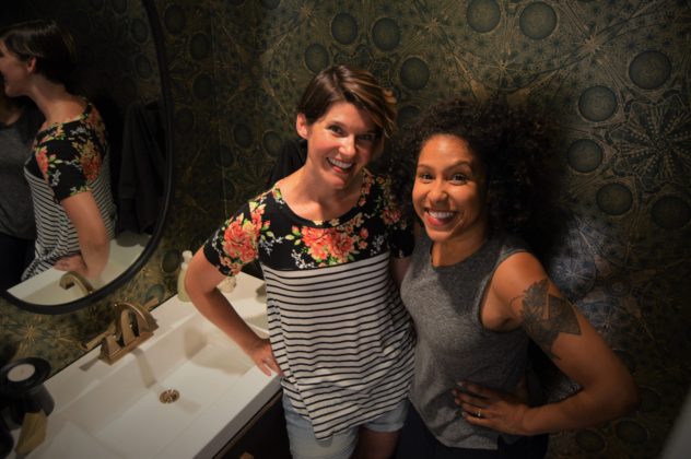
The concept for the room started around this wallpaper that my SIL had fallen in love with. When she texted me the link and asked if she was crazy, I basically said “Yup. Let’s get started.” The gold foiled Musical Mandalas wallpaper is from Flavor Paper.
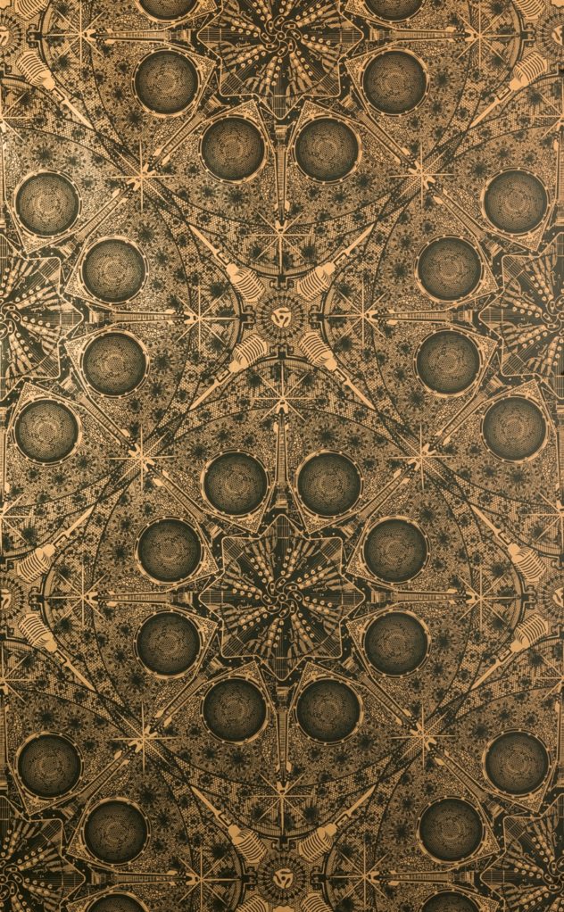 They make super beautiful hand- printed papers that range from edgy to super weird and I’m here for it all. You should take a look and imagine what the bravest version of yourself would choose.
The room was tiny and the wallpaper had set the tone. From there I knew things had to be elegant and simple but not too fussy. My young niece and nephew brush their teeth in there, so from a functional standpoint they needed storage and a “landing pad” on the sink for the morning routine.
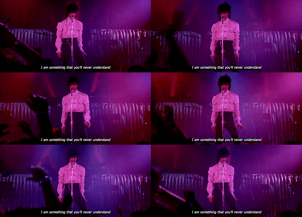
I sourced a vanity with storage, a black framed mirror and some accessories and found the Prince print to hang on the opposite wall. It just felt right. Julia and I are both huge Prince fans and I love that I know her well enough to take such a hard left turn with confidence. Once this detail was approved I got really excited about this room. I mean REALLY excited.

The Purple One looks mischievous and a little disapproving in the print (kinda his brand) and it is not lost on me that he is positioned to overlook the decidedly unglamorous activities that occur in a Powder Room. Just judging your whole life.
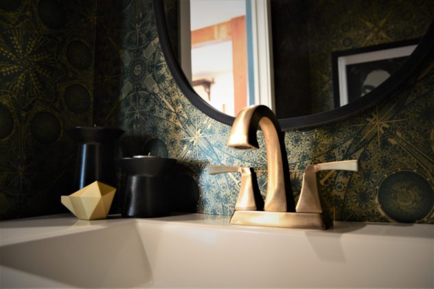
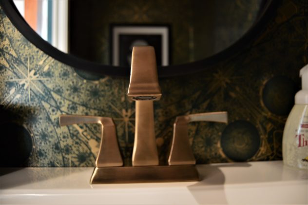
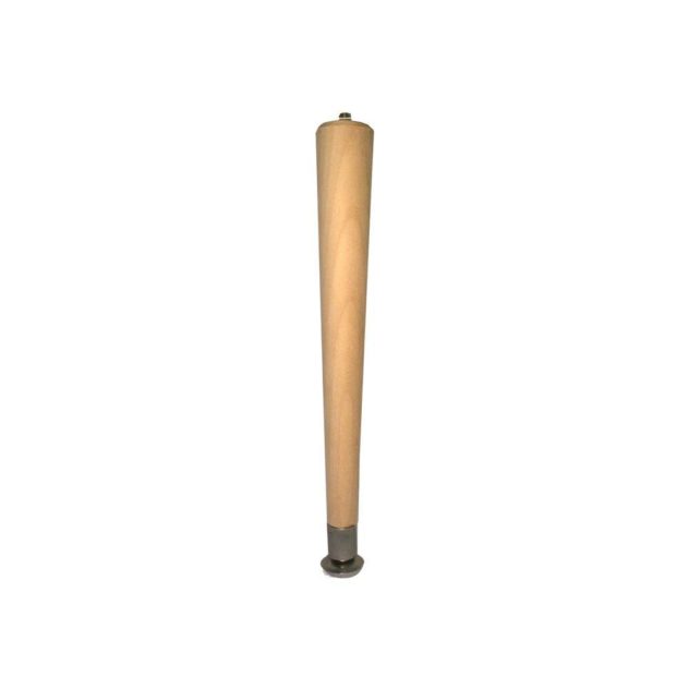
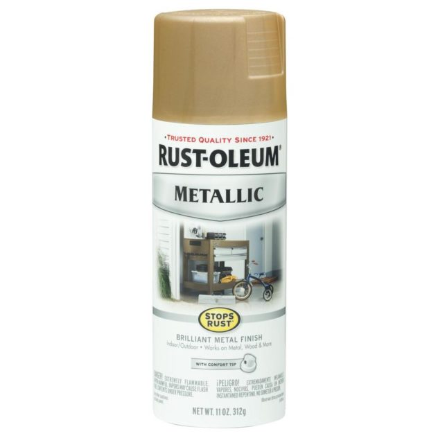
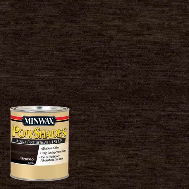
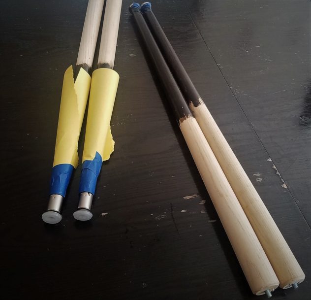
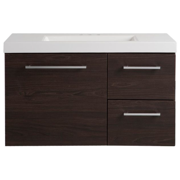
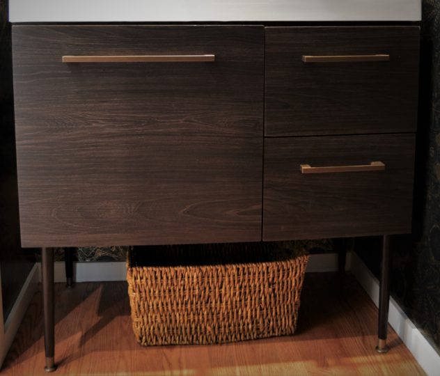
I chose a brass faucet because brass is used in the kitchen just outside of the room and for similar style continuity, I opted to take on a little project by adding some mid century legs to a modern floating vanity. (Process photos below.)
So I popped in to St. Louis for one quick week- long trip to oversee the wallpaper installation. My girl definitely called in a pro on this one and it was the right call. That mess looked hard, but the installer had been in the game so long he barely had to look at his work as he chatted us up. Skills. Plus he made dad jokes and was the sweetest and hugged us when he left without if being weird. We gained more than wallpaper that day… we gained an uncle?
Finally, my BIL hatched a plan to make my vanity aspirations a reality and did all the plumbing and we put that bad boy together and this is what we ended up with! I present to you the coolest place I’ve ever peed. (Quality control.)
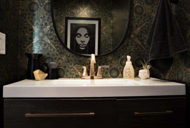
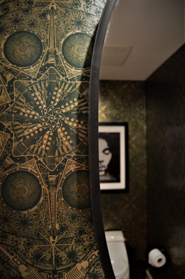
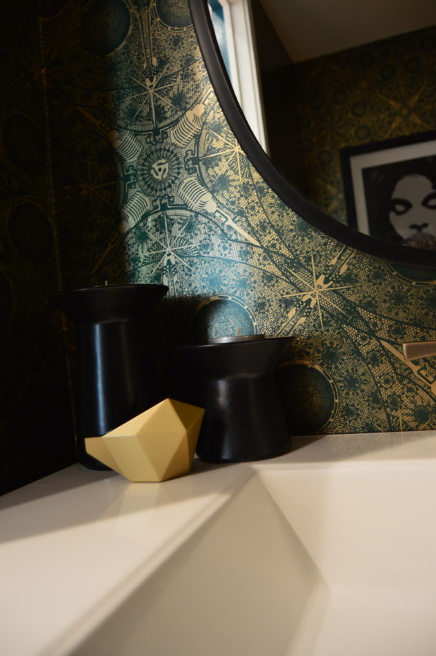

Who doesn’t love a good before and after shot?
I know this type of bold design isn’t for everybody…
but it really makes me appreciate how individual design is and renews my love for the challenge of reflecting all the different and beautiful weirdos who trust me with their spaces.
So even if you hate this, I hope this project will inspire you to reflect your own individuality in your space, no matter what that is!
The Vanity
I hope you enjoyed this little tour!
Thanks for reading. I’ll have more highlight from the St Louis project soon!
What a transformation! Love thw wallpaper!
Killed it. That wallpaper tho! Yaaaas.
Ca alors!
It’s really awesome! That wallpaper!