When you’re trying to suspend disbelief you have to be transported, visually, into the lives of the characters you’re wasting your life on. But sometimes, no matter how compelling the plots and how humpy the love scenes and how hungry the zombies, the drama of the spaces overshadows the stories. Shout out to all those set designers who get it so right that I have to annoy my husband by rewinding Netfilx to get a better look at non plot- related details. The unsung heroes of TV who make the spaces of our favorite characters (to hate) look like they would actually live there. Lemme tell you about a few sets that had me mad distracted.
Molly’s therapist’s office on “Insecure”
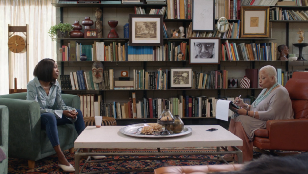
Molly stays a mess. (Really? Dro?) So I can’t really speak to her therapist’s transformative powers but the good doctor’s eye for design is beyond reproach. That library wall looks to be no less than 6% James Baldwin. That tasteful and cultured color palette? The over-sized coffee table elegantly balanced by it’s centerpiece decor? It’s no wonder our girl can’t focus on getting right.
Robert and Sol’s spot on “Grace and Frankie”
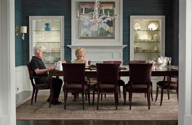
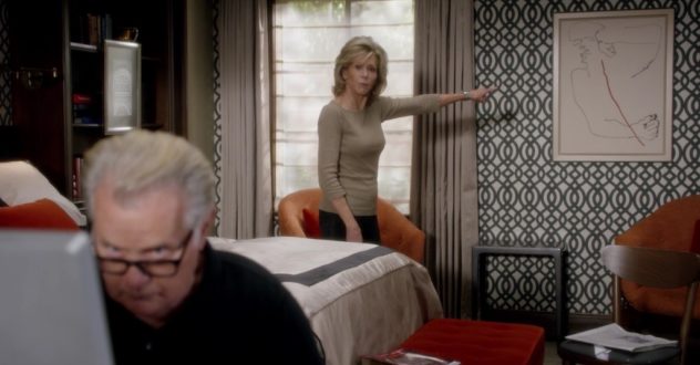
This show is cute but it’s really just the one story line that keeps me intrigued and that is Sol and Robert living in their truth. Because that truth turned out to be most glamorous. Their home is mature and refined. I just feel like nobody would be mad at the whole “decades long affair with my married best friend” thing anymore once they saw what a great design team the two make. I’d be like ” *Shrug* Do y’all have any wallpaper suggestions for my foyer?”
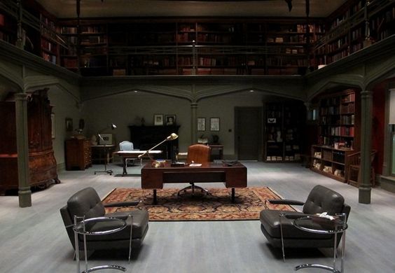
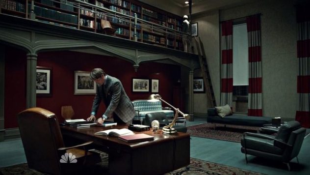
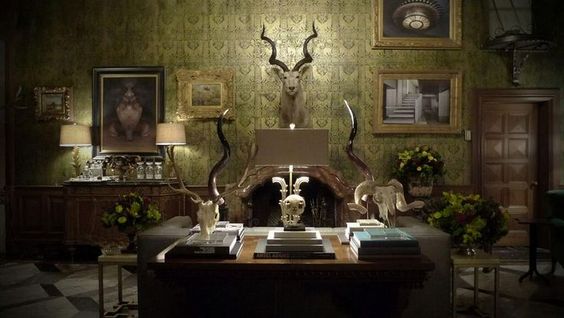
Hannibal’s Whole joint on “Hannibal”
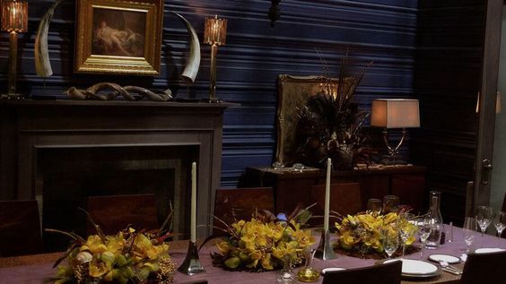
Ooo and his Florence Apartment:
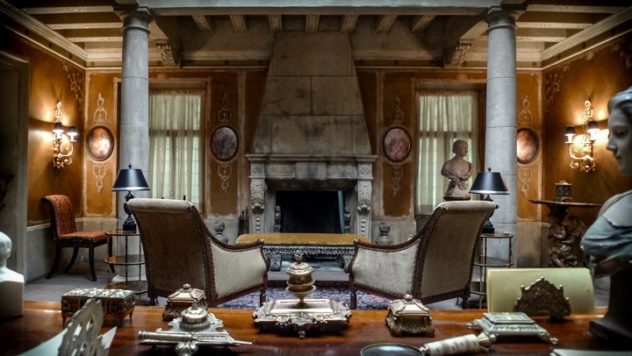
Look. I’m not an idiot. I know what happens in that dining room. Just, like… what’s the liver to fava bean ratio? Yeah, obviously sociopathic homicidal cannibal. But his perfectly moody and cultivated interiors are so elegant. It would be hard to turn down an invite. Okay I am an idiot.
Annalise keating’s living room on “How to get away with murder”
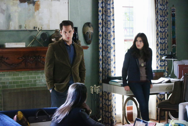
What? I’m just supposed to ignore those swag onlays on the fireplace surround or that mint glazed subway tile. Am I not human? And those drapery panels. Who did she kill? Never mind. Acquitted. The mantle decor, the mask, the large scale abstract piece. All of it. No wonder I’m completely lost on the plot at this point. Also, wine.
cottonmouth’s office (lair) on luke cage

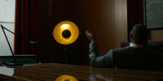
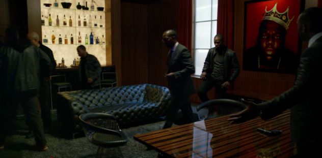
Cottonmouth was the worst but wasn’t he kinda the best tho?. Spoiler alert… #gonetoosoon. And that office of his was so perfectly him. It was mean. But it was sexy. The anchor of that room is obvious; the Biggie piece. Perfection. It was visually arresting, powerfully symbolic and, as it turns out, prophetic. A lot of people died on this show (too many people), but none more commanding than the club king. Rest in style Mr. Mouth.
These set designers are trying me. Some people are too good at their jobs is all I’m saying. I’m pausing my shows to google stuff like “snake lamp”, “Hannibal study green” and “antique African drums”. Can I kick back please? Or maybe I just have a concentration problem.

Loved this article!
Thanks friend. Love you for reading.
I haven’t watched a couple of these shows but Hannibal’s decor was so I can’t even come up with a word…. (Kiss my finger tips). I especially loved his office. Now since you wrote this I will be watching the decor more often.
Haha. I’m not endorsing any of them… except Insecure because it is perfect in every way and you need to cancel your life to watch it if you have not. 🙂
Well, Sweets! Maybe you need to think about joining their ranks. I have been to your home. It is not the world of make believe but exquisite exotic balanced living space. I think I have said this before but your writing is quite over the top wonderful too! Is there anything you cannot do?
😉