We’re all pretending to be cool to impress this house.
Like… when I stepped inside I felt both under-dressed and overdressed. You know how classy New York ladies can wear like a jean and a white button up and a heel and look effortless and cultured but if I do it I look very confused about my plans for the day plus I’m T-rexing three hours in because heels are of the devil and feet were designed flat? This house is that lady. This house paid the bill for dinner without anyone noticing. This house’s parents let it swear in middle school.
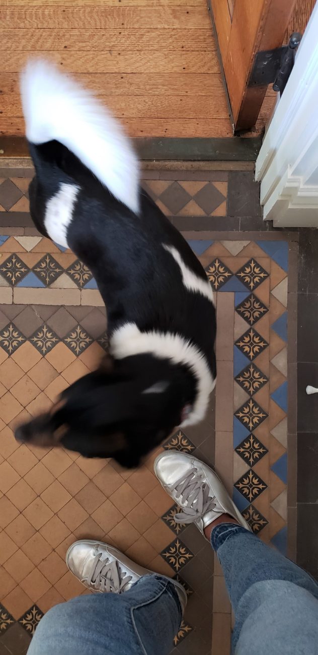
And I should have been prepared. No less than three of my previous home tour subjects suggested I was fully wasting my life unless I got inside THIS house. They were correct. Rude, but correct. And Chris’ style is matched only by her generosity cuz when I tell you how I sweated this woman whom I barely know to literally get into her home, walk around and look at everything she owns and take pictures with my phone… it was either gonna end in a home tour or a no contact order. And ya girl has yet to be served so… I’m calling it a success.
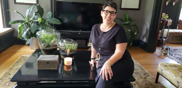
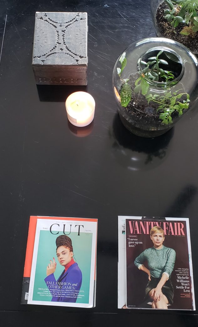
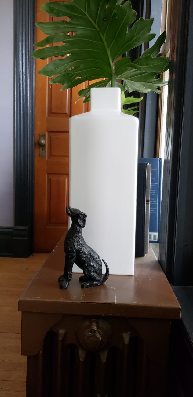
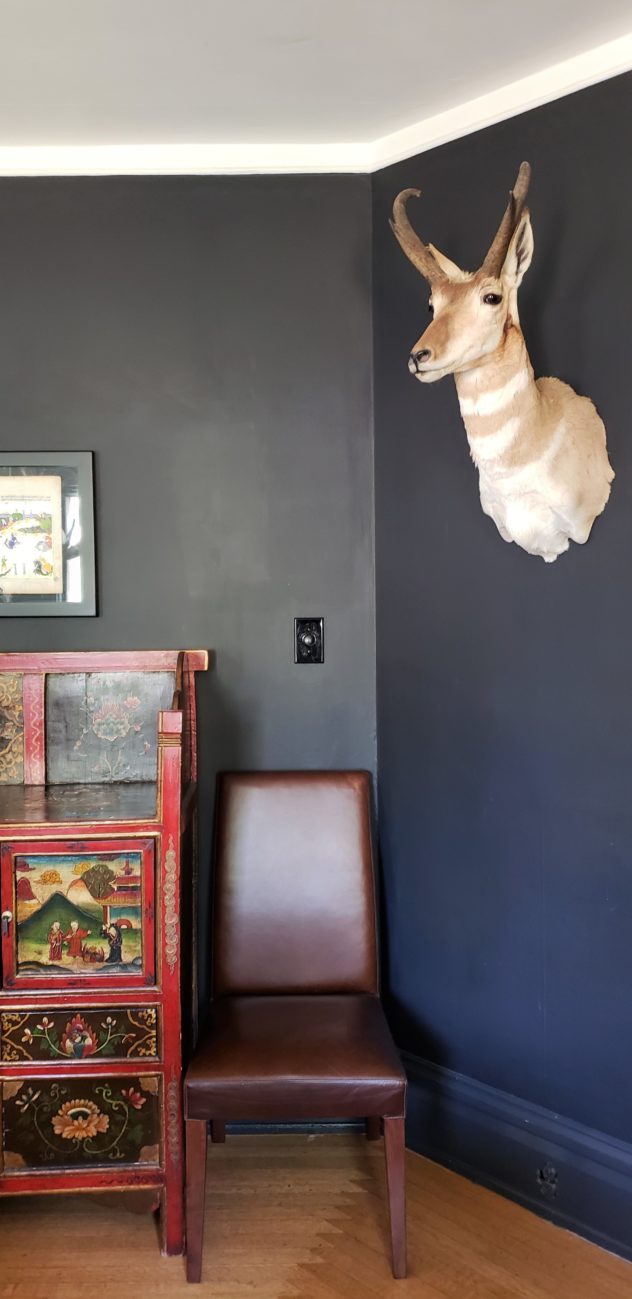
Chris and Andy bought the 1880s era home in serious disrepair about 10 years ago and have been loving it back together ever since. What results is a series of curated spaces with adventurous color choices, wide- ranging artwork and thoughtful decor. I would describe the home’s design as eclectic maximalist but otherwise it doesn’t follow too many rules. At times it is rustic/ industrial, you turn a corner and see eastern influences, the next second the vibe is formal and masculine then modernist with bohemian and mid- century moments… all while leaning-in hard to its Victorian bones. The thing that makes it work is its commitment to the shake-up. The reason it isn’t a free-for- all hot mess is the consistency and pace of the journey. Refer to this tour next time you are afraid to take a style leap, folks. (And then call me. Let’s not be hasty 😏)
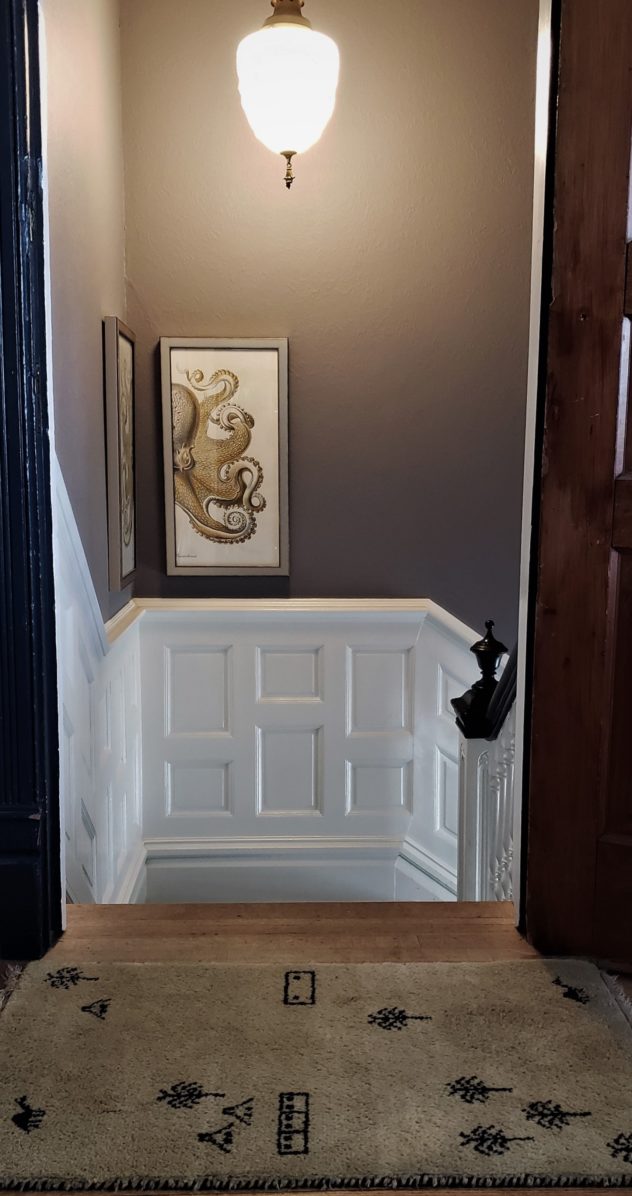
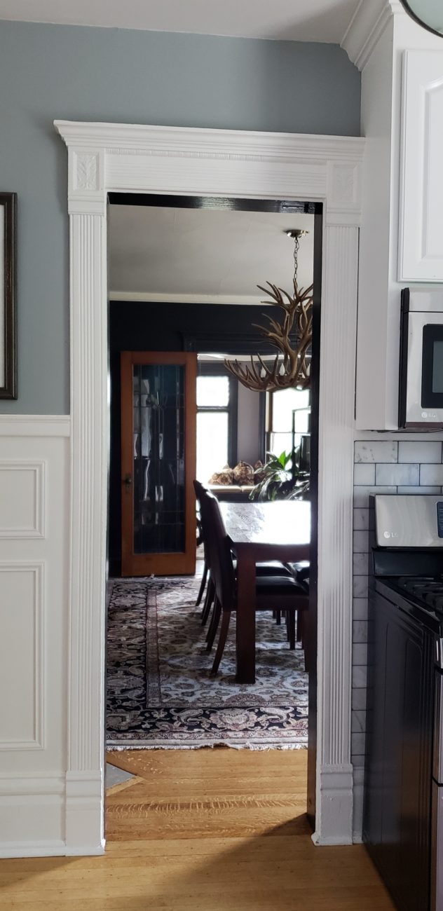
One of the things I most appreciate about the home is the layout. Because it had been a upper/lower 2 family, the duo had to get creative about making a single family space flow. The downstairs has sort of a parlor, a game room, a home office and the master bedroom. The living room, kitchen, dining room and additional bedrooms are upstairs. I’m digging that you have to go deeper into the home (up a staircase) to get to the more personal living spaces. Such a great adaptation and a great example of customizing your home for your own family’s needs.
And now I will shut up and show you the good stuff. There are so many great photos, I thought about splitting it into two posts but I trust ya’ll not to OD on style.
Downstairs

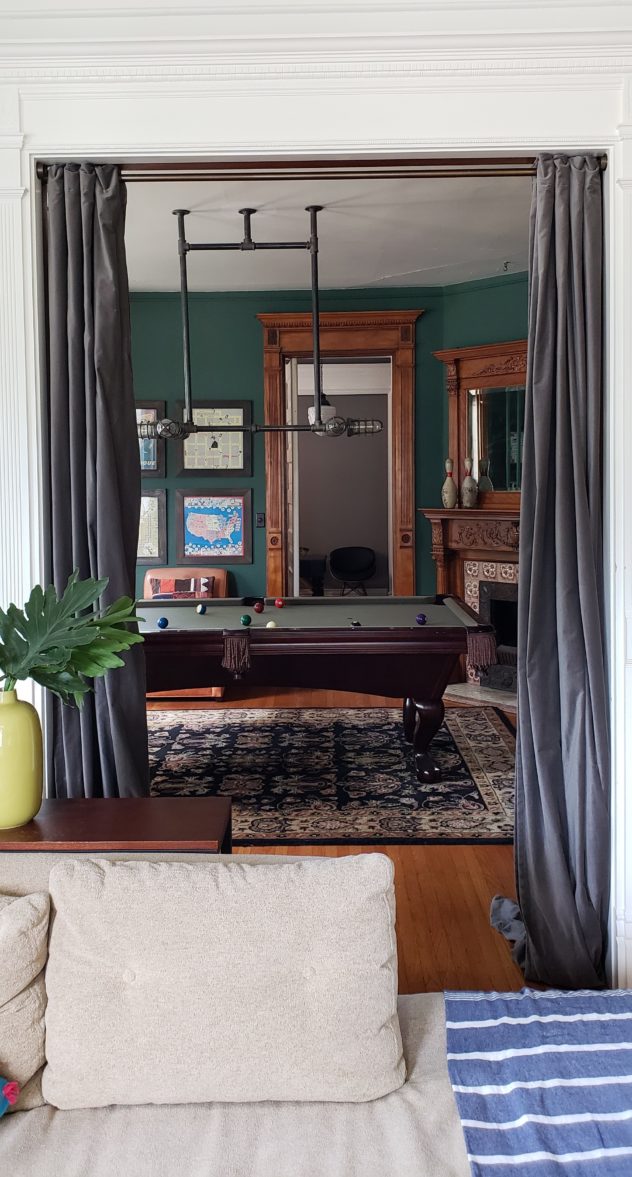
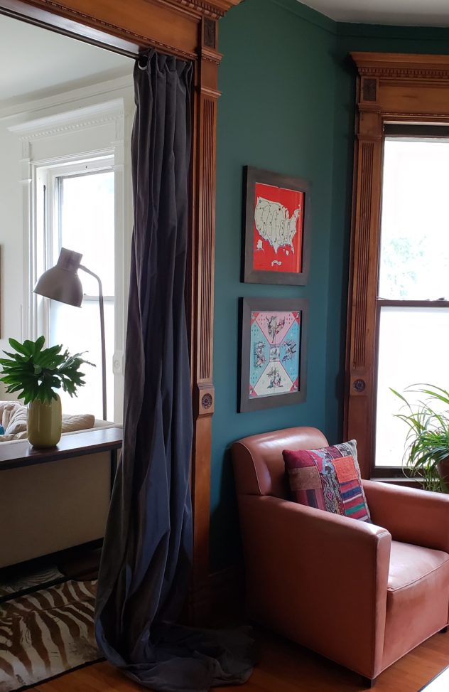
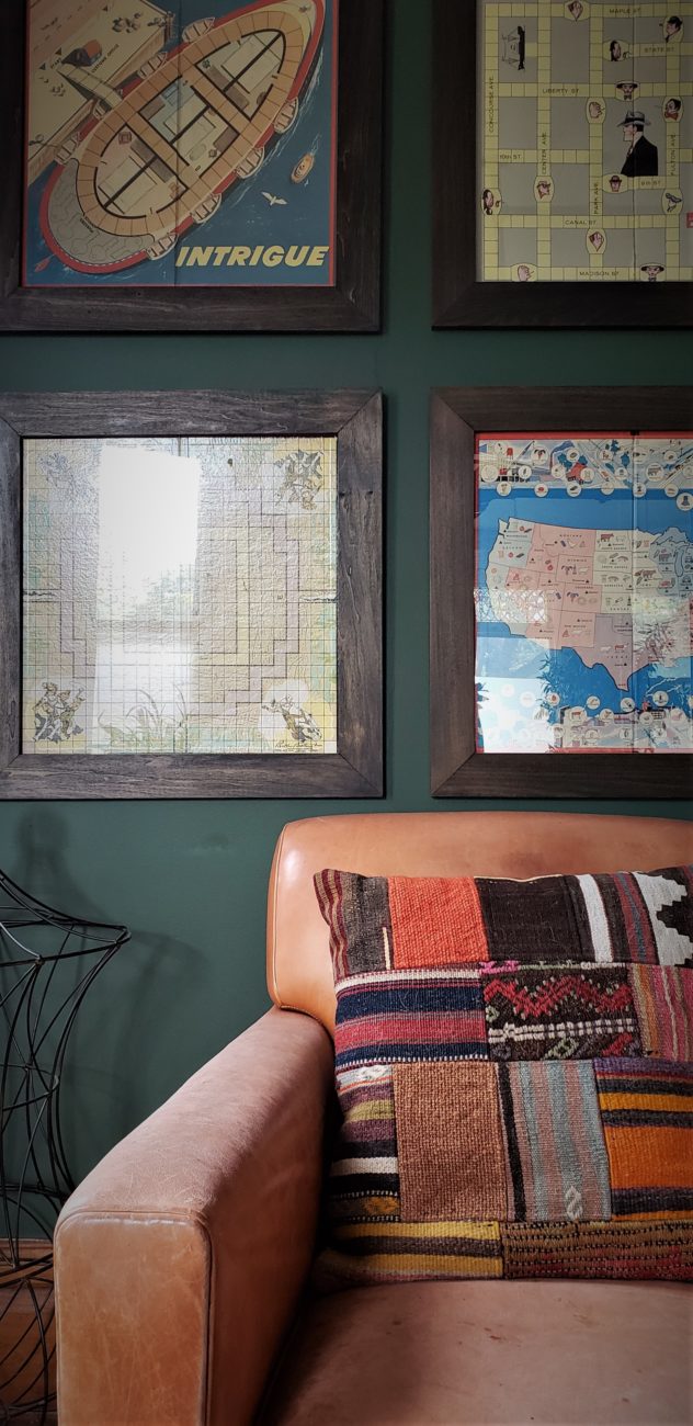
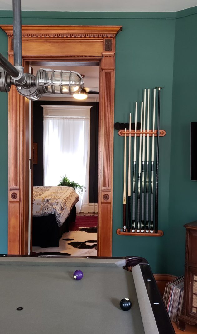


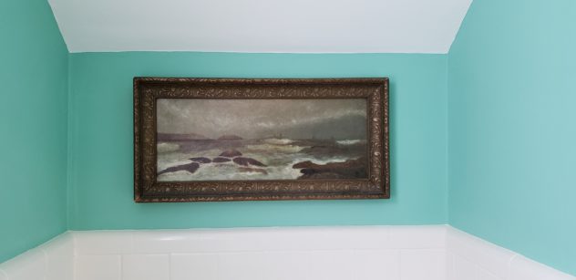
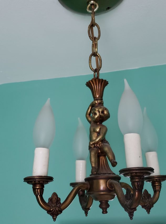
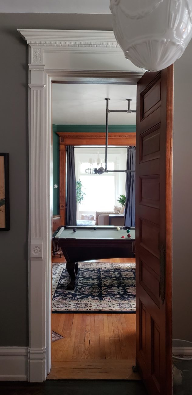

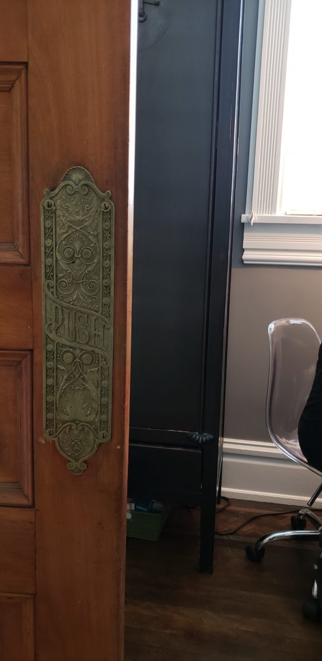
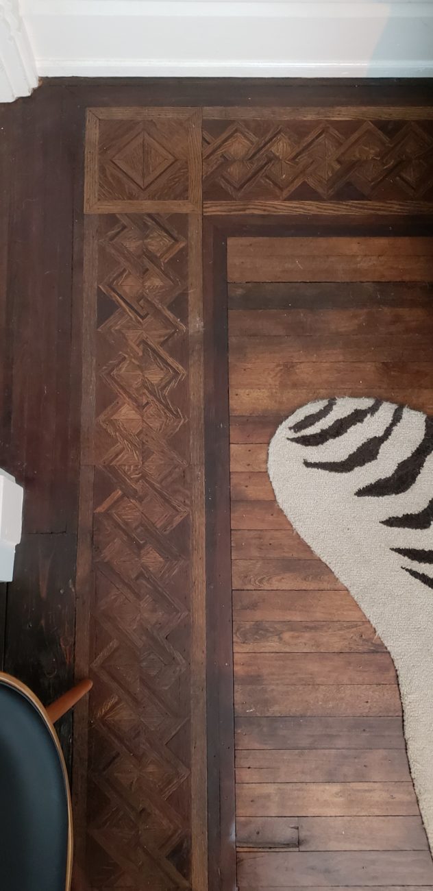
Details
(fo days)

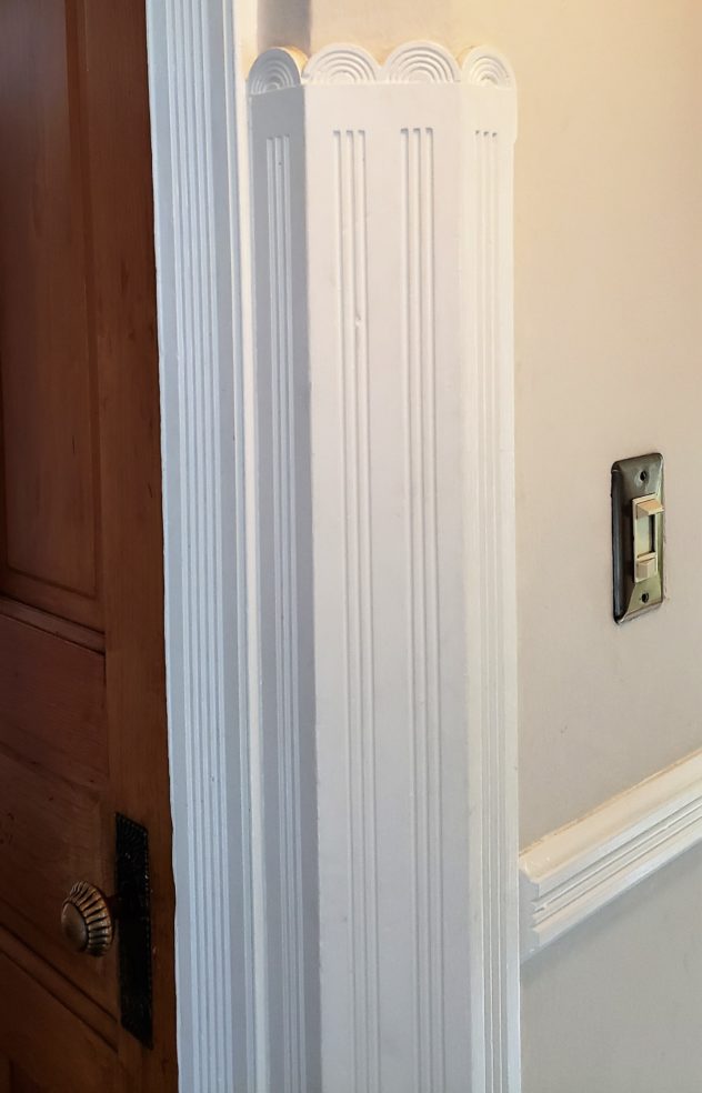

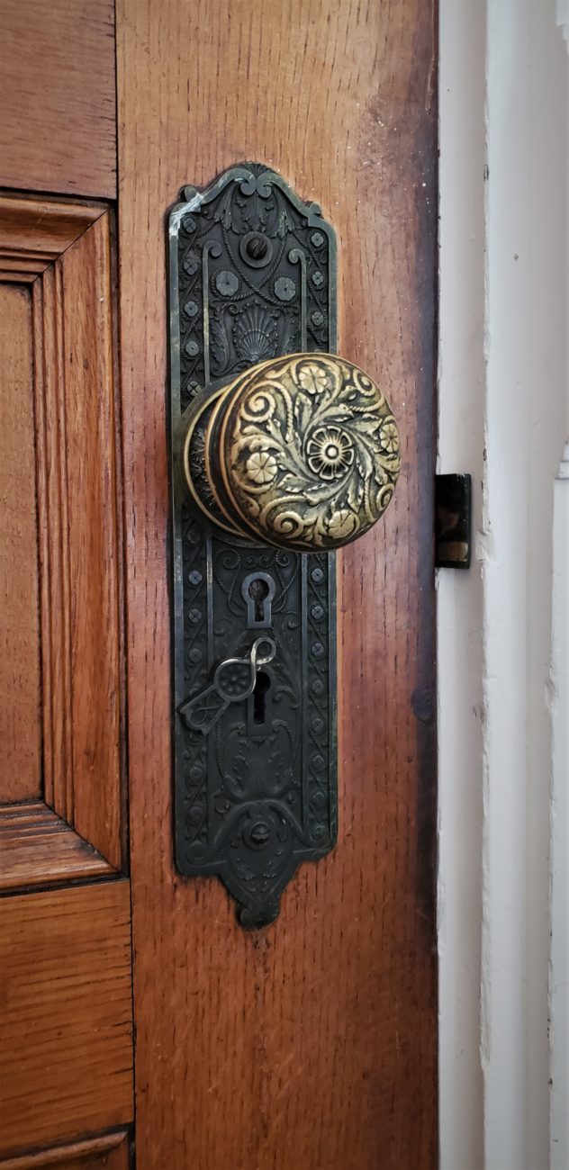

Upstairs
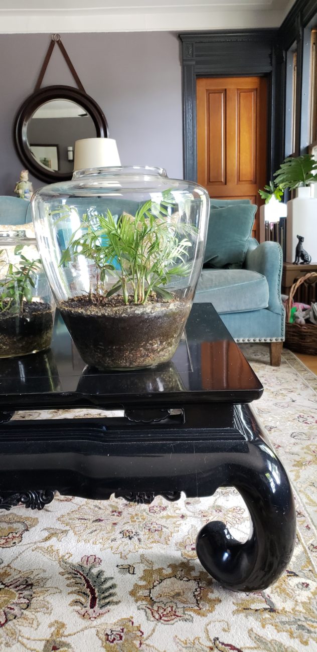





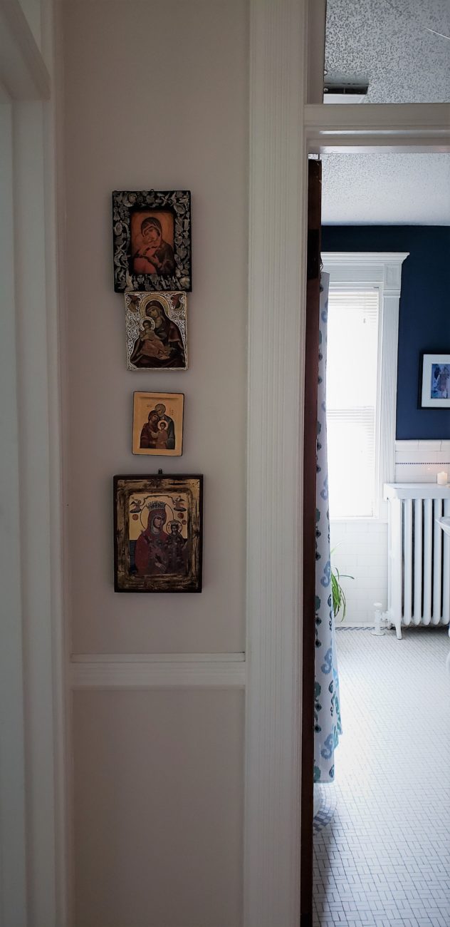
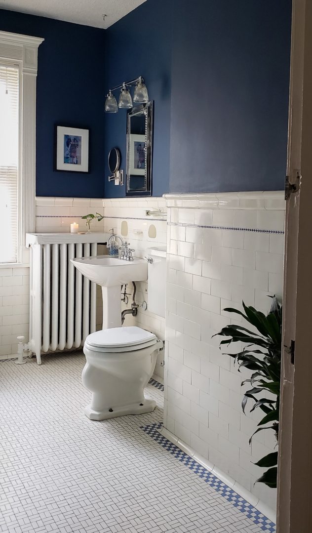
And that’s it! We made it through. Thanks to Chris and Andy for allowing the intrusion. I will be finding another pretense to return and it will be thinly veiled.
Drop a comment below and let me know what you think. What was your favorite room or style moment?
WOW! Chris and Andy were our next-door neighbors. How well we remember the day eight moving vans pulled up to their house … and they moved in. Everyone thought that our house was the one to be seen — it had belonged to a judge, doctor, and teacher before us — but what Andy and Chris have done to transform their place surely takes the cake for benefiting this historic part of Racine!
Stunning!! I love the brave use of dark colors in large doses. Gorgeous combos and details!
Beautiful job Chris, looks like home. I love what you’ve done. Love u guys, Rochell
Beautiful details and moments of surprise, that add interest and flair!
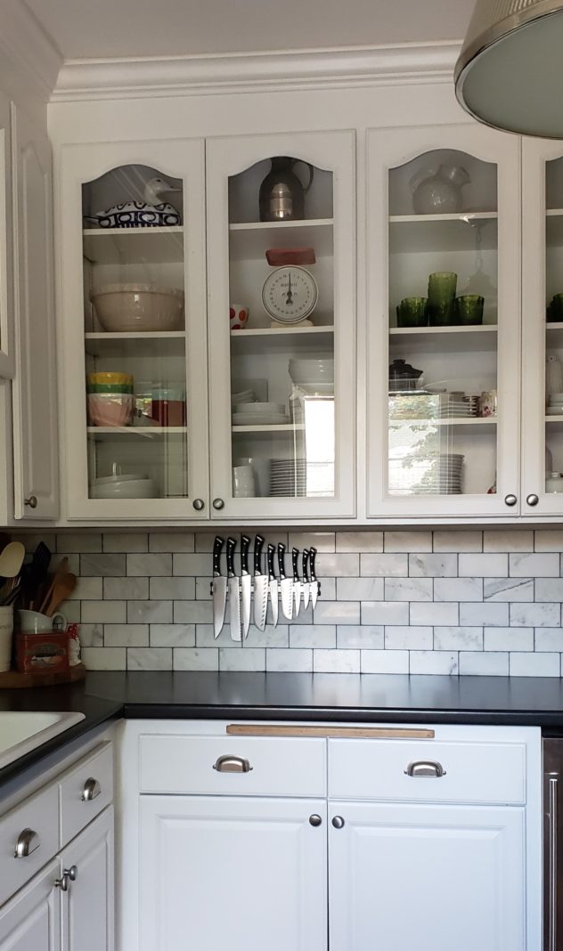
I’ve been in their home a few times and am OBSESSED. I wandered around with my jaw dropped the entire time. The. Entire. Time. You did an excellent job of capturing how special this home it and found several things that I had missed (while I walked around in a awesome-induced daze). Also that marble subway – you know that speaks my language.
Girl, yes. That tile is everything. Thanks for reading!
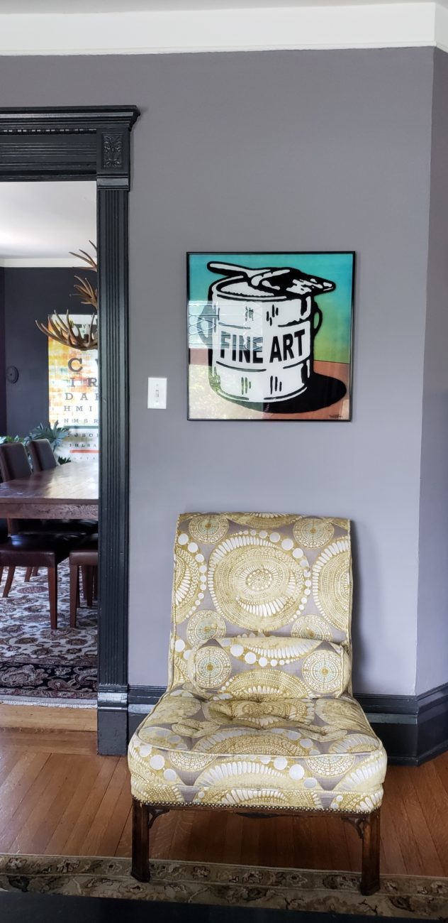
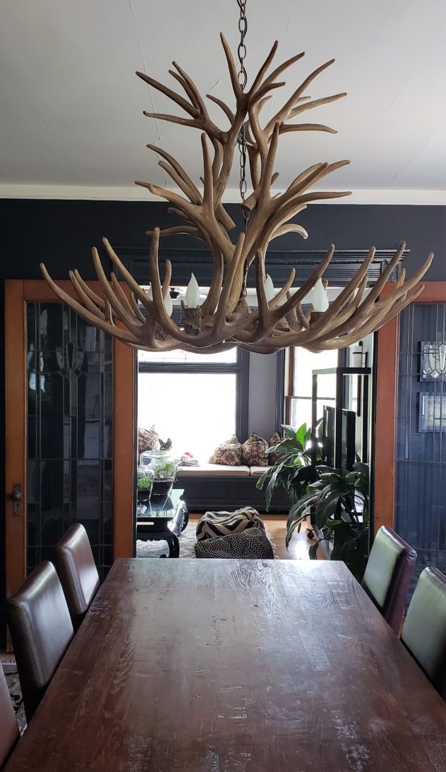
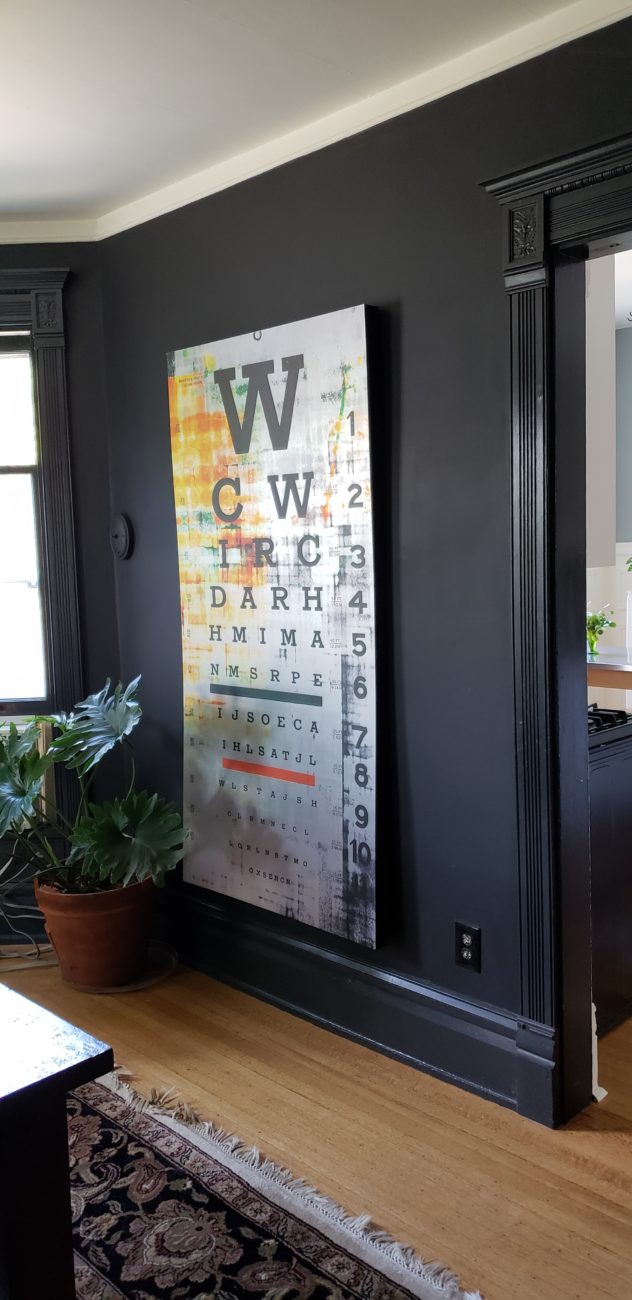
It takes a lot to impress me, and even more so to make a comment on it. So here I am telling you how very impressed I am and commenting on it. My favorite piece is the armless chair under the Fine Art print. I would have never picked the antler Chandelier, but I’ll be damned if it doesn’t work perfect. I am totally impressed. This is way cool. I admire everything about it.
Thanks for taking the time to comment! It was a joy to tour this house and yes… impressive indeed.
Love love love the incredible mixture of everything that tickles their fancy being beautifully constructed together. Absolutely stunning. I have to go catch my breath now.